電信客戶流失預測
項目數據
https://www.kaggle.com/blastchar/telco-customer-churn
項目概況
電信行業的客戶可以從各種服務提供商中進行選擇,並從一個服務提供商切換到另一個服務提供商。在這個競爭激烈的市場上,電信業務的年流失率為15-25%。
個性化的客戶保留是困難的,因為大多數公司都有大量的客戶,不能為每個客戶投入太多時間。成本太高,超過了額外收入。然而,如果一家公司能夠預測哪些客戶可能提前離開,那么它可以將客戶保留工作的重點放在這些“高風險”客戶身上。最終目標是擴大其覆蓋范圍並獲得更多的客戶忠誠度。在這個市場上取得成功的核心在於客戶本身。
客戶流失是一個關鍵指標,因為留住現有客戶的成本要比獲得新客戶的成本低得多。
為了減少客戶流失,電信公司需要預測哪些客戶面臨高流失風險。
為了發現潛在客戶流失的早期跡象,首先必須對客戶及其在多個渠道之間的互動進行全面的了解。
因此,通過解決客戶流失問題,這些企業不僅可以保持其市場地位,還可以發展壯大。他們網絡中的客戶越多,發起成本越低,利潤越大。因此,公司成功的關鍵重點是減少客戶流失和實施有效的保留戰略。
技術工具
本項目以以Python語言為基礎,使用conda發行的python3.8.5版本。使用vscode上的jupyter插件進行操作。在數據挖掘過程中,使用pandas進行數據整理和統計分析,使用matplotlib和seaborn進行數據可視化,使用scikit-learn、sgboost和catboost進行建模預測。
目的
1.客戶流失率和繼續使用主動服務的客戶的百分比是多少?
2.是否存在基於性別的客戶流失模式?
3.構建用戶畫像分析,了解客戶人群特點。
4.最賺錢的服務類型是什么?
5.根據數據樣本中的參數綜合分析客戶特征。
6.給產品或運營提出建議。
7.分析案例中的流失狀況,並擬合模型,預測客戶的流失狀況。
1、項目環境配置
導入相關的包
import matplotlib.pyplot as plt
import numpy as np
import pandas as pd
import missingno as msno
import seaborn as sns

import plotly.express as px
import plotly.graph_objects as go
from plotly.subplots import make_subplots

from sklearn.ensemble import AdaBoostClassifier, ExtraTreesClassifier  # ada分類器 、 極度隨機數分類算法
from sklearn.ensemble import GradientBoostingClassifier # 集成學習梯度提升決策樹
from sklearn.ensemble import RandomForestClassifier  # 隨機森林
from sklearn.linear_model import LogisticRegression  # 邏輯回歸
from sklearn.metrics import confusion_matrix, accuracy_score, classification_report # 評估函數
from sklearn.model_selection import train_test_split  # 數據集划分函數
from sklearn.naive_bayes import GaussianNB  # 朴素貝葉斯
from sklearn.neighbors import KNeighborsClassifier  # KNN算法
from sklearn.preprocessing import LabelEncoder  # 編碼轉換
from sklearn.preprocessing import StandardScaler # 數據標准化函數
from sklearn.svm import SVC  # 支持向量機
from sklearn.tree import DecisionTreeClassifier  # 決策樹分類器
from sklearn.discriminant_analysis import LinearDiscriminantAnalysis  # 線性判別分析
from xgboost import XGBClassifier  # XGB分類器
from sklearn import metrics # 量度函數
from sklearn.metrics import roc_curve # 召回曲線
消除部分warning
import warnings
warnings.filterwarnings('ignore')
plt顯示中文和正負號
plt.rcParams['font.sans-serif'] = ['SimHei']
plt.rcParams['axes.unicode_minus'] = False
2、數據獲取及分析
讀取數據文件
df = pd.read_csv('./data/WA_Fn-UseC_-Telco-Customer-Churn.csv')
查看前5條數據和后5條數據
df.head(5).append(df.tail(5))
df.describe()
df.shape
df.info()


3、特征工程
數據預處理
缺失值可視化
msno.matrix(df);
使用此矩陣,我們可以非常快速地找到數據的缺失模式。
從上面的可視化中,我們可以觀察到它沒有突出的數據,並且沒有缺失的數據。
TotalCharges表示總費用,這里為對象類型,需要轉換為float類型
注意astype如果遇到空值,轉換成數值型就會報錯
df['TotalCharges'].replace(' ', np.nan, inplace=True)
df['TotalCharges'] = df['TotalCharges'].astype(np.float64)
df.info()
再次檢查缺失值
pd.isnull(df["TotalCharges"]).sum()
查看缺失值
df[np.isnan(df['TotalCharges'])]
直接刪除這11個缺失值
df.dropna(inplace=True)
再次檢查缺失值
pd.isnull(df["TotalCharges"]).sum()
去除重復值
df.drop_duplicates()
df.shape
數據特征轉換
對Churn列中的的Yes和No分別用1和0替換,必須是原地替換
df['Churn'].replace(to_replace='Yes', value=1, inplace=True)
df['Churn'].replace(to_replace='No', value=0, inplace=True)
df['Churn'].head()
特征選擇
數據可視化
| 參數 | 解釋 |
|---|---|
| labels | 餅圖外側顯示的說明文字 |
| explode | 離開中心距離 |
| startangle | 起始繪制角度,默認圖是從x軸正方向逆時針畫起,如設定=90則從y軸正方向畫起 |
| shadow | 是否陰影 |
| labeldistance label | 繪制位置,相對於半徑的比例, 如<1則繪制在餅圖內側 |
| autopct | 控制餅圖內百分比設置,可以使用format字符串或者format function |
| '%1.2f' | 小數點前后位數(沒有用空格補齊) |
| pctdistance | 類似於labeldistance,指定autopct的位置刻度 |
| radius | 餅圖半徑 |
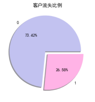
| #客戶流失餅狀圖 | |
| plt.pie(df["Churn"].value_counts(), labels=df["Churn"].value_counts().index, explode=(0.1, 0), autopct='%1.2f%%', shadow=True, colors = ['#c2c2f0','#ffb3e6', '#66b3ff']) | |
| plt.title("客戶流失比例") | |
| plt.show() |
其他餅狀圖
object_col = df.select_dtypes(include=[np.object]).columns.drop('customerID')
fig, axes = plt.subplots(nrows=3, ncols=5, figsize=(60, 100))
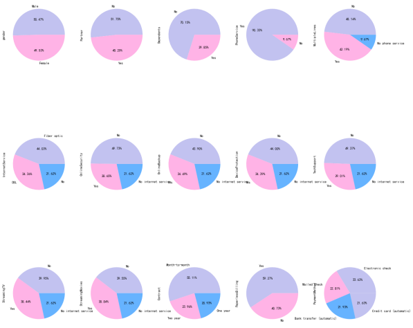
i = 1
for index in object_col:
plt.subplot(3, 5, i)
ax = df[index].value_counts().plot.pie(figsize=(20, 20),autopct='%1.2f%%', colors = ['#c2c2f0','#ffb3e6', '#66b3ff'])
i = i + 1
plt.show()
分析性別與流失的關系
g_labels = ['Male', 'Female']
c_labels = ['No', 'Yes']
fig = make_subplots(rows=1, cols=2, specs=[[{'type':'domain'}, {'type':'domain'}]])
fig.add_trace(go.Pie(labels=g_labels, values=df['gender'].value_counts(), name="Gender"),
              1, 1)
fig.add_trace(go.Pie(labels=c_labels, values=df['Churn'].value_counts(), name="Churn"),
              1, 2)

fig.update_traces(hole=.4, hoverinfo="label+percent+name", textfont_size=16)

fig.update_layout(
    title_text="性別和流失分布",
    annotations=[dict(text='Gender', x=0.16, y=0.5, font_size=20, showarrow=False),
                 dict(text='Churn', x=0.84, y=0.5, font_size=20, showarrow=False)])
fig.show()

plt.figure(figsize=(6, 6))
labels =["Churn: Yes","Churn:No"]
values = [1869,5163]
labels_gender = ["F","M","F","M"]
sizes_gender = [939,930 , 2544,2619]
colors = ['#ff6666', '#66b3ff']
colors_gender = ['#c2c2f0','#ffb3e6', '#c2c2f0','#ffb3e6']
explode = (0.3,0.3)
explode_gender = (0.1,0.1,0.1,0.1)
textprops = {"fontsize":15}
plt.pie(values, labels=labels,autopct='%1.1f%%',pctdistance=1.08, labeldistance=0.8,colors=colors, startangle=90,frame=True, explode=explode,radius=10, textprops =textprops, counterclock = True, )
plt.pie(sizes_gender,labels=labels_gender,colors=colors_gender,startangle=90, explode=explode_gender,radius=7, textprops =textprops, counterclock = True, )
centre_circle = plt.Circle((0,0),5,color='black', fc='white',linewidth=0)
fig = plt.gcf()
fig.gca().add_artist(centre_circle)

plt.title('性別的流失分布: Male(M), Female(F)', fontsize=15, y=1.1)

plt.axis('equal')
plt.tight_layout()
plt.show()
fig = go.Figure()

fig.add_trace(go.Bar(
  x = [['Churn:No', 'Churn:No', 'Churn:Yes', 'Churn:Yes'],
       ["Female", "Male", "Female", "Male"]],
  y = [965, 992, 219, 240],
  name = 'DSL',
))

fig.add_trace(go.Bar(
  x = [['Churn:No', 'Churn:No', 'Churn:Yes', 'Churn:Yes'],
       ["Female", "Male", "Female", "Male"]],
  y = [889, 910, 664, 633],
  name = 'Fiber optic',
))

fig.add_trace(go.Bar(
  x = [['Churn:No', 'Churn:No', 'Churn:Yes', 'Churn:Yes'],
       ["Female", "Male", "Female", "Male"]],
  y = [690, 717, 56, 57],
  name = 'No Internet',
))

fig.update_layout(title_text="<b>性別與網絡服務的流失關系</b>")

fig.show()


性別與流失基本無關
分析用戶合同簽訂方式與流失的關系
fig = px.histogram(df, x="Churn", color="Contract", barmode="group", title="<b>用戶合同簽訂方式流失分布<b>")
fig.update_layout(width=700, height=500, bargap=0.1)
fig.show()
流失的客戶中,約75%為按月簽訂合同的客戶,約13%為按年簽訂合同的客戶,約33%為按兩年簽訂合同的客戶
分析用戶支付方式與流失的關系
labels = df['PaymentMethod'].unique()
values = df['PaymentMethod'].value_counts()

fig = go.Figure(data=[go.Pie(labels=labels, values=values, hole=.3)])
fig.update_layout(title_text="<b>用戶支付方式流失分布</b>")
fig.show()
fig = px.histogram(df, x="Churn", color="PaymentMethod", title="<b>客戶支付方式與流失的分布</b>")
fig.update_layout(width=700, height=500, bargap=0.1)
fig.show()
ax = sns.catplot(y="Churn", x="MonthlyCharges", row="PaymentMethod", kind="box", data=df, height=1.5, aspect=4, orient='h', palette="pastel")


由圖上可以看出,付款方式對客戶流失率影響為:電子支票 > 郵件支票 > 銀行轉賬(自動) > 信用卡支付(自動)。


無紙化賬單的客戶最有可能流失。
信用卡支付對留住現有客戶更有效。
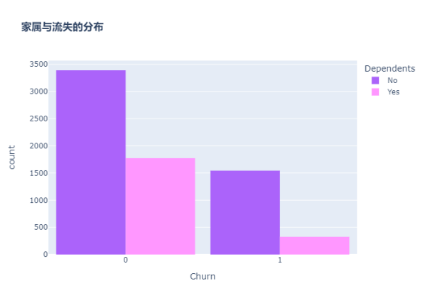
分析客戶是否有家屬與流失的關系
color_map = {"Yes": "#FF97FF", "No": "#AB63FA"}
fig = px.histogram(df, x="Churn", color="Dependents", barmode="group", title="<b>家屬與流失的分布</b>", color_discrete_map=color_map)
fig.update_layout(width=700, height=500, bargap=0.1)
fig.show()
沒有家屬的客戶更容易流失
分析用戶配偶與流失的關系
color_map = {"Yes": '#FFA15A', "No": '#00CC96'}
fig = px.histogram(df, x="Churn", color="Partner", barmode="group", title="<b>配偶與流失的分布</b>", color_discrete_map=color_map)
fig.update_layout(width=700, height=500, bargap=0.1)
fig.show()
graphic = sns.FacetGrid(df, row='Partner', col="Dependents", hue="Churn", height=3.5, palette="pastel")
graphic.map(plt.scatter, "tenure", "MonthlyCharges", alpha=0.6)
graphic.add_legend();


沒有配偶的客戶更容易流失
分析客戶年齡與流失的關系
color_map = {"Yes": '#00CC96', "No": '#B6E880'}
fig = px.histogram(df, x="Churn", color="SeniorCitizen", title="<b>年齡與流失的分布</b>", color_discrete_map=color_map)
fig.update_layout(width=700, height=500, bargap=0.1)
fig.show()

可以看出,老年人的比例非常低。
大多數老年人都在流失。
分析用戶在線安全服務與流失的關系
color_map = {"Yes": "#FF97FF", "No": "#AB63FA"}
fig = px.histogram(df, x="Churn", color="OnlineSecurity", barmode="group", title="<b>在線安全服務與流失的分布</b>", color_discrete_map=color_map)
fig.update_layout(width=700, height=500, bargap=0.1)
fig.show()
大多數客戶在無在線安全服務的情況下流失


分析客戶電子賬單與流失的關系
color_map = {"Yes": '#FFA15A', "No": '#00CC96'}
fig = px.histogram(df, x="Churn", color="PaperlessBilling",  title="<b>電子賬單與流失的分布</b>", color_discrete_map=color_map)
fig.update_layout(width=700, height=500, bargap=0.1)
fig.show()
分析客戶技術支持與流失的關系
fig = px.histogram(df, x="Churn", color="TechSupport",barmode="group",  title="<b>技術支持與流失的關系</b>")
fig.update_layout(width=700, height=500, bargap=0.1)
fig.show()

沒有技術支持的客戶最有可能遷移到其他服務提供商。
分析客戶電話服務與流失的關系
color_map = {"Yes": '#00CC96', "No": '#B6E880'}
fig = px.histogram(df, x="Churn", color="PhoneService", title="<b>電話服務與客戶流失的關系</b>", color_discrete_map=color_map)
fig.update_layout(width=700, height=500, bargap=0.1)
fig.show()
很少一部分客戶沒有電話服務,其中三分之一的客戶更可能流失。
分析客戶停留時長與流失的關系

繪制核密度圖
自定義繪制核密度圖的函數
def kdeplot(col):
    plt.figure(figsize=(20, 12), dpi=100)
    plt.title('KDE for {}'.format(col))
    ax1 = sns.kdeplot(df[df['Churn'] == 1][col], shade=True)
    ax2 = sns.kdeplot(df[df['Churn'] == 0][col], shade=True)
    plt.legend(['流失', '未流失'])
    plt.show()

kdeplot('tenure')
kdeplot('MonthlyCharges')
kdeplot('TotalCharges')
df['total_charges_to_tenure_ratio'] = df['TotalCharges'] / df['tenure']
df['monthly_charges_diff'] = df['MonthlyCharges'] - df['total_charges_to_tenure_ratio']
kdeplot('monthly_charges_diff')
graphic = sns.PairGrid(df, y_vars=["tenure"], x_vars=["MonthlyCharges", "TotalCharges"], height=4.5, hue="Churn", aspect=1.1, palette="pastel")
ax = graphic.map(plt.scatter, alpha=0.6)


用“小提琴圖”看PhoneService、MultipleLines、InternetService與MonthlyCharges的情況
ax = sns.catplot(x="MultipleLines", y="MonthlyCharges", hue="Churn", kind="violin", split=True, palette="pastel", data=df, height=4.2, aspect=1.4)
ax = sns.catplot(x="InternetService", y="MonthlyCharges", hue="Churn", kind="violin", split=True, palette="pastel", data=df, height=4.2, aspect=1.4)
ax = sns.catplot(x="PhoneService", y="MonthlyCharges", hue="Churn", kind="violin", split=True, palette="pastel", data=df, height=4.2, aspect=1.4)
fig = px.box(df, x='Churn', y = 'tenure')

fig.update_yaxes(title_text='Tenure (Months)', row=1, col=1)

fig.update_xaxes(title_text='Churn', row=1, col=1)

fig.update_layout(autosize=True, width=750, height=600,
    title_font=dict(size=25, family='Courier'),
    title='<b>客戶停留時長與流失分布</b>',
)

fig.show()


新客戶更容易流失
使用熱地圖顯示相關系數
| 熱力系數圖參數 | 解釋 |
|---|---|
| heatmap | 使用熱地圖展示系數矩陣情況 |
| linewidths | 熱力圖矩陣之間的間隔大小 |
| annot | 設定是否顯示每個色塊的系數值 |
構造相關性矩陣
charges = df.iloc[:, 1:20]
corr = charges.apply(lambda x: pd.factorize(x)[0])
corr = corr.corr()
plt.figure(figsize=(20, 16))
ax = sns.heatmap(corr, xticklabels=corr.columns, yticklabels=corr.columns, linewidths=0.2, annot=True)
plt.title("變量間的相關性")

結論:
從上圖可以看出,互聯網服務、網絡安全服務、在線備份業務、設備保護業務、技術支持服務、網絡電視和網絡電影之間存在較強的相關性。
多線業務和電話服務之間也有很強的相關性,並且都呈強正相關關系。
one-hot編碼
df_dummies = pd.get_dummies(df.iloc[:, 1:21])
df_dummies.head()
電信用戶是否流失與各變量之間的相關性
plt.figure(figsize=(15, 8))
df_dummies.corr()['Churn'].sort_values(ascending=False).plot(kind='bar')
plt.title("電信用戶是否流失與各變量之間的相關性")
由圖上可以看出,變量gender 和 PhoneService 處於圖形中間,其值接近於 0 ,這兩個變量對電信客戶流失預測影響非常小,可以直接舍棄。
分析用戶在線備份業務、設備保護業務、網絡電視、網絡電影與流失的關系
在線備份業務、設備保護業務、網絡電視、網絡電影和無互聯網服務對客戶流失率的影響
covariables = ["OnlineBackup", "DeviceProtection", "StreamingTV", "StreamingMovies"]
covariables_dict = [ "在線備份業務", "設備保護業務", "網絡電視", "網絡電影"]
fig, axes = plt.subplots(nrows=2, ncols=2, figsize=(10, 10))
for i, item in enumerate(covariables):
    plt.subplot(2, 2, (i + 1))
    ax = sns.countplot(x=item, hue="Churn", data=df, palette="pastel", order=["Yes", "No", "No internet service"])
    plt.xlabel(covariables_dict[i])
    plt.title(covariables_dict[i] + "對客戶流失率的影響")
    i = i + 1
plt.show()


-
由上圖可以看出,在網絡安全服務、在線備份業務、設備保護業務、技術支持服務、網絡電視和網絡電影六個變量中,沒有互聯網服務的客戶流失率值是相同的,都是相對較低。
-
這可能是因為以上六個因素只有在客戶使用互聯網服務時才會影響客戶的決策,這六個因素不會對不使用互聯網服務的客戶決定是否流失產生推論效應。
結論
1.用戶流失與性別gender無關。
2.老年人流失比率比較大,原因可能在於老年人對電信套餐認識不深,普及度較低,容易流失老年人客戶。
3.沒有伴侶以及沒有家屬的用戶流失率大。伴侶及家庭成員的存在可以顯著影響電信用戶的留存或流失。
4.用戶流失基本與手機服務指標“電話服務”和“多線”無關。可能是因為這是電信企業的核心業務,用戶流失與此無關。
5.網絡服務指標中,采用光纖服務的用戶更容易流失。可能是因為光纖服務的性價比不高。
6.其他訂閱服務指標中,前四項服務(“在線安全”、“在線備份”、“設備保護”和“技術支持”)對客戶流失呈正相關,沒有訂閱該服務的用戶較容易流失,后兩項(“流媒體電視”和“流媒體電影”)對客戶流失沒有明顯關系。
7.電子支付更容易流失客戶。可能是因為辦理業務方便,抑或是操作頻率高,使客戶厭倦。
8.采用無紙化賬單的客戶更容易流失。可能是因為讓客戶的錢流動沒有感覺。
9.合同簽約期越長用戶越不容易流失。2年合同若在中途毀約,對客戶有一定損失,這在一定程度上減少了客戶的流失。
10.新客戶更容易流失。可以采取一定的折扣方案挽留新用戶,提高新用戶的留存率。
11.月費率越高越容易流失客戶,若不在高費率的基礎上提供更優質的服務,容易導致用戶流失。月費為60元左右可以使得流失率較低且留存率較高,此后流失率大幅增加。80元左右時,客戶的流失率達到頂峰。
12.總費用少的用戶反而容易流失。因此費用保持在60元左右最好。
建議
用戶方面:針對老年用戶、無親屬、無伴侶用戶的特征推出定制服務如老年朋友套餐、溫暖套餐等。鼓勵用戶加強關聯,推出各種親子套餐、情侶套餐等,滿足客戶的多樣化需求。針對新注冊用戶,推送半年優惠如贈送消費券,以度過用戶流失高峰期。
服務方面:針對光纖用戶可以推出光纖和通訊組合套餐,對於連續開通半年以上的用戶給與優惠減免。開通網絡電視、電影的用戶容易流失,需要研究這些用戶的流失原因,是服務體驗如觀影流暢度清晰度等不好還是資源如片源等過少,再針對性的解決問題。針對在線安全、在線備份、設備保護、技術支持等增值服務,應重點對用戶進行推廣介紹,如首月/半年免費體驗,使客戶習慣並受益於這些服務
交易傾向方面:針對單月合同用戶,建議推出年合同付費折扣活動,將月合同用戶轉化為年合同用戶,提高用戶存留時長,以減少用戶流失。 針對采用電子支票支付用戶,建議定向推送其它支付方式的優惠券,引導用戶改變支付方式。對於開通電子賬單的客戶,可以在電子賬單上增加等級積分等顯示,等級升高可以免費享受增值服務,積分可以兌換某些日用商品。
根據預測模型,構建一個高流失率的用戶列表。通過用戶調研推出一個最小可行化產品功能,並邀請種子用戶進行試用。
選擇特征
刪除customerID、gender、phone service
df_var = df.iloc[:, 2:20]
df_var.drop("PhoneService", axis=1, inplace=True)
提取ID
df_id = df['customerID']
特征編碼
離散特征的編碼分為兩種情況:
1、離散特征的取值之間沒有大小的意義,使用one-hot編碼。
2、離散特征的取值有大小的意義,就使用數值的映射。
scaler = StandardScaler(copy=False)
scaler.fit_transform(df_var[['tenure', 'MonthlyCharges', 'TotalCharges']])
df_var[['tenure', 'MonthlyCharges', 'TotalCharges']] = scaler.transform(df_var[['tenure', 'MonthlyCharges', 'TotalCharges']])

畫箱型圖,查看異常值
plt.figure(figsize=(8, 4))
numbox = sns.boxplot(data=df_var[['tenure', 'MonthlyCharges', 'TotalCharges']], palette="pastel")
plt.title("客戶職位、月費用和總費用信息箱型圖")
繪制分布圖
def distplot(feature, frame, color='r'):
    plt.figure(figsize=(8,3))
    plt.title("Distribution for {}".format(feature))
    ax = sns.distplot(frame[feature], color= color)
num_cols = ["tenure", 'MonthlyCharges', 'TotalCharges']
for feat in num_cols: distplot(feat, df)
由於數字特征分布在不同的值范圍內,因此我將使用標准標量將它們縮小到相同的范圍。
df_std = pd.DataFrame(StandardScaler().fit_transform(df[num_cols].astype('float64')), columns=num_cols)
for feat in ['tenure', 'MonthlyCharges', 'TotalCharges']: distplot(feat, df_std, color='c')
特征轉換
六個變量中存在No internet service,即無互聯網服務對客戶流失率影響很小,這些客戶不使用任何互聯網產品,可以使用 No 替代 No internet service
查看對象類型字段中存在的值
def uni(columnlabel):
    print(columnlabel, "--", df_var[columnlabel].unique())  # unique函數去除其中重復的元素,返回唯一值
df_object = df_var.select_dtypes(['object'])
for i in range(0, len(df_object.columns)):
    uni(df_object.columns[i])
df_var.replace(to_replace='No internet service', value='No', inplace=True)
df_var.replace(to_replace='No phone service', value='No', inplace=True)
for i in range(0, len(df_object.columns)):
    uni(df_object.columns[i])
def labelencode(columnlabel):
    df_var[columnlabel] = LabelEncoder().fit_transform(df_var[columnlabel])

for i in range(0, len(df_object.columns)):
    labelencode(df_object.columns[i])

for i in range(0, len(df_object.columns)):
    uni(df_object.columns[i])
4、模型設計、選擇
| 參數 | 功能 |
|---|---|
| test_size/train_size | 設置train/test中train和test所占的比例 |
| random_state | 將樣本隨機打亂 |
X = df_var
y = df["Churn"].values
X_train, X_test, y_train, y_test = train_test_split(X, y, test_size=0.30, random_state=17)


KNN
knn_model = KNeighborsClassifier(n_neighbors = 11)
knn_model.fit(X_train,y_train)
predicted_y = knn_model.predict(X_test)
accuracy_knn = knn_model.score(X_test,y_test)
print("KNN accuracy:",accuracy_knn)
print(classification_report(y_test, predicted_y, digits=5))
SVC
svc_model = SVC(random_state = 1)
svc_model.fit(X_train,y_train)
predict_y = svc_model.predict(X_test)
accuracy_svc = svc_model.score(X_test,y_test)
print("SVM accuracy is :",accuracy_svc)
Random Forest
model_rf = RandomForestClassifier(n_estimators=500 , oob_score = True, n_jobs = -1,
                                  random_state =50, max_features = "auto",
                                  max_leaf_nodes = 30)
model_rf.fit(X_train, y_train)

prediction_test = model_rf.predict(X_test)
print (metrics.accuracy_score(y_test, prediction_test))
print(classification_report(y_test, prediction_test, digits=5))
plt.figure(figsize=(4,3))
sns.heatmap(confusion_matrix(y_test, prediction_test),
                annot=True,fmt = "d",linecolor="k",linewidths=3)

plt.title(" RANDOM FOREST CONFUSION MATRIX",fontsize=14)
plt.show()
y_rfpred_prob = model_rf.predict_proba(X_test)[:,1]
fpr_rf, tpr_rf, thresholds = roc_curve(y_test, y_rfpred_prob)
plt.plot([0, 1], [0, 1], 'k--' )
plt.plot(fpr_rf, tpr_rf, label='Random Forest',color = "r")
plt.xlabel('False Positive Rate')
plt.ylabel('True Positive Rate')
plt.title('Random Forest ROC Curve',fontsize=16)
plt.show();
Logistic Regression
lr_model = LogisticRegression()
lr_model.fit(X_train,y_train)
accuracy_lr = lr_model.score(X_test,y_test)
print("Logistic Regression accuracy is :",accuracy_lr)
lr_pred= lr_model.predict(X_test)
print(classification_report(y_test,lr_pred, digits=5))
plt.figure(figsize=(4,3))
sns.heatmap(confusion_matrix(y_test, lr_pred),
                annot=True,fmt = "d",linecolor="k",linewidths=3)

plt.title("LOGISTIC REGRESSION CONFUSION MATRIX",fontsize=14)
plt.show()
y_pred_prob = lr_model.predict_proba(X_test)[:,1]
fpr, tpr, thresholds = roc_curve(y_test, y_pred_prob)
plt.plot([0, 1], [0, 1], 'k--' )
plt.plot(fpr, tpr, label='Logistic Regression',color = "r")
plt.xlabel('False Positive Rate')
plt.ylabel('True Positive Rate')
plt.title('Logistic Regression ROC Curve',fontsize=16)
plt.show();
Decision Tree
dt_model = DecisionTreeClassifier()
dt_model.fit(X_train,y_train)
predictdt_y = dt_model.predict(X_test)
accuracy_dt = dt_model.score(X_test,y_test)
print("Decision Tree accuracy is :",accuracy_dt)
print(classification_report(y_test, predictdt_y, digits=5))
AdaBoost Classifier
a_model = AdaBoostClassifier()
a_model.fit(X_train,y_train)
a_preds = a_model.predict(X_test)
print("AdaBoost Classifier accuracy")
metrics.accuracy_score(y_test, a_preds)
print(classification_report(y_test, a_preds, digits=5))
plt.figure(figsize=(4,3))
sns.heatmap(confusion_matrix(y_test, a_preds), annot=True,fmt = "d",linecolor="k",linewidths=3)
plt.title("AdaBoost Classifier Confusion Matrix",fontsize=14)
plt.show()
Gradient Boosting Classifier
gb = GradientBoostingClassifier()
gb.fit(X_train, y_train)
gb_pred = gb.predict(X_test)
print("Gradient Boosting Classifier", accuracy_score(y_test, gb_pred))
print(classification_report(y_test, gb_pred, digits=5))
plt.figure(figsize=(4,3))
sns.heatmap(confusion_matrix(y_test, gb_pred), annot=True,fmt = "d",linecolor="k",linewidths=3)
plt.title("Gradient Boosting Classifier Confusion Matrix",fontsize=14)
plt.show()
Voting Classifier
from sklearn.ensemble import VotingClassifier
clf1 = GradientBoostingClassifier()
clf2 = LogisticRegression()
clf3 = AdaBoostClassifier()
eclf1 = VotingClassifier(estimators=[('gbc', clf1), ('lr', clf2), ('abc', clf3)], voting='soft')
eclf1.fit(X_train, y_train)
predictions = eclf1.predict(X_test)
print("Final Accuracy Score ")
print(accuracy_score(y_test, predictions))
plt.figure(figsize=(4,3))
sns.heatmap(confusion_matrix(y_test, predictions),annot=True,fmt = "d",linecolor="k",linewidths=3)

plt.title("CONFUSION MATRIX",fontsize=14)
plt.show()
print(classification_report(y_test, predictions, digits=5))
Naive Bayes
gnb = GaussianNB()
gnb.fit(X_train, y_train)
predictions = gnb.predict(X_test)
accuracy_gnb = gnb.score(X_test,y_test)
print("Naive Bayes accuracy is :",predictions)
print(classification_report(y_test, predictions, digits=5))
XGB
xgb = XGBClassifier()
xgb.fit(X_train, y_train)
predictions = xgb.predict(X_test)
accuracy_xgb = xgb.score(X_test,y_test)
print("XGB accuracy is :",predictions)
print(classification_report(y_test, predictions, digits=5))
Extra Trees
et = ExtraTreesClassifier()
et.fit(X_train, y_train)
predictions = et.predict(X_test)
accuracy_et = et.score(X_test,y_test)
print("Extra Trees accuracy is :",predictions)
print(classification_report(y_test, predictions, digits=5))
Linear Discriminant Analysis
lda = LinearDiscriminantAnalysis()
lda.fit(X_train, y_train)
predictions = lda.predict(X_test)
accuracy_lda = lda.score(X_test,y_test)
print("Linear Discriminant Analysis accuracy is :",predictions)
print(classification_report(y_test, predictions, digits=5))
Quadratic Discriminant Analysis
qda = LinearDiscriminantAnalysis()
qda.fit(X_train, y_train)
predictions = qda.predict(X_test)
accuracy_qda = qda.score(X_test,y_test)
print("Quadratic Discriminant Analysis accuracy is :",predictions)
print(classification_report(y_test, predictions, digits=5))
5、模型評估
| 參數 | 解釋 | 公式 |
|---|---|---|
| 召回率(recall) | 原本為對的當中,預測為對的比例(值越大越好,1為理想狀態) | R=TP/(TP+FN) |
| 精確率、精度(precision) | 預測為對的當中,原本為對的比例(值越大越好,1為理想狀態) | P=TP/(TP+FP) |
| F1分數(F1-Score) | 綜合了Precision與Recall的產出的結果(值越大越好,1為理想狀態) | F1=2×(P×R)/(P+R) |
| AUC(Area Under Curve) | ROC曲線下的面積。ROC曲線一般位於y=x上方,AUC越大,分類效果越好 |
由上可知,Voting Classifier的F1分數最高為0.81090,召回率最高,所以最終選擇投票分類器。
混淆矩陣中一共1549個未流失用戶,561個流失用戶。其中該模型正確預測1400個未流失用戶和324個流失客戶。屬於可接受范圍內。
本文原先是用word寫的,鏈接附在這里,有需要可以下載
https://files-cdn.cnblogs.com/files/blogs/728660/%E7%94%B5%E4%BF%A1%E5%AE%A2%E6%88%B7%E6%B5%81%E5%A4%B1%E9%A2%84%E6%B5%8B.7z