TableView 就是 Qt Quick 為表格式呈現數據提供的組件。想必兄台用過 Excel,可以藉此想象下 TableView 的效果。
TableView 與 ListView 類似,相比之下多了滾動條、挑選、可調整尺寸的表頭等特性。 它的數據也通過 Model 來提供,你可以使用 ListModel、XmlListModel,也可以使用 C++ 中從 QAbstractltemModel、QAbstractTableModel 等繼承而實現的 Model。
使用 ListView 也可以將數據呈現為表格樣式,不過稍微有些復雜,尤其是 delegate 的定義,當數據有很多列(比如播放列表、進銷存管理、學生成績表等)時,就會很復雜,再要有排序之類的操作,那就……此時就是 TableView 的用武之地了。
一、—個簡單的TableView實例
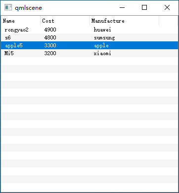
下面是前面講 ListView 時的示例,采用 TableView 來重寫一下。QML 文件 phone_table_ simple.qml 的內容如下:
import QtQuick 2.0
import QtQuick.Window 2.3
import QtQuick.Controls 1.2

Window {
    width: 360
    height: 360
    visible: true

    TableView{
        id: phoneTable
        anchors.fill: parent
        focus: true

        // TableViewColumn 描述表格的每一列
        TableViewColumn{role: "name"; title: "Name"; width: 80; elideMode: Text.ElideRight;}
        TableViewColumn{role: "cost"; title: "Cost"; width: 100;}
        TableViewColumn{role: "manufacture"; title: "Manufacture"; width: 140;}

        model: ListModel{
            id: phoneModel

            ListElement{
                name: "rongyao2";
                cost: "4900";
                manufacture: "huawei"
            }

            ListElement{
                name: "s6";
                cost: "4800";
                manufacture :"sumsung"
            }

            ListElement{
                name: "apple5"
                cost: "3300"
                manufacture: "apple"
            }

            ListElement{
                name: "Mi5"
                cost: "3200"
                manufacture: "xiaomi"
            }
        } // model is end

    }
}
效果如下圖所示:
二、TableViewColumn 屬性講解
定義了 TableViewColumn,描述表格的每一列,這是必需的,否則表格無法顯示。示例中用到 role、title、width 三個屬性,這是要使用 TableViewColumn 的最小屬性集,role 對應 Model 中 ListElement 中的 role-name,正是這個屬性完成了二維表格與一維 Model 之間的數據映射;title 是表頭中一列的標題;width 定義列寬。
-
role、title、width
這三個屬性,是要使用 TableViewColumn 的最小屬性集,role 對應 Model 中 ListElement 中的 role-name,正是這個屬性完成了二維表格與一維 Model 之間的數據映射;title 是表頭中一列的標題;width 定義列寬;
-
resizable
定義一列的寬度是否可以調整,默認值為 true;
-
movable
屬性定義是否可以拖動一列的位置, 默認值為 true;
-
horizontalAlignment
指定列標題文本的對齊方式,可以取 Text.AlignLeft (默認值)、Text.AlignRight、Text.AlignHCenter、Text.AlignJustify 四個值中的一個;
-
elideMode
指定標題不能完整顯示時的省略方式,可以取 Text.ElideRight (默認值)、Text.ElideLeft、 Text.ElideMiddle、Text.ElideNone 四個值中的一個;
-
visible
布爾值,指定表格的一列是否顯示,默認值為 true。
TableViewColumn 的最后一個屬性是 delegate,指定一個組件用來繪制這一列,示例中沒有指定,釆取了默認值;在你提供的 delegate 中,可以訪問 styleData 的部分屬性來獲知相關信息。styleData 是 TableView 相關的風格數據,有很多屬性。下面所列的屬性可以在 TableViewColumn 的 delegate 中訪問:
- styleData.selected,當 Item 選中時為 true。
- styleData.value,當前 Item 的文本。
- styleData.textColor,Item 的默認顏色。
- styleData.row,行索引。
- styleData.column,列索引。
- styleData.elideMode,列省略模式。
- styleData.textAlignment,列文本對齊方式。
如你所見,我們僅僅是設置了 model,定義了表格的列屬性,就得到了一個看起來還不錯的表格,代碼比我們使用 ListView 時少多了。
如果你覺得默認的表格樣式不好看,還可以定制它們。
三、定制表格外觀
通過設置 itemDelegate、rowDelegate、headerDelegate 等屬性,可以定制表格的外觀。
3.1 itemDelegate
itemDelegate 屬性指定如何繪制每一個單元格,它的類型是 Component。在 itemDelegate 中可以訪問的 styleData 屬性與 TableViewColumn 的 delegate —樣。下面是一個 itemDelegate 定義實例:
// 設置每個單元格的字體樣式
itemDelegate: Text {
    text: styleData.value
    color: styleData.selected ? "red" : styleData.textColor
    elide: styleData.elideMode
}
上面的 ItemDelegate 只有一個 Text 對象,它的 text 屬性被設置為 styleData.value 。如果本 Item 被選中,文本顏色用紅色,否則就用 styleData.textColor 文本如果顯示不全,就采用 styleData.elideMode 指定的省略模式(在默認模式下省略號在右側)。
itemDelegate 並不局限於一個簡單的可見 Item,你可以組合多個可見元素來實現復雜的 itemDelegate,比如在單元格內放置一個復選框、一個圖片等。
3.2 rowDelegate
rowDelegate 屬性指定如何繪制行背景,它的高度將決定 TableView 的行高。 rowDelegate 可以訪問下列 styleData 屬性(你可以理解成每一行都有這些屬性可用):
- styleData.altemate,本行使用交替的背景顏色時為true。
- styleData.selected,本行被選中時為 true。
- styleData.row,本行的索引。
下面是一個 rowDelegate 實例:
// 設置行的背景色
rowDelegate: Rectangle {
    color: styleData.selected ? root.highlight : root.alterBackground
}
在上面的 rowDelegate 中,我用一個 Rectangle 作為行背景元素,根據是否使用交替背景、是否選中為行指定了不同的背景色。
3.3 headerDelegate
headerDelegate 屬性定義如何繪制表頭,它可以訪問下列 styleData 附加屬性:
-
styleData.value,本 Item 的值。
-
styleData.column,本列索引。
-
styleData.pressed,本列被按下(如鼠標左鍵按下或手指按下)時為 true。
-
styleData.containsMouse,鼠標是否停在本列內。
-
styleData.textAlignment,本列文本的水平對齊方式。
下面是一個 headerDelegate 實例:
// 漸變色
property var normalG: Gradient {
    GradientStop { position: 0.0; color: "#c7d3ac" }
    GradientStop { position: 1.0; color: "#F0F0F0" }
}
property var hoverG: Gradient {
    GradientStop { position: 0.0; color: "white"; }
    GradientStop { position: 1.0; color: "#d7e3bc"; }
}
property var pressG: Gradient {
    GradientStop { position: 0.0; color: "#d7e3bc"; }
    GradientStop { position: 1.0; color: "white"; }
}
// ...

// 設置表頭的樣式
headerDelegate: Rectangle {
    implicitWidth: 10
    implicitHeight: 24
    gradient: styleData.pressed ? root.pressG : (styleData.containsMouse ? root.hoverG: root.normalG)
    border.width: 1
    border.color: "gray"

    Text {
        anchors.verticalCenter: parent.verticalCenter
        anchors.left: parent.left
        anchors.leftMargin: 4
        anchors.right: parent.right
        anchors.rightMargin: 4
        text: styleData.value
        color: styleData.pressed ? "red" : "blue"
        font.bold: true
    }
}
我通過 headerDelegate 改變了默認的表頭外觀,使用漸變色來填充表頭背景,為鼠標按下、經過定義了不同的背景顏色和文本顏色。
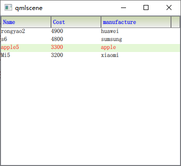
3.4 定制表格外觀后的示例
現在讓我們修改一下 phone_table_simple.qml 示例,為 TableView 添加 itemDelegate、 rowDelegate、headerDelegate,改變 TableView 的外觀。新的 QML 文件是 phone_table_delegate.qml,內容如下:
import QtQuick 2.2
import QtQuick.Controls 1.2

Rectangle {
    width: 360
    height: 300
    id: root

    property var background: "#d7e3bc"
    property var alterBackground: "white"
    property var highlight: "#e4f7d6"
    property var headerBkgnd: "#F0F0F0"
    property var normalG: Gradient {
            GradientStop { position: 0.0; color: "#c7d3ac" }
            GradientStop { position: 1.0; color: "#F0F0F0" }
    }
    property var hoverG: Gradient {
            GradientStop { position: 0.0; color: "white"; }
            GradientStop { position: 1.0; color: "#d7e3bc"; }
    }
    property var pressG: Gradient {
            GradientStop { position: 0.0; color: "#d7e3bc"; }
            GradientStop { position: 1.0; color: "white"; }
    }

    TableView {
        id: phoneTable
        focus: true
        anchors.fill: parent
        TableViewColumn{ role: "name"  ; title: "Name" ; width: 100; elideMode: Text.ElideRight;}
        TableViewColumn{ role: "cost" ; title: "Cost" ; width: 100; }
        TableViewColumn{ role: "manufacture" ; title: "manufacture" ; width: 140; }

        // 設置每個單元格的字體樣式
        itemDelegate: Text {
            text: styleData.value
            color: styleData.selected ? "red" : styleData.textColor
            elide: styleData.elideMode
        }

        // 設置行的背景色
        rowDelegate: Rectangle {
            color: styleData.selected ? root.highlight : root.alterBackground
        }

        // 設置表頭的樣式
        headerDelegate: Rectangle {
            implicitWidth: 10
            implicitHeight: 24
            gradient: styleData.pressed ? root.pressG : (styleData.containsMouse ? root.hoverG: root.normalG)
            border.width: 1
            border.color: "gray"

            Text {
                anchors.verticalCenter: parent.verticalCenter
                anchors.left: parent.left
                anchors.leftMargin: 4
                anchors.right: parent.right
                anchors.rightMargin: 4
                text: styleData.value
                color: styleData.pressed ? "red" : "blue"
                font.bold: true
            }
        }

        model: ListModel {
            id: phoneModel

            ListElement{
                name: "rongyao2";
                cost: "4900";
                manufacture: "huawei"
            }
            ListElement{
                name: "s6";
                cost: "4800";
                manufacture :"sumsung"
            }
            ListElement{
                name: "apple5"
                cost: "3300"
                manufacture: "apple"
            }
            ListElement{
                name: "Mi5"
                cost: "3200"
                manufacture: "xiaomi"
            }
        }

    }
}
效果圖如下:
四、動態增刪改查 TabelView
有時你可能會想給 TableView 添加一列(一個字段),這時可以使用addColumn()方法, 其參數是 TableViewColumn,指向一個 TableViewColumn 實例,你可以動態創建這個實例。
對於前兩節的示例,第三列可以這樣添加進去:
Component.onCompleted: {
	var col = Qt.createQmlObject("import QtQuick 2.2\nimport QtQuick.Controls 1.2\nTableViewColumn{ role: \"mamifacturer\"; title: \"Manufacturer\"; width: 140; }", phoneModel);
	phoneTable.addColumn( col );
}
要想在指定位置添加一列,可以使用insertColumn(index, column)方法,index 參數指定列的索引,column 參數與 addColumn() 的參數一樣。
如果你想刪除某列,可以使用removeColumn(index)方法,指定列索引即可。
TableView 還提供了moveColumn(from, to),用於將一列從位置 from 移動到 to。
而如果你想給 TableView 動態添加數據,則可以通過調用 ListModel 的 append() 或 insert() 方法實現。刪除數據通過 ListModel 的 clear() 或 remove() 方法實現。這些在前面介紹 ListView 的時候都已經介紹過了。
對於自定義的 Model,比如在 C++ 中實現的,則需要提供增、刪、改數據的接口。 TableView 就介紹到這里了,進一步的應用請結合示例和 Qt 幫助學習。
參考:
《Qt Quick核心編程》第13章