本文主要介紹基本元素 TextInput, TextField, TextEdit, TextArea 等的基本屬性。Textlnput 與 TextField 為行編輯控件,TextEdit 與 TextArea 為塊編輯控件。
一、Textinput
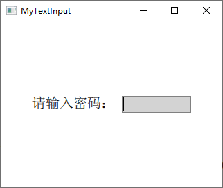
Textinput 用於編輯一行文本,類似於 QLineEdit,除了顯示光標和文本外,默認並沒有邊框等裝飾性效果,所以在使用時一般要為其添加一個可視化的外觀。
Window {
visible: true
width: 320
height: 240
Row {
spacing: 10
anchors.centerIn: parent
Text {
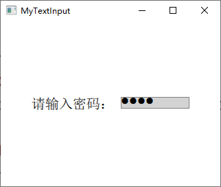
text: qsTr("請輸入密碼:") ;
font.pointSize: 15
verticalAlignment: Text.AlignVCenter
}
Rectangle {
width: 100
height: 24
color: "lightgrey"
border.color: "grey"
TextInput {
anchors.fill: parent
anchors.margins: 2
font.pointSize: 15
focus: true
}
}
}
}
Textinput 默認並沒有邊框,所以上面使用 Rectangle 作為其邊框,程序運行效果如下圖所示:
下面介紹其一些屬性:
- font 分組屬性允許你設置 Textlnput 元素所用字體的各種屬性,包括字體族(family)、大小(pixelSize、pointSize)、粗細(bold、weight)、斜體(italic)、下畫線(underline)等。
- horizontalAlignment 和 verticalAlignment 用於設定文本對齊方式,wrapMode 設置文本超過控件寬度時的換行策略,color 設置文字顏色,contentWidth、contentHeight 返回文本的寬、高。
- 當用戶按了回車鍵或確認鍵,或者編輯框失去焦點時,會發出 accepted 和 editingFinished 信號,開發者可以實現 onAccepted 和 onEditingFinished 信號處理器來處理。
1.1 自適應輸入框尺寸
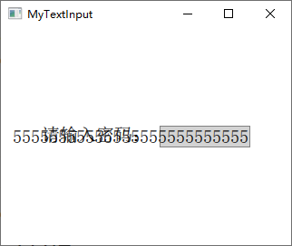
按照前面的代碼已經為 TextInput 設置了一個基本的外觀,但是如果輸入過多的內容時,會顯示到背景之外,如下圖所示:
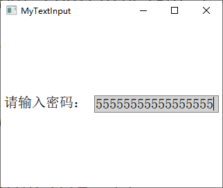
所以要根據輸入的內容來動態改變輸入框背景的尺寸,這個可以通過 contentWidth 和 contentHeight 屬性來根據輸入內容的寬高設置背景矩形的大小,將前面代碼更改如下:
Rectangle {
    width: input.contentWidth<100 ? 100 : input.contentWidth + 10
    height: input.contentHeight + 5
    color: "lightgrey"
    border.color: "grey"

    TextInput {
        id: input
        anchors.fill: parent
        anchors.margins: 2
        font.pointSize: 15
        focus: true
    }
}
運行效果如下圖所示:
1.2 輸入掩碼
可以使用輸入掩碼 inputMask 來限制輸入的內容,輸入掩碼就是使用一些特殊的字符來限制輸入的格式和內容,舉個簡單的例子,你想讓用戶輸入類似於 "2014-01-30" 這種格式的日期, 可以將 inputMask 設置為 "0000-00-00"。可用的掩碼字符如下表所示。
| 字符(必須輸入) | 字符(可留空) | 含義 |
|---|---|---|
| A | a | 只能輸入A-Z,a-z |
| N | n | 只能輸入A-Z,a-z,0-9 |
| X | x | 可以輸入任意字符 |
| 9 | 0 | 只能輸入0-9 |
| D | d | 只能輸入1-9 |
| # | 只能輸入加號(+),減號(-),0-9 | |
| H | h | 只能輸入十六進制字符,A-F,a-f,0-9 |
| B | b | 只能輸入二進制字符,0或1 |
| 字符 | 含義 |
|---|---|
| > | 后面的字母字符自動轉換為大寫 |
| < | 后面的字母字符自動轉換為小寫 |
| ! | 停止字母字符的大小寫轉換 |
| [ ] { } | 括號中的內容會直接顯示出來 |
| \ | 將該表中的特殊字符正常顯示用作分隔符 |
下面來看示例代碼:
Rectangle {
    width: input.contentWidth<100 ? 100 : input.contentWidth + 10
    height: input.contentHeight + 5
    color: "lightgrey"
    border.color: "grey"

    TextInput {
        id: input
        anchors.fill: parent
        anchors.margins: 2
        font.pointSize: 15
        focus: true

        inputMask: ">AA_9_a"
        onEditingFinished: text2.text = text
    }
}

Text { id: text2}
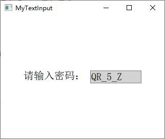
當輸入完成后可以按下回車鍵,這時會調用 onEditingFinished 信號處理器,在其中可以對輸入的文本進行處理。注意,只有當所有必須輸入的字符都輸入后,按下回車鍵才可以調用該信號處理器,比如這里的掩碼字符 9 要求必須輸入一個數字,如果不輸入而是直接留空,那么按下回車鍵也沒有效果。代碼運行效果如下圖所示:
1.3 驗證器
除了使用掩碼,還可以使用整數驗證器 IntValidator 、DoubleValidator(非整數驗證器)和RegExpValidator(正則表達式驗證器)。下面的代碼可以限制在 TextInput 中只能輸入 11 到 31 之間的整數:
validator: IntValidator{ bottom: 11; top: 31; }
對於正則表達式的使用,可以參考網上教程。
1.4 回顯方式
TextInput項目的 echoMode 屬性指定了文本的顯示方式,可用的方式有:
- TextInput.Normal:直接顯示文本(默認方式);
- TextInput.Password:使用密碼掩碼字符(根據不同平台顯示效果不同)來代替真實的字符;
- TextInput.NoEcho:不顯示輸入的內容;
- TextInput.PasswordEchoOnEdit:使用密碼掩碼字符,但在輸入時顯示真實字符。
下面來看示例代碼:
TextInput {
    id: input
    focus: true
    echoMode: TextInput.PasswordEchoOnEdit

    onEditingFinished: {
        input.focus = false
        text2.text = text
    }
}
代碼先設置了 TextInput 獲得焦點,這樣輸入字符會直接顯示,等輸入完成按下回車鍵以后使 TextInput 失去焦點,這樣輸入的字符會用密碼掩碼顯示。效果如下圖所示:
如果 echoMode 不為 Textlnput.Normal,那么 displayText 屬性就保存顯示給用戶的文本,而 text 屬性則保存實際輸入的文本,比如你設定 passwordCharacter 為 *, echoMode為TextInput.Password,那么displayText屬性內保存的就是一串 *。
二、TextEdit
TextEdit 是 Qt Quick 提供的多行文本編輯框,它的大多數屬性與 Textinput 類似。下面只說不同之處:
-
文本顏色
TextInput 的文本顏色使用 color 屬性指定,TextField 的文本顏色使用 textColor 屬性指定。
-
背景色
TextInput 沒有背景,是透明的,能夠與父控件無縫結合;而 TextField 有背景,其背景色可通過 TextFieldStyle 的 background 屬性來設定,其他屬性都一樣。
-
富文本
Textlnput 不支持使用 HTML 標記的富文本,而 TextEdit 可以。
示例如下:
import QtQuick 2.9
import QtQuick.Window 2.2

Window {
    visible: true
    width: 640
    height: 480

    TextEdit {
        width: 240
        textFormat: Text.RichText
        text: "<b>Hello</b> <i>World!</i>"
        font.family: "Helvetica"
        font.pointSize: 20
        color: "blue"
        focus: true
        anchors.centerIn: parent
    }
}
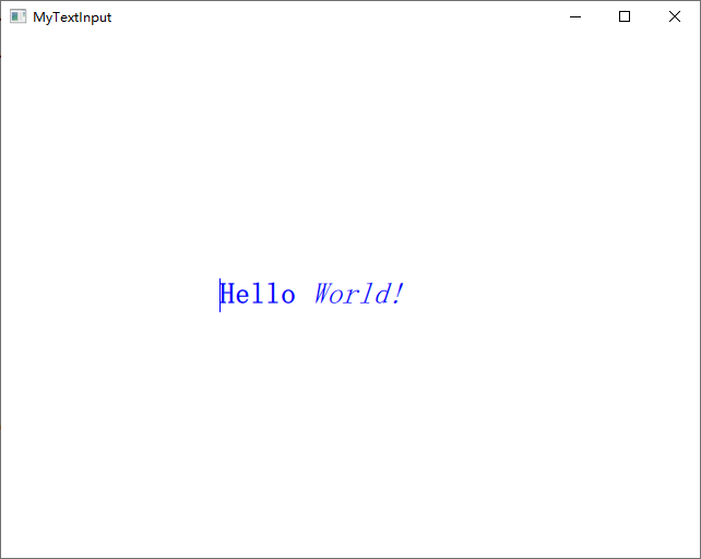
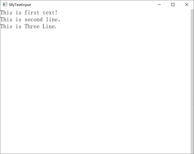
運行代碼可以看到,TextEdit 沒有提供滾動條、光標跟隨和其它在可視部件中通常具有的行為。為了更加人性化的體驗,我們可以使用 Flickable 來為其提供滾動,實現光標跟隨。下面來看一段示例代碼:
Window {
    visible: true
       width: 640
       height: 480

       Flickable {
           id: flick

           anchors.fill: parent
           contentWidth: edit.paintedWidth
           contentHeight: edit.paintedHeight
           clip: true

           function ensureVisible(r)
           {
               if (contentX >= r.x)
                   contentX = r.x;
               else if (contentX+width <= r.x+r.width)
                   contentX = r.x+r.width-width;
               if (contentY >= r.y)
                   contentY = r.y;
               else if (contentY+height <= r.y+r.height)
                   contentY = r.y+r.height-height;
           }

           TextEdit {
               id: edit
               width: flick.width
               height: flick.height
               font.pointSize: 15
               wrapMode: TextEdit.Wrap
               focus: true
               onCursorRectangleChanged:
                   flick.ensureVisible(cursorRectangle)
           }
       }

       Rectangle {
           id: scrollbar
           anchors.right: flick.right
           y: flick.visibleArea.yPosition * flick.height
           width: 10
           height: flick.visibleArea.heightRatio * flick.height
           color: "lightgrey"
       }
}
這里使用的 Flickable 類型到后面會詳細講解。在 TextEdit 中可以設置 selectByMouse 屬性為 true 來使鼠標可以選取文本內容,可以直接通過鍵盤快捷鍵實現文本的復制、粘貼、撤銷等操作,當然也可以使用相應的函數來完成。運行效果如下圖所示:
參考:
《Qt Quick核心編程》第9章
QML學習(五)—<TextInput和TextEdit輸入欄>