一、簡介
Button 是很常見的控件,Qt 助手的說明如下(參考 Button QML Type):
Button QML Type
Push-button that can be clicked to perform a command or answer a question. More...
Import Statement: import QtQuick.Controls 2.5
Since: Qt 5.7
Inherits: AbstractButton
Inherited By: RoundButton and ToolButton
根據以上可知,在 QML 中要使用 Buttoon,需要先導入控件庫 import QtQuick.Controls 2.5,使用其它控件也是一樣,都需要導入這個庫。
在界面上添加一個按鈕:
import QtQuick 2.12
import QtQuick.Window 2.12
import QtQuick.Controls 2.5

Window {
    visible: true
    width: 640
    height: 480
    title: qsTr("Hello World")

    Button{
        x:100  // 設置按鈕的橫坐標
        y:100  // 設置縱坐標
        text:"我是按鈕"   // 按鈕文本

        // 信號槽連接
        onClicked: {
            console.log("我被點擊了")
        }
    }
}
上面只設置了 Button 基本的文本屬性和 onClicked 事件處理,下面說說 QML 按鈕的其它屬性及用法。
二、屬性
- flat
此屬性決定按鈕是否為扁平。除非按下或選中按鈕,否則通常不會繪制按鈕的背景。默認值為 false。
- highlighted
此屬性決定按鈕是否突出顯示。可以突出顯示一個按鈕,以吸引用戶的注意。 它對鍵盤交互沒有影響。默認值為false。
- enabled
設置是否使能。默認值為 true。
- font.pointSize
設置字體大小。
三、信號槽連接
在 Button 的父類 AbstractButton 可以找到如下信號:
canceled()
clicked()
doubleClicked()
pressAndHold()
pressed()
released()
toggled()
按鈕信號槽寫法:on + 信號首字母大寫,例如下面的代碼,寫了一個點擊事件,代碼如下:
// 信號槽連接,單擊信號
onClicked: {
	console.log("我被點擊了")
}
槽函數代碼的 3 種寫法
(1)調用外部 JS 函數;
(2)函數調用時大括號也可以不寫;
(3)用控件的 id 調用,例如給 Button 添加了一個屬性 id:myButoon。
Button{
    id:myButoon
    x:100
    y:100
    text:"我是按鈕"

    // 信號槽連接,單擊信號
    onClicked: {
        console.log("我被點擊了")
    }

    // 模擬外部JS函數
    function slotDouble(){
        console.log("我被雙擊了")
    }

    // 1.調用外部 JS 函數
    //onDoubleClicked: {
    //slotDouble();
    //}

    // 2.函數調用時大括號也可以不寫
    //onDoubleClicked: slotDouble()

    // 3.用控件的 id 調用
    //onDoubleClicked: myButoon.slotDouble()
}
四、自定義按鈕
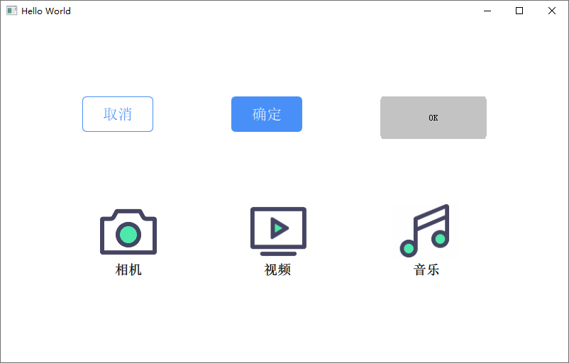
先看下實現效果,未點擊任何按鈕時:
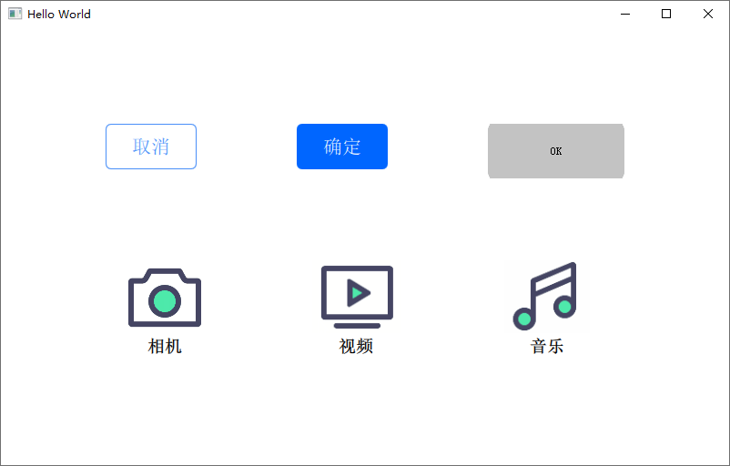
點擊確定按鈕時:
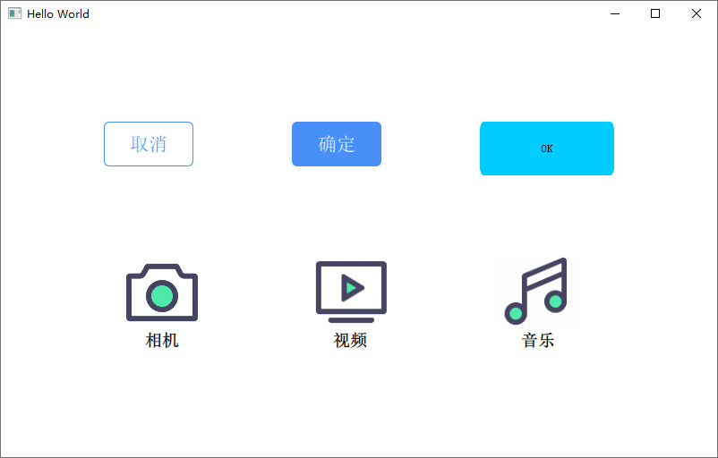
點擊 OK 按鈕時:
(1)純代碼方式,使用 color 屬性來設置點擊前和點擊后的字體、背景和邊框顏色以美化按鈕,MyButton.qml 的內容如下:
import QtQuick 2.9
import QtQuick.Controls 2.4

Button {
    id: root_Button
    font.pointSize: 16 // 設置字體大小

    property color clr_font: "#ffffff"
    property color clr_backNormal: "#498ff8"
    property color clr_backPress: "#0066FF"
    property color clr_boardNormal: "#498ff8"
    property color clr_boardPress: "#0066FF"

    // 設置按鈕文本
    contentItem: Text {
        id: text2
        text: root_Button.text
        font: root_Button.font
        opacity: enabled ? 1.0 : 0.3
        color: clr_font
        horizontalAlignment: Text.AlignHCenter
        verticalAlignment: Text.AlignVCenter
        elide: Text.ElideRight
    }

    // 設置按鈕背景
    background: Rectangle {
        implicitWidth: 100
        implicitHeight: 40
        opacity: enabled ? 1 : 0.3
        color: root_Button.down ? clr_backPress : clr_backNormal
        border.color: root_Button.down ? clr_boardPress : clr_boardNormal
        border.width: 1
        radius: 6
    }
}
(2)使用三張圖片資源來實現按鈕的三態,ThreeIconButton.qml 的內容如下:
import QtQuick 2.0
import QtQuick.Controls 1.4
import QtQuick.Controls.Styles 1.4

Button
{
    id: root_Button
    property string nomerPic: "qrc:/image/ok.png"
    property string hoverPic: "qrc:/image/ok1.png"
    property string pressPic: "qrc:/image/ok2.png"

    style: ButtonStyle {
        background:Rectangle{
            implicitHeight: root_Button.height
            implicitWidth:  root_Button.width

            color: "transparent"  // 設置背景透明,否則會出現默認的白色背景

            BorderImage {
                anchors.fill: parent
                source: control.hovered ? (control.pressed ? pressPic : hoverPic) : nomerPic;
            }
        }
    }
}
(3)使用 Rectangle 來重寫按鈕,同時顯示圖標和下方的提示文本,以及定義了點擊和釋放信號槽,MyIconButton.qml 的內容如下:
import QtQuick 2.0

Rectangle {
    id: rec

    property alias img_src: icon.source
    property alias btn_txt: button.text

    property color clr_enter: "#dcdcdc"
    property color clr_exit: "#ffffff"
    property color clr_click: "#aba9b2"
    property color clr_release: "#ffffff"

    //自定義點擊信號
    signal clickedLeft()
    signal clickedRight()
    signal release()

    width: 130
    height: 130
    radius: 10

    Image {
        id: icon
        width: 80
        height: 80
        source: "qrc:/camera.png"
        fillMode: Image.PreserveAspectFit
        clip: true
        anchors.top: parent.top
        anchors.right: parent.right
        anchors.left: parent.left
        anchors.margins: 10
    }

    Text {
        id: button
        text: qsTr("button")

        anchors.top: icon.bottom
        anchors.topMargin: 5
        anchors.horizontalCenter: icon.horizontalCenter
        anchors.bottom: icon.bottom
        anchors.bottomMargin: 5

        font.bold: true
        font.pointSize: 14
    }

    MouseArea {
        id: mouseArea
        anchors.fill: parent
        hoverEnabled: true

        //接受左鍵和右鍵輸入
        acceptedButtons: Qt.LeftButton | Qt.RightButton
        onClicked: {
            //左鍵點擊
            if (mouse.button === Qt.LeftButton)
            {
                parent.clickedLeft()
//                console.log(button.text + " Left button click")
            }
            else if(mouse.button === Qt.RightButton)
            {
                parent.clickedRight()
            }
        }

        //按下
        onPressed: {
            color = clr_click
        }

        //釋放
        onReleased: {
            color = clr_enter
            parent.release()
        }

        //指針進入
        onEntered: {
            color = clr_enter
        }

        //指針退出
        onExited: {
            color = clr_exit
        }
    }
}
(4)實際調用代碼:
import QtQuick 2.9
import QtQuick.Window 2.2
import QtQuick.Controls 2.4

Window {
    visible: true
    width: 800
    height: 480
    title: qsTr("Hello World")

    Grid {
         columns : 3
         rows: 2
         spacing: 80
         anchors.centerIn: parent

         MyButton{
             id: btnCancle
             width: 100
             height: 50
             text: "取消"
             clr_font: "#498ff8"
             clr_backNormal: "#ffffff"
             clr_backPress: "#DEE4ED"
             clr_boardNormal: "#498ff8"
             clr_boardPress: "#498ff8"

         }

         MyButton{
             id: btnOk
             width: 100
             height: 50
             text: "確定"
         }

         ThreeIconButton {
             width: 150
             height: 60
             text: "OK"
         }

         MyIconButton {
             id: btn_camera
             img_src: "qrc:/image/camera.png";
             btn_txt: "相機"
             onClickedLeft: console.log(btn_txt + " Left button click")
         }

         MyIconButton {
             id: btn_video
             img_src: "qrc:/image/dianshiju.png";
             btn_txt: "視頻"
             onClickedLeft: console.log(btn_txt + " Left Button click")
         }

         MyIconButton {
             id: btn_audio
             img_src: "qrc:/image/music.png";
             btn_txt: "音樂"
             onClickedLeft: console.log(btn_txt + " Left Button click")
         }
    }
}
五、自定義按鈕-代碼下載
GitHub 下載鏈接為:https://github.com/confidentFeng/QML_Demo/tree/master/MyButton
參考: