https://r4ds.had.co.nz/transform.html#grouped-summaries-with-summarise
5.6 通過summarise()進行分組概括
summarise()將數據框折疊為單行:
summarise(flights, delay = mean(dep_delay, na.rm = TRUE))
#> # A tibble: 1 x 1
#>   delay
#>   <dbl>
#> 1  12.6
除非我們將它與group_by()配對,否則summarize()並不是非常有用。這會將分析單位從完整數據集更改為單個組。當在分組數據框上使用dplyr時,它們將自動“按組”應用。例如,如果我們將完全相同的代碼應用於按日期分組的數據框,我們會得到每個日期的平均延遲:
by_day <- group_by(flights, year, month, day)
summarise(by_day, delay = mean(dep_delay, na.rm = TRUE))
#> # A tibble: 365 x 4
#> # Groups:   year, month [?]
#>    year month   day delay
#>   <int> <int> <int> <dbl>
#> 1  2013     1     1 11.5
#> 2  2013     1     2 13.9
#> 3  2013     1     3 11.0
#> 4  2013     1     4  8.95
#> 5  2013     1     5  5.73
#> 6  2013     1     6  7.15
#> # … with 359 more rows
在使用dplyr時group_by()和summarize()是同時使用最常用的工具之一:分組概括。但在我們進一步研究之前,我們需要引入管道的概念。
5.6.1 通過管道連接多個操作符
想要探索每個位置的距離和平均延遲之間的關系,可以編寫如下代碼:
by_dest <- group_by(flights, dest)
delay <- summarise(by_dest,
  count = n(),
  dist = mean(distance, na.rm = TRUE),
  delay = mean(arr_delay, na.rm = TRUE)
)
delay <- filter(delay, count > 20, dest != "HNL")

# It looks like delays increase with distance up to ~750 miles
# and then decrease. Maybe as flights get longer there's more
# ability to make up delays in the air?
ggplot(data = delay, mapping = aes(x = dist, y = delay)) +
  geom_point(aes(size = count), alpha = 1/3) +
  geom_smooth(se = FALSE)
#> `geom_smooth()` using method = 'loess' and formula 'y ~ x'
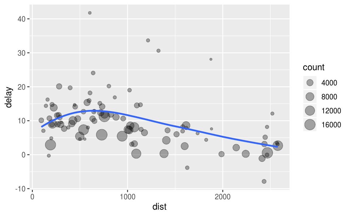
准備數據的三步:
- 按照destination過濾
- 概括計算distance,average delay和flights。
- 過濾,移除噪音點,移除Honolulu airport,因為它的距離大約是下一個最近的機場的兩倍。
這段代碼有點繁,因為我們必須為每個中間數據框命名。 命名有時候很難,所以這會減慢我們的分析速度。
還有另一種解決管道相同問題的方法,%>%:
delays <- flights %>%
  group_by(dest) %>%
  summarise(
    count = n(),
    dist = mean(distance, na.rm = TRUE),
    delay = mean(arr_delay, na.rm = TRUE)
  ) %>%
  filter(count > 20, dest != "HNL")
這側重於轉換,而不是轉換的內容,這使代碼更容易閱讀。 可以將其作為一系列命令性語句閱讀:組,然后匯總,然后過濾。 正如本文所述,在閱讀代碼時%>%意味着“然后”。
在幕后,x%>%f(y)變為f(x, y),x%>%f(y)%>%g(z)變為g(f(x,y),z) 等等。可以使用管道以從左到右,從上到下的方式重寫多個操作。從現在開始會經常使用管道,因為它大大提高了代碼的可讀性.
使用管道是屬於tidyverse的關鍵標准之一。唯一的例外是ggplot2:它是在發布管道操作符之前編寫的。不幸的是,ggplot2的下一次迭代,ggvis,確實使用了這個管道,但是還沒有為黃金時間做好准備。
5.6.2 缺失值
您可能想知道我們上面使用的na.rm參數。 如果我們不設置它會發生什么?
flights %>%
  group_by(year, month, day) %>%
  summarise(mean = mean(dep_delay))
#> # A tibble: 365 x 4
#> # Groups:   year, month [?]
#>    year month   day  mean
#>   <int> <int> <int> <dbl>
#> 1  2013     1     1    NA
#> 2  2013     1     2    NA
#> 3  2013     1     3    NA
#> 4  2013     1     4    NA
#> 5  2013     1     5    NA
#> 6  2013     1     6    NA
#> # … with 359 more rows
我們得到了很多缺失值!這是因為聚合函數遵循通常的缺失值規則:如果輸入中有任何缺失值,則輸出將是缺失值。幸運的是,所有聚合函數都有一個na.rm參數,該參數在計算之前刪除缺失值:
flights %>%
  group_by(year, month, day) %>%
  summarise(mean = mean(dep_delay, na.rm = TRUE))
#> # A tibble: 365 x 4
#> # Groups:   year, month [?]
#>    year month   day  mean
#>   <int> <int> <int> <dbl>
#> 1  2013     1     1 11.5
#> 2  2013     1     2 13.9
#> 3  2013     1     3 11.0
#> 4  2013     1     4  8.95
#> 5  2013     1     5  5.73
#> 6  2013     1     6  7.15
#> # … with 359 more rows
在這種情況下,如果缺失值代表取消的航班,我們也可以通過首先刪除已取消的航班來解決問題。我們將保存此數據集,以便我們可以在接下來的幾個示例中重復使用它。
not_cancelled <- flights %>%
  filter(!is.na(dep_delay), !is.na(arr_delay))

not_cancelled %>%
  group_by(year, month, day) %>%
  summarise(mean = mean(dep_delay))
#> # A tibble: 365 x 4
#> # Groups:   year, month [?]
#>    year month   day  mean
#>   <int> <int> <int> <dbl>
#> 1  2013     1     1 11.4
#> 2  2013     1     2 13.7
#> 3  2013     1     3 10.9
#> 4  2013     1     4  8.97
#> 5  2013     1     5  5.73
#> 6  2013     1     6  7.15
#> # … with 359 more rows
5.6.3 計數
無論何時進行任何聚合,最好包括count(n())或非缺失值的計數(sum(!is.na(x)))。這樣,可以根據非常少量的數據檢查。例如,讓我們看一下具有最高平均延遲的平面(由它們的尾號標識):
delays <- not_cancelled %>%
  group_by(tailnum) %>%
  summarise(
    delay = mean(arr_delay)
  )

ggplot(data = delays, mapping = aes(x = delay)) +
  geom_freqpoly(binwidth = 10)
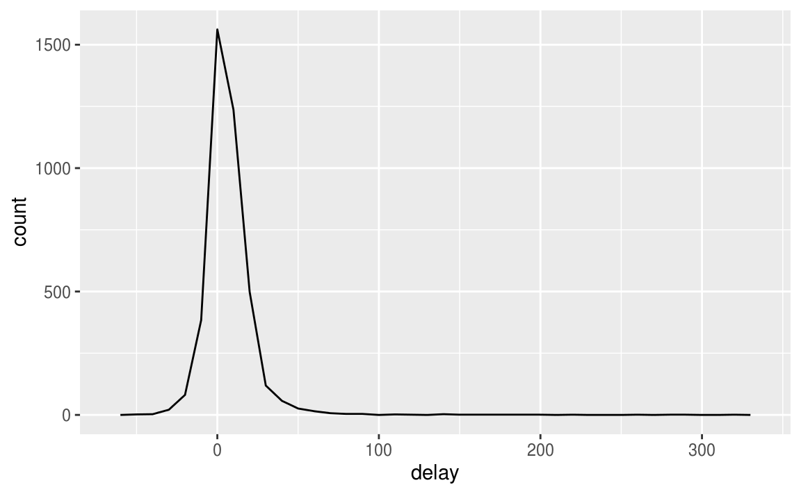
有些飛機的平均延誤時間為5小時(300分鍾)!
這個故事實際上有點微妙。 如果我們繪制航班數量與平均延誤的散點圖,我們可以獲得更多信息:
delays <- not_cancelled %>%
  group_by(tailnum) %>%
  summarise(
    delay = mean(arr_delay, na.rm = TRUE),
    n = n()
  )

ggplot(data = delays, mapping = aes(x = n, y = delay)) +
  geom_point(alpha = 1/10)
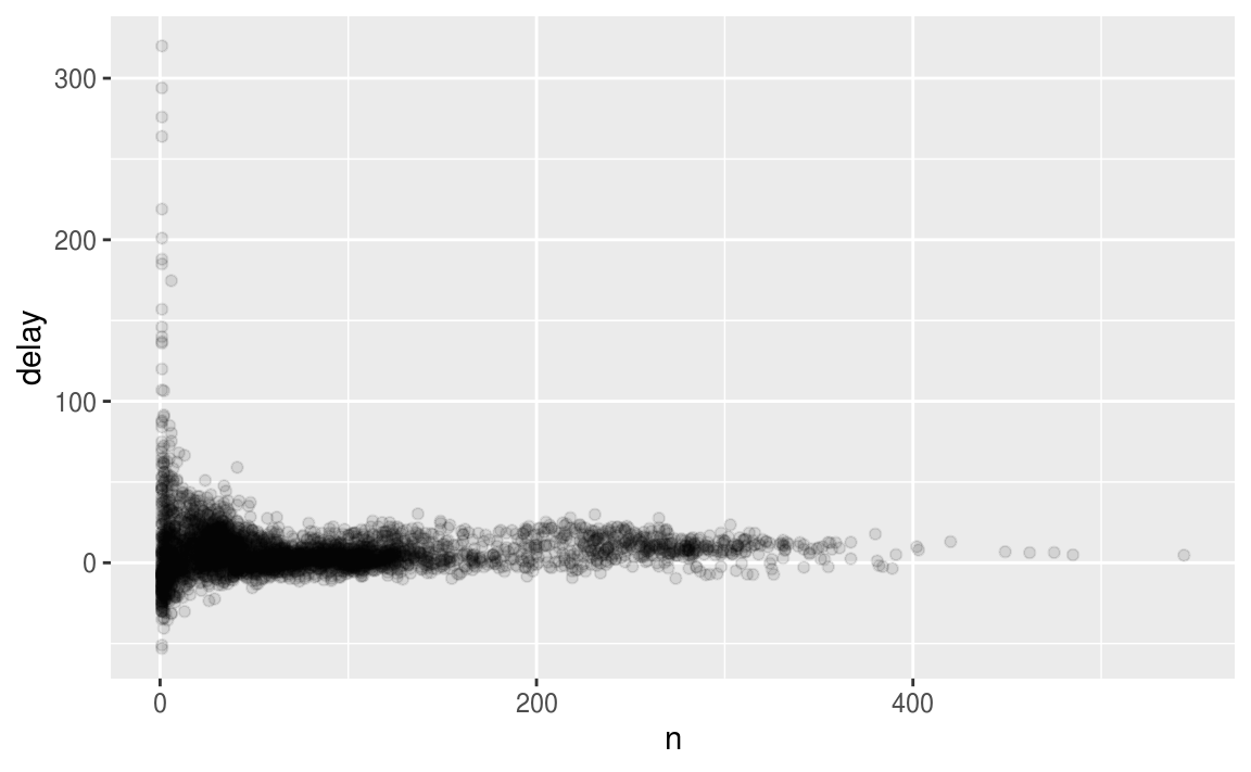
毫不奇怪,當航班很少時,平均延誤會有更大的變化。此圖的形狀非常有特色:無論何時繪制平均值(或其他摘要)與組大小,都會看到隨着樣本量的增加,變化會減小。
在查看此類圖時,過濾掉具有最少觀察數的組通常很有用,因此可以看到更多的模式,而不是最小組中的極端變化。這就是下面的代碼所做的,並向您展示了將ggplot2集成到dplyr流中的便捷模式。 必須從%>%切換到+,這有點痛苦,但是一旦掌握了它,就會非常方便。
delays %>%
  filter(n > 25) %>%
  ggplot(mapping = aes(x = n, y = delay)) +
    geom_point(alpha = 1/10)
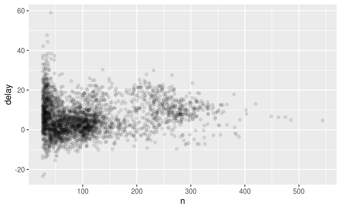
RStudio提示:一個有用的鍵盤快捷鍵是Cmd / Ctrl + Shift + P.這會將之前發送的塊從編輯器重新發送到控制台。 當(例如)在上面的示例中探索n的值時,這非常方便。 使用Cmd / Ctrl + Enter發送整個塊一次,然后修改n的值並按Cmd / Ctrl + Shift + P重新發送完整塊。
這種模式還有另一種常見的變化。讓我們來看看棒球擊球手的平均表現如何與他們擊球的次數有關。在這里,使用來自拉赫曼包的數據來計算每個大聯盟棒球運動員的擊球率(擊球次數/嘗試次數)。
當繪制擊球手的技能(按擊球平均數,ba測量)與擊球的機會數(ab測量)時,會看到兩種模式:
- 如上所述,隨着我們獲得更多數據點,我們聚合的變化會減少。
- 技能(ba)與擊球機會(ab)之間存在正相關關系。 這是因為球隊控制誰去比賽,顯然他們會選擇最好的球員。
# Convert to a tibble so it prints nicely
batting <- as_tibble(Lahman::Batting)

batters <- batting %>%
  group_by(playerID) %>%
  summarise(
    ba = sum(H, na.rm = TRUE) / sum(AB, na.rm = TRUE),
    ab = sum(AB, na.rm = TRUE)
  )

batters %>%
  filter(ab > 100) %>%
  ggplot(mapping = aes(x = ab, y = ba)) +
    geom_point() +
    geom_smooth(se = FALSE)
#> `geom_smooth()` using method = 'gam' and formula 'y ~ s(x, bs = "cs")'

這對排名也有重要意義。如果天真地對desc(ba)進行排序,那么打擊率最高的人顯然很幸運,不熟練:
batters %>%
  arrange(desc(ba))
#> # A tibble: 18,915 x 3
#>   playerID     ba    ab
#>   <chr>     <dbl> <int>
#> 1 abramge01     1     1
#> 2 banisje01     1     1
#> 3 bartocl01     1     1
#> 4 bassdo01      1     1
#> 5 berrijo01     1     1
#> 6 birasst01     1     2
#> # … with 1.891e+04 more rows
可以在這里找到對這個問題的一個很好的解釋:http://varianceexplained.org/r/empirical_bayes_baseball/ 和 http://www.evanmiller.org/how-not-to-sort-by-average-rating.html。
5.6.4 實用的匯總功能
只使用平均值,計數和求和就可以獲得很長的路要走,但R提供了許多其他有用的匯總函數:
- 衡量定位:我們使用均值
mean(x),但中位數median(x)也很有用。均值是除以長度的總和;中位數是一個值,其中50%的x高於它,50%低於它。
將聚合與邏輯子集相結合有時很有用。我們還沒有談到這種子集化,但你會在子集中了解更多。
not_cancelled %>%
  group_by(year, month, day) %>%
  summarise(
    avg_delay1 = mean(arr_delay),
    avg_delay2 = mean(arr_delay[arr_delay > 0]) # the average positive delay
  )
#> # A tibble: 365 x 5
#> # Groups:   year, month [?]
#>    year month   day avg_delay1 avg_delay2
#>   <int> <int> <int>      <dbl>      <dbl>
#> 1  2013     1     1      12.7        32.5
#> 2  2013     1     2      12.7        32.0
#> 3  2013     1     3       5.73       27.7
#> 4  2013     1     4      -1.93       28.3
#> 5  2013     1     5      -1.53       22.6
#> 6  2013     1     6       4.24       24.4
#> # … with 359 more rows
- 衡量離散度:
sd(x),IQR(x),mad(x)。均方根偏差或標准差sd(x)是離散的標准度量。四分位數范圍IQR(x)和中位數絕對偏差mad(x)是穩健的等價物,如果有異常值可能會更有用。
# Why is distance to some destinations more variable than to others?
not_cancelled %>%
  group_by(dest) %>%
  summarise(distance_sd = sd(distance)) %>%
  arrange(desc(distance_sd))
#> # A tibble: 104 x 2
#>   dest  distance_sd
#>   <chr>       <dbl>
#> 1 EGE         10.5
#> 2 SAN         10.4
#> 3 SFO         10.2
#> 4 HNL         10.0
#> 5 SEA          9.98
#> 6 LAS          9.91
#> # … with 98 more rows
- 等級衡量:
minx(x),quantile(x,0.25),max(x)。 分位數是中位數的推廣。 例如,quantile(x, 0.25)將發現x中值大於25%,並且小於剩余的75%的值。
# When do the first and last flights leave each day?
not_cancelled %>%
  group_by(year, month, day) %>%
  summarise(
    first = min(dep_time),
    last = max(dep_time)
  )
#> # A tibble: 365 x 5
#> # Groups:   year, month [?]
#>    year month   day first  last
#>   <int> <int> <int> <dbl> <dbl>
#> 1  2013     1     1   517  2356
#> 2  2013     1     2    42  2354
#> 3  2013     1     3    32  2349
#> 4  2013     1     4    25  2358
#> 5  2013     1     5    14  2357
#> 6  2013     1     6    16  2355
#> # … with 359 more rows
- Measures of position:
first(x),nth(x, 2),last(x)。與x[1],x[2]和x[length(x)]相似,但是如果該位置不存在,則允許設置默認值(即,您試圖從組中獲取第3個元素)只有兩個元素)。 例如,我們可以找到每天的第一次和最后一次出發:
not_cancelled %>%
  group_by(year, month, day) %>%
  summarise(
    first_dep = first(dep_time),
    last_dep = last(dep_time)
  )
#> # A tibble: 365 x 5
#> # Groups:   year, month [?]
#>    year month   day first_dep last_dep
#>   <int> <int> <int>     <int>    <int>
#> 1  2013     1     1       517     2356
#> 2  2013     1     2        42     2354
#> 3  2013     1     3        32     2349
#> 4  2013     1     4        25     2358
#> 5  2013     1     5        14     2357
#> 6  2013     1     6        16     2355
#> # … with 359 more rows
這些功能是對排名過濾的補充。 過濾提供所有變量,每個觀察在一個單獨的行中:
not_cancelled %>%
  group_by(year, month, day) %>%
  mutate(r = min_rank(desc(dep_time))) %>%
  filter(r %in% range(r))
#> # A tibble: 770 x 20
#> # Groups:   year, month, day [365]
#>    year month   day dep_time sched_dep_time dep_delay arr_time
#>   <int> <int> <int>    <int>          <int>     <dbl>    <int>
#> 1  2013     1     1      517            515         2      830
#> 2  2013     1     1     2356           2359        -3      425
#> 3  2013     1     2       42           2359        43      518
#> 4  2013     1     2     2354           2359        -5      413
#> 5  2013     1     3       32           2359        33      504
#> 6  2013     1     3     2349           2359       -10      434
#> # … with 764 more rows, and 13 more variables: sched_arr_time <int>,
#> #   arr_delay <dbl>, carrier <chr>, flight <int>, tailnum <chr>,
#> #   origin <chr>, dest <chr>, air_time <dbl>, distance <dbl>, hour <dbl>,
#> #   minute <dbl>, time_hour <dttm>, r <int>
- 計數和邏輯值的比例:
sum(x > 10),mean(y == 0)。 當與數字函數一起使用時,TRUE轉換為1,FALSE轉換為0。這使得sum()和mean()非常有用:sum(x)給出x中的TRUE數,而mean(x)給出比例。
# How many flights left before 5am? (these usually indicate delayed
# flights from the previous day)
not_cancelled %>%
  group_by(year, month, day) %>%
  summarise(n_early = sum(dep_time < 500))
#> # A tibble: 365 x 4
#> # Groups:   year, month [?]
#>    year month   day n_early
#>   <int> <int> <int>   <int>
#> 1  2013     1     1       0
#> 2  2013     1     2       3
#> 3  2013     1     3       4
#> 4  2013     1     4       3
#> 5  2013     1     5       3
#> 6  2013     1     6       2
#> # … with 359 more rows

# What proportion of flights are delayed by more than an hour?
not_cancelled %>%
  group_by(year, month, day) %>%
  summarise(hour_perc = mean(arr_delay > 60))
#> # A tibble: 365 x 4
#> # Groups:   year, month [?]
#>    year month   day hour_perc
#>   <int> <int> <int>     <dbl>
#> 1  2013     1     1    0.0722
#> 2  2013     1     2    0.0851
#> 3  2013     1     3    0.0567
#> 4  2013     1     4    0.0396
#> 5  2013     1     5    0.0349
#> 6  2013     1     6    0.0470
#> # … with 359 more rows
5.6.5 對多個變量分組
當您按多個變量分組時,每個概括都會剝離一個分組級別。 這樣可以輕松逐步匯總數據集:
daily <- group_by(flights, year, month, day)
(per_day   <- summarise(daily, flights = n()))
#> # A tibble: 365 x 4
#> # Groups:   year, month [?]
#>    year month   day flights
#>   <int> <int> <int>   <int>
#> 1  2013     1     1     842
#> 2  2013     1     2     943
#> 3  2013     1     3     914
#> 4  2013     1     4     915
#> 5  2013     1     5     720
#> 6  2013     1     6     832
#> # … with 359 more rows
(per_month <- summarise(per_day, flights = sum(flights)))
#> # A tibble: 12 x 3
#> # Groups:   year [?]
#>    year month flights
#>   <int> <int>   <int>
#> 1  2013     1   27004
#> 2  2013     2   24951
#> 3  2013     3   28834
#> 4  2013     4   28330
#> 5  2013     5   28796
#> 6  2013     6   28243
#> # … with 6 more rows
(per_year  <- summarise(per_month, flights = sum(flights)))
#> # A tibble: 1 x 2
#>    year flights
#>   <int>   <int>
#> 1  2013  336776
逐步匯總時要小心:總和和計數都可以,但是需要考慮加權平均值和方差,並且不可能完全按照基於排名的統計數據(如中位數)進行。 換句話說,分組總和的總和是總和,但分組中位數的中位數不是總體中位數。
5.6.6 取消組合
如果需要刪除分組,並返回對未分組數據的操作,使用ungroup()。
daily %>%
  ungroup() %>%             # no longer grouped by date
  summarise(flights = n())  # all flights
#> # A tibble: 1 x 1
#>   flights
#>     <int>
#> 1  336776
5.6.7 練習
1. Brainstorm at least 5 different ways to assess the typical delay characteristics of a group of flights. Consider the following scenarios:
- A flight is 15 minutes early 50% of the time, and 15 minutes late 50% of the time.
- A flight is always 10 minutes late.
- A flight is 30 minutes early 50% of the time, and 30 minutes late 50% of the time.
- 99% of the time a flight is on time. 1% of the time it’s 2 hours late.
Which is more important: arrival delay or departure delay?

2. Come up with another approach that will give you the same output as not_cancelled %>% count(dest) and not_cancelled %>% count(tailnum, wt = distance) (without using count()).

3. Our definition of cancelled flights (is.na(dep_delay) | is.na(arr_delay) ) is slightly suboptimal. Why? Which is the most important column?

4. Look at the number of cancelled flights per day. Is there a pattern? Is the proportion of cancelled flights related to the average delay?

5. Which carrier has the worst delays? Challenge: can you disentangle the effects of bad airports vs. bad carriers? Why/why not? (Hint: think about flights %>% group_by(carrier, dest) %>% summarise(n()))

6. What does the sort argument to count() do. When might you use it?