4.0版本做了重大調整,遷移請參照: SmartDialog 3.x 遷移 4.0
本文內容已更新,文中內容及其代碼皆為4.0用法
前言
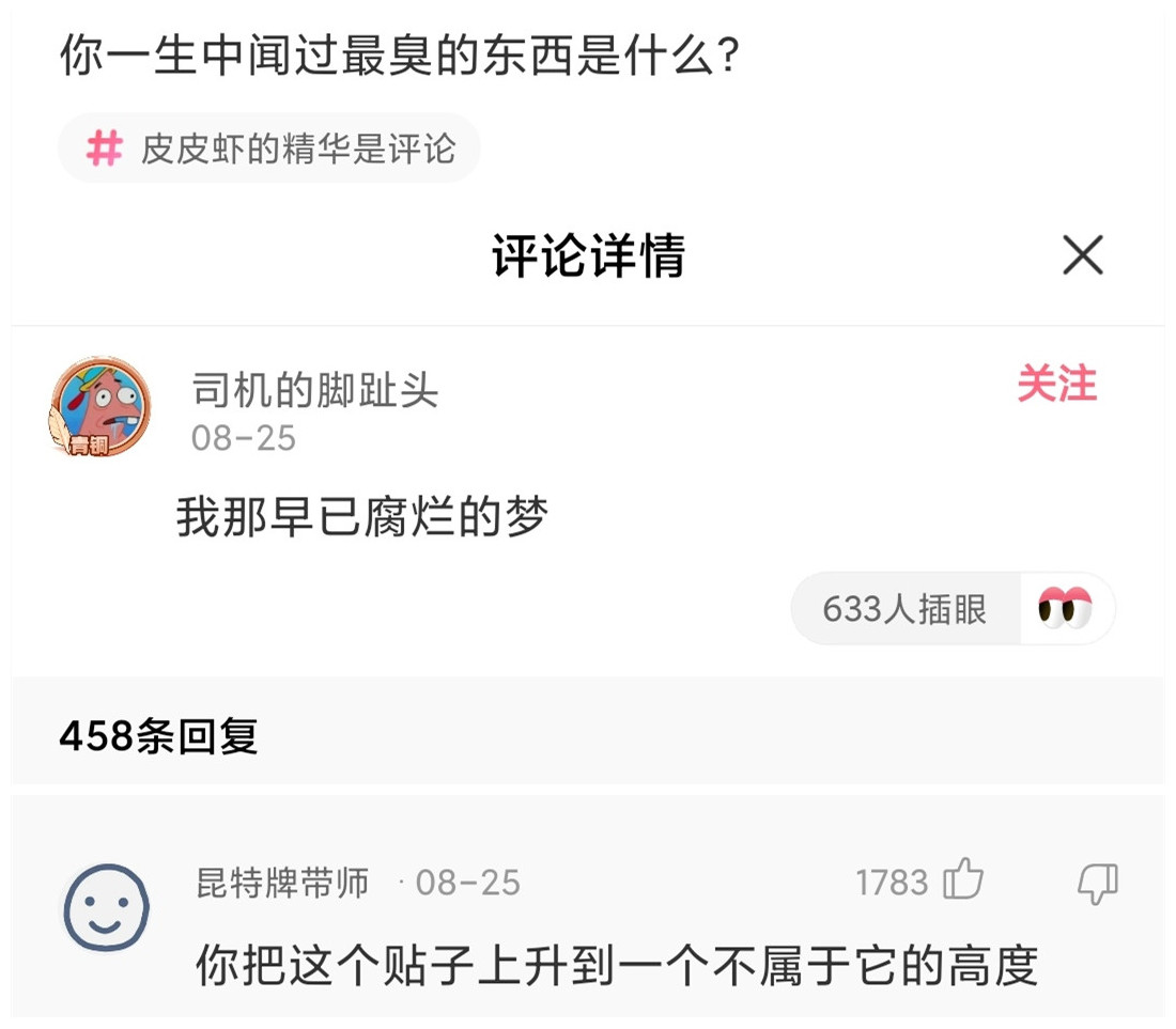
Q:你一生中聞過最臭的東西,是什么?
A:我那早已腐爛的夢。
兄弟萌!!!我又來了!
這次,我能自信的對大家說:我終於給大家帶了一個,能真正幫助大家解決諸多坑比場景的pub包!
將之前的flutter_smart_dialog,在保持api穩定的基礎上,進行了各種抓頭重構,解決了一系列問題
現在,我終於可以說:它現在是一個簡潔,強大,侵入性極低的pub包!
關於侵入性問題
- 之前為了解決返回關閉彈窗,使用了一個很不優雅的解決方法,導致侵入性有點高
- 這真是讓我如坐針氈,如芒刺背,如鯁在喉,這個問題終於搞定了!
同時,我在pub包內部設計了一個彈窗棧,能自動移除棧頂彈窗,也可以定點移除棧內標記的彈窗。
存在的問題
使用系統彈窗存在一系列坑,來和各位探討探討
-
必須傳BuildContext
- 在一些場景必須多做一些傳參工作,蛋痛但不難的問題
-
loading彈窗
- 使用系統彈窗做loading彈窗,肯定遇到過這個坑比問題
- loading封裝在網絡庫里面:請求網絡時加載loading,手賤按了返回按鈕,關閉了loading
- 然后請求結束后發現:特么我的頁面怎么被關了!!!
- 系統彈窗就是一個路由頁面,關閉系統就是用pop方法,這很容易誤關正常頁面
- 當然肯定有解決辦法,路由監聽的地方處理,此處就不細表了
- 使用系統彈窗做loading彈窗,肯定遇到過這個坑比問題
-
某頁面彈出了多個系統Dialog,很難定點關閉某個非棧頂彈窗
- 蛋蛋,這是路由入棧出棧機制導致的,理解的同時也一樣要吐槽
-
系統Dialog,點擊事件無法穿透暗色背景
- 這個坑比問題,我是真沒轍
相關思考
上面列舉了一些比較常見的問題,最嚴重的問題,應該就是loading的問題
-
loading是個超高頻使用的彈窗,關閉loading彈窗的方法,同時也能關閉正常使用的頁面,本身就是一個隱患
-
穿透dialog遮罩是個非常重要的功能,基於該功能,能夠在實際業務中,實現很多騷操作
-
既然在系統dialog難以解決各種痛點,加上系統dialog也是基於overlay去實現的,這樣的話,我們也可以去高度定制overlay!
這次,我要一次性幫各位解決:toast消息,loading彈窗,以及更強大的自定義dialog!
經過多個版本的迭代優化,我覺得我可以吹下牛了:SmartDialog替代Flutter自帶Dialog毫無壓力,甚至功能更加貼心,更加多樣性!
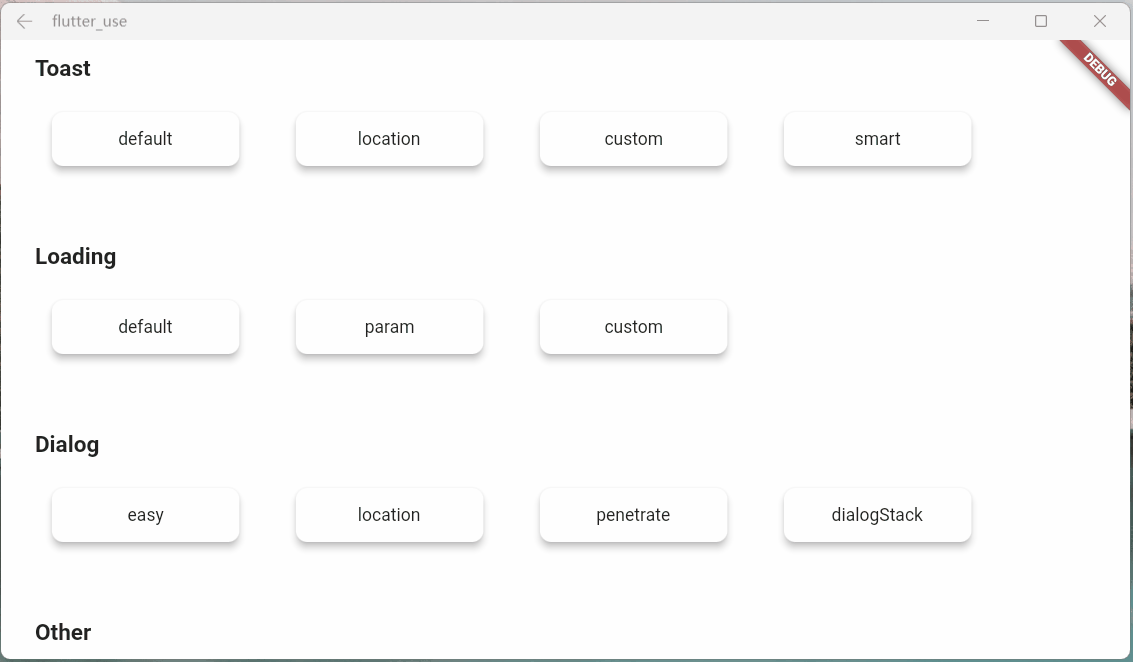
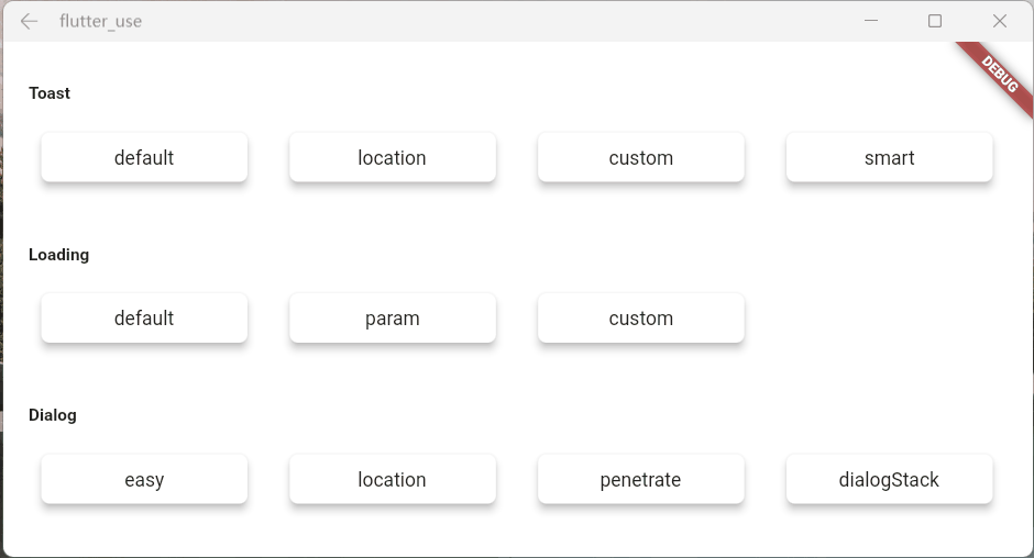
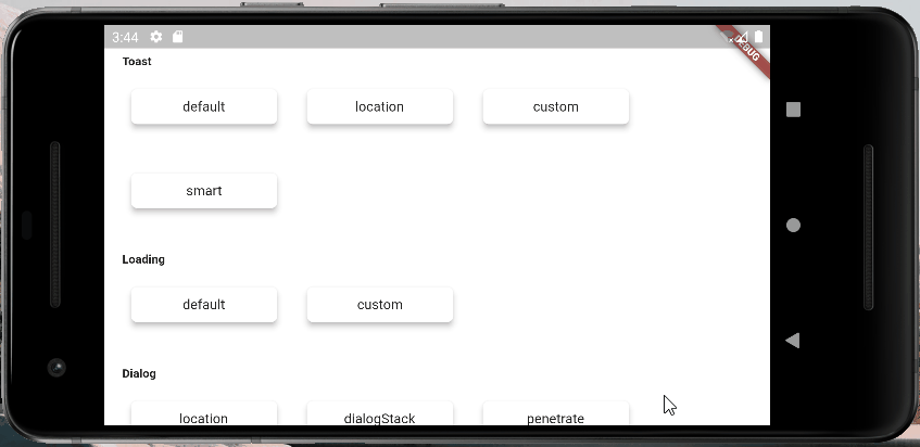
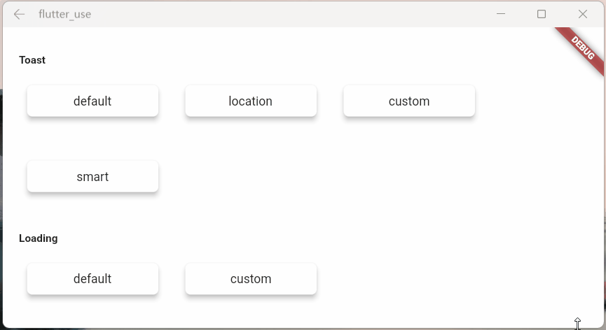
快速上手
初始化
- 引入(最新版本請點擊pub查看):pub,github,web effect
dependencies:
  flutter_smart_dialog: ^4.0.7
- 接入方式更加簡潔😊
void main() => runApp(MyApp());

class MyApp extends StatelessWidget {
  @override
  Widget build(BuildContext context) {
    return MaterialApp(
      home: HomePage,
      // here
      navigatorObservers: [FlutterSmartDialog.observer],
      // here
      builder: FlutterSmartDialog.init(),
    );
  }
}
高級初始化:配置全局自定義Loading和Toast
SmartDialog的showLoading和showToast內部提供了一個默認樣式,當然了,肯定支持自定義參數
- SmartDialog自定義Loading或Toast是非常簡單的:但是,使用的時候,可能會讓你覺得有一點麻煩
- 舉個例子
- 使用自定義Loading:
SmartDialog.showLoading(builder: (_) => CustomLoadingWidget); - 我們想要的使用效果,肯定是這樣的:
SmartDialog.showLoading();
- 使用自定義Loading:
- 針對上面的考慮,我在入口處增加了,可設置自定義默認Loading和Toast樣式的功能
下面向大家演示下
- 入口處需要配置下:實現toastBuilder和loadingBuilder,並傳入自定義Toast和Loading控件
- builder回調的參數,是showToast和showLoading處傳過來的,大家可用可不用,並沒有什么強制性
- 但是我覺得toast樣式的msg參數,大家肯定都會用。。。
void main() => runApp(MyApp());

class MyApp extends StatelessWidget {
  @override
  Widget build(BuildContext context) {
    return MaterialApp(
      home: HomePage,
      // here
      navigatorObservers: [FlutterSmartDialog.observer],
      // here
      builder: FlutterSmartDialog.init(
        //default toast widget
        toastBuilder: (String msg) => CustomToastWidget(msg: msg),
        //default loading widget
        loadingBuilder: (String msg) => CustomLoadingWidget(msg: msg),
      ),
    );
  }
}
極簡使用
- toast使用💬
SmartDialog.showToast('test toast');
- loading使用⏳
SmartDialog.showLoading();
await Future.delayed(Duration(seconds: 2));
SmartDialog.dismiss();
- dialog使用🎨
SmartDialog.show(builder: (context) {
  return Container(
    height: 80,
    width: 180,
    decoration: BoxDecoration(
      color: Colors.black,
      borderRadius: BorderRadius.circular(10),
    ),
    alignment: Alignment.center,
    child:
    Text('easy custom dialog', style: TextStyle(color: Colors.white)),
  );
});
OK,上面展示了,只需要極少的代碼,就可以調用相應的功能
當然,內部還有不少地方做了特殊優化,后面,我會詳細的向大家描述下
你可能會有的疑問
初始化框架的時候,相比以前,居然讓大家多寫了一個參數(不設置自定義默認toast和loading樣式的情況下),內心十分愧疚😩
關閉頁面本質上是一個比較復雜的情況,涉及到
- 物理返回按鍵
- AppBar的back按鈕
- 手動pop
為了監控這些情況,不得已增加了一個路由監控參數
實體返回鍵
對返回按鈕的監控,是非常重要的,基本能覆蓋大多數情況
pop路由
雖然對返回按鈕的監控能覆蓋大多數場景,但是一些手動pop的場景就需要新增參數監控
- 不加
FlutterSmartDialog.observer- 如果打開了穿透參數(就可以和彈窗后的頁面交互),然后手動關閉頁面
- 就會出現這種很尷尬的情況

- 加了
FlutterSmartDialog.observer,就能比較合理的處理了- 當然,這里的過渡動畫,也提供了參數控制是否開啟 😉
關於 FlutterSmartDialog.init()
本方法不會占用你的builder參數,init內部回調出來了builder,你可以大膽放心的繼續套
- 例如:繼續套Bloc全局實例😄
class MyApp extends StatelessWidget {
  @override
  Widget build(BuildContext context) {
    return MaterialApp(
      home: HomePage,
      navigatorObservers: [FlutterSmartDialog.observer],
      builder: FlutterSmartDialog.init(builder: _builder),
    );
  }
}

Widget _builder(BuildContext context, Widget? child) {
  return MultiBlocProvider(
    providers: [
      BlocProvider.value(value: BlocSpanOneCubit()),
    ],
    child: child!,
  );
}
超實用的參數:backDismiss
- 這個參數是默認設置為true,返回的時候會默認關閉彈窗;如果設置為false,將不會關閉頁面
- 這樣就可以十分輕松的做一個緊急彈窗,禁止用戶的下一步操作
- 我們來看一個場景:假定某開源作者決定棄坑軟件,不允許用戶再使用該軟件的彈窗
SmartDialog.show(
  backDismiss: false,
  clickMaskDismiss: false,
  builder: (_) {
    return Container(
      height: 480,
      width: 500,
      padding: EdgeInsets.all(20),
      decoration: BoxDecoration(
        borderRadius: BorderRadius.circular(20),
        color: Colors.white,
      ),
      alignment: Alignment.topCenter,
      child: SingleChildScrollView(
        child: Wrap(
          direction: Axis.vertical,
          crossAxisAlignment: WrapCrossAlignment.center,
          spacing: 10,
          children: [
            // title
            Text(
              '特大公告',
              style: TextStyle(fontSize: 30, fontWeight: FontWeight.bold),
            ),
            // content
            Text('鄙人日夜鑽研下面秘籍,終於成功釣到富婆'),
            Image.network(
              'https://cdn.jsdelivr.net/gh/xdd666t/MyData@master/pic/flutter/blog/20211102213746.jpeg',
              height: 200,
              width: 400,
            ),
            Text('鄙人思考了三秒鍾,懷着\'沉重\'的心情,決定棄坑本開源軟件'),
            Text('本人今后的生活是富婆和遠方,已無\'精力\' 再維護本開源軟件了'),
            Text('各位叼毛,有緣江湖再見!'),
            // button (only method of close the dialog)
            ElevatedButton(
              onPressed: () => SmartDialog.dismiss(),
              child: Text('再會!'),
            )
          ],
        ),
      ),
    );
  },
);

從上面的效果圖可以看出來
- 點擊遮罩,無法關閉彈窗
- 點擊返回按鈕無法關閉彈窗
- 只能點我們自己的按鈕,才能關閉彈窗,點擊按鈕的邏輯可以直接寫成關閉app之類
只需要倆個簡單的參數設置,就能實現這樣一個很棒的應急彈窗
設置全局參數
SmartDialog的全局參數都有着一個比較合理的默認值
為了應付多變的場景,你可以修改符合你自己要求的全局參數
- 設置符合你的要求的數據,放在app入口就行初始化就行
- 注:如果沒有特殊要求,可以不用初始化全局參數(內部皆有默認值)
SmartDialog.config
  ..custom = SmartConfigCustom()
  ..attach = SmartConfigAttach()
  ..loading = SmartConfigLoading()
  ..toast = SmartConfigToast();
- 代碼的注釋寫的很完善,某個參數不明白的,點進去看看就行了
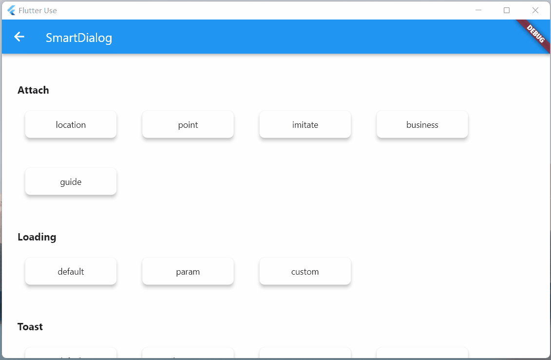
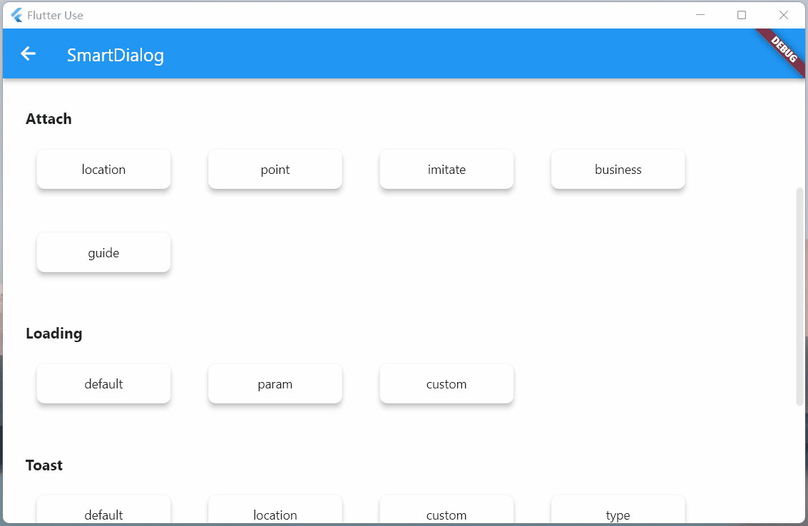
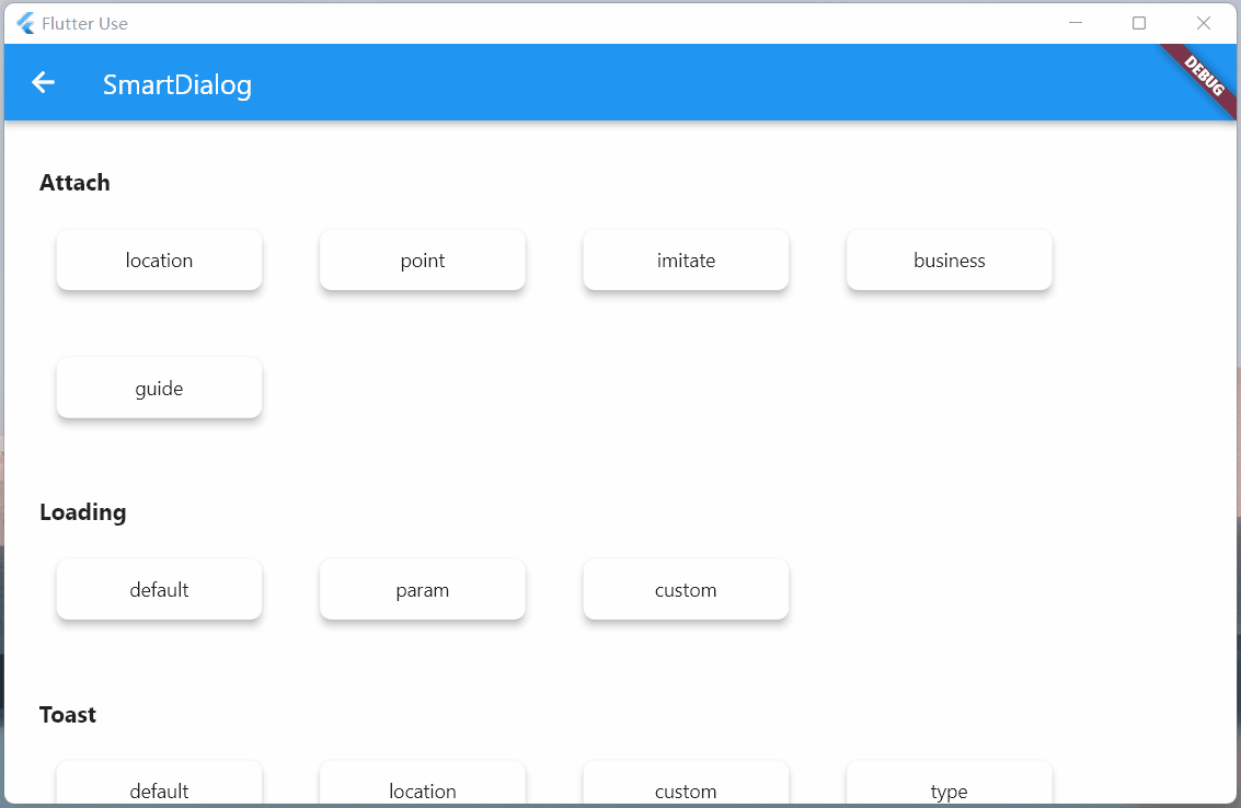
Attach篇
這是一個很重要的功能,本來早就想加進去了,但是比較忙,一直擱置了;元旦(2022.1.1)開了頭,就花了一些時間,完成了這個功能和相關demo
定位
定位目標widget的坐標,這個做起來並不難;但是必須要拿到我們傳入的自定義widget大小,這樣才能將自定義widget疊放到一個比較合適的位置(通過一些計算,獲取中心點)
- 實際上Flutter提供一個非常合適的組件
CustomSingleChildLayout,這個組件還提供偏移坐標功能,按理來說非常合適 - 但是,
CustomSingleChildLayout和SizeTransition動畫控件,存在占位面積沖突,只能使用AnimatedOpacity漸隱動畫 - 位移動畫不能用,這我沒法忍,拋棄
CustomSingleChildLayout;使用了各種騷操作,終於拿到自定義widget的大小,比較完美實現了效果
定位dialog,使用showAttach方法,參數注釋寫的相當詳細,不明白用法的看看注釋就行了
強大的定位功能
- 必須傳目標widget的BuildContext,需要通過它計算出目標widget的坐標和大小
void _attachLocation() {
  attachDialog(BuildContext context, AlignmentGeometry alignment) async {
    SmartDialog.showAttach(
      targetContext: context,
      usePenetrate: true,
      alignment: alignment,
      clickMaskDismiss: false,
      builder: (_) => Container(width: 100, height: 100, color: randomColor()),
    );
    await Future.delayed(Duration(milliseconds: 350));
  }

  //target widget
  List<BuildContext> contextList = [];
  List<Future Function()> funList = [
    () async => await attachDialog(contextList[0], Alignment.topLeft),
    () async => await attachDialog(contextList[1], Alignment.topCenter),
    () async => await attachDialog(contextList[2], Alignment.topRight),
    () async => await attachDialog(contextList[3], Alignment.centerLeft),
    () async => await attachDialog(contextList[4], Alignment.center),
    () async => await attachDialog(contextList[5], Alignment.centerRight),
    () async => await attachDialog(contextList[6], Alignment.bottomLeft),
    () async => await attachDialog(contextList[7], Alignment.bottomCenter),
    () async => await attachDialog(contextList[8], Alignment.bottomRight),
  ];
  btn({
    required String title,
    required Function(BuildContext context) onTap,
  }) {
    return Container(
      margin: EdgeInsets.all(25),
      child: Builder(builder: (context) {
        Color? color = title.contains('all') ? randomColor() : null;
        contextList.add(context);
        return Container(
          width: 130,
          child: ElevatedButton(
            style: ButtonStyle(
              backgroundColor: ButtonStyleButton.allOrNull<Color>(color),
            ),
            onPressed: () => onTap(context),
            child: Text('$title'),
          ),
        );
      }),
    );
  }

  SmartDialog.show(builder: (_) {
    return Container(
      width: 700,
      padding: EdgeInsets.all(50),
      decoration: BoxDecoration(
        borderRadius: BorderRadius.circular(20),
        color: Colors.white,
      ),
      child: SingleChildScrollView(
        child: Wrap(alignment: WrapAlignment.spaceEvenly, children: [
          btn(title: 'topLeft', onTap: (context) => funList[0]()),
          btn(title: 'topCenter', onTap: (context) => funList[1]()),
          btn(title: 'topRight', onTap: (context) => funList[2]()),
          btn(title: 'centerLeft', onTap: (context) => funList[3]()),
          btn(title: 'center', onTap: (context) => funList[4]()),
          btn(title: 'centerRight', onTap: (context) => funList[5]()),
          btn(title: 'bottomLeft', onTap: (context) => funList[6]()),
          btn(title: 'bottomCenter', onTap: (context) => funList[7]()),
          btn(title: 'bottomRight', onTap: (context) => funList[8]()),
          btn(
            title: 'allOpen',
            onTap: (_) async {
              for (var item in funList) await item();
            },
          ),
          btn(
            title: 'allClose',
            onTap: (_) => SmartDialog.dismiss(status: SmartStatus.allAttach),
          ),
        ]),
      ),
    );
  });
}
動畫效果和show方法幾乎是一致的,為了這個一致的體驗,內部做了相當多的針對性優化
自定義坐標點
- 大多數情況基本都是使用targetContext
SmartDialog.showAttach(
  targetContext: context,
  builder: (_) => Container(width: 100, height: 100, color: Colors.red),
);
- 當然還有少數情況,需要使用自定義坐標,此處也提供targetBuilder參數:設置了targetBuilder參數,targetContext將自動失效
- targetContext 是十分常見的場景,所以,這邊設置為必傳參數
- targetBuilder中的回調參數也是通過targetContext計算得來的
- 在一些特殊情況,targetContext可知設置為空,targetBuilder中的回調參數默認賦值為zero
SmartDialog.showAttach(
  targetContext: context,
  target: Offset(100, 100);,
  builder: (_) => Container(width: 100, height: 100, color: Colors.red),
);
- 看來下自定義坐標點效果
void _attachPoint() async {
  targetDialog(Offset offset) {
    var random = Random().nextInt(100) % 5;
    var alignment = Alignment.topCenter;
    if (random == 0) alignment = Alignment.topCenter;
    if (random == 1) alignment = Alignment.centerLeft;
    if (random == 2) alignment = Alignment.center;
    if (random == 3) alignment = Alignment.centerRight;
    if (random == 4) alignment = Alignment.bottomCenter;
    SmartDialog.showAttach(
      targetContext: null,
      targetBuilder: (_, __) => offset,
      usePenetrate: true,
      clickMaskDismiss: false,
      alignment: alignment,
      keepSingle: true,
      builder: (_) {
        return ClipRRect(
          borderRadius: BorderRadius.circular(10),
          child: Container(width: 100, height: 100, color: randomColor()),
        );
      },
    );
  }

  SmartDialog.show(builder: (_) {
    return Container(
      width: 600,
      height: 400,
      alignment: Alignment.center,
      decoration: BoxDecoration(
        borderRadius: BorderRadius.circular(20),
        color: Colors.white,
      ),
      child: GestureDetector(
        onTapDown: (detail) => targetDialog(detail.globalPosition),
        child: Container(
          width: 500,
          height: 300,
          color: Colors.grey,
          alignment: Alignment.center,
          child: Text('click me', style: TextStyle(color: Colors.white)),
        ),
      ),
    );
  });
}
targetBuilder是個十分強大的參數,將其和scalePointBuilder參數配合,能做出很多非常有意思的氣泡類彈窗
模仿DropdownButton
- 實際上模仿DropdownButton挺不容易的
- 首先要計算DropdownButton控件的位置,在其位置上顯示點擊后的折疊控件
- 需要處理DropdownButton之外區域的點擊事件(點擊區域外關閉DropdownButton)
- 還需要監聽返回事件,手動pop路由事件;是這類事件的,需要關閉DropdownButton
- 這玩意要自定義,挺讓人頭大的;但是,現在你可以使用
SmartDialog.showAttach輕松模仿一個,上述需要注意的事項都幫你處理好了
void _attachImitate() {
  //模仿DropdownButton
  imitateDialog(BuildContext context) {
    var list = ['小呆呆', '小菲菲', '小豬豬'];
    SmartDialog.showAttach(
      targetContext: context,
      usePenetrate: true,
      builder: (_) {
        return Container(
          margin: EdgeInsets.all(10),
          decoration: BoxDecoration(boxShadow: [
            BoxShadow(color: Colors.black12, blurRadius: 8, spreadRadius: 0.2)
          ]),
          child: Column(
            children: List.generate(list.length, (index) {
              return Material(
                color: Colors.white,
                child: InkWell(
                  onTap: () => SmartDialog.dismiss(),
                  child: Container(
                    height: 50,
                    width: 100,
                    alignment: Alignment.center,
                    child: Text('${list[index]}'),
                  ),
                ),
              );
            }),
          ),
        );
      },
    );
  }

  //imitate widget
  dropdownButton({String title = 'Dropdown'}) {
    return DropdownButton<String>(
      value: '1',
      items: [
        DropdownMenuItem(value: '1', child: Text('$title:小呆呆')),
        DropdownMenuItem(value: '2', child: Text('小菲菲')),
        DropdownMenuItem(value: '3', child: Text('小豬豬'))
      ],
      onChanged: (value) {},
    );
  }

  imitateDropdownButton() {
    return Builder(builder: (context) {
      return Stack(children: [
        dropdownButton(title: 'Attach'),
        InkWell(
          onTap: () => imitateDialog(context),
          child: Container(height: 50, width: 140, color: Colors.transparent),
        )
      ]);
    });
  }

  SmartDialog.show(builder: (_) {
    return Container(
      width: 600,
      height: 400,
      alignment: Alignment.center,
      margin: EdgeInsets.all(20),
      decoration: BoxDecoration(
        borderRadius: BorderRadius.circular(20),
        color: Colors.white,
      ),
      child: MaterialApp(
        debugShowCheckedModeBanner: false,
        home: Container(
          padding: EdgeInsets.symmetric(horizontal: 100),
          child: Row(
            mainAxisAlignment: MainAxisAlignment.spaceBetween,
            children: [dropdownButton(), imitateDropdownButton()],
          ),
        ),
      ),
    );
  });
}

高亮
這次把遮罩特定區域高亮的功能加上了,這是一個非常實用的功能!
- 你只需要設置
highlightBuilder參數即可 - 定義高亮的區域,他必須是個不通透的Widget,例如是Contaienr,必須設置一個顏色(色值無要求)
- 使用各種奇形怪狀的圖片也行,這樣就能顯示各種復雜圖形的高亮區域
highlightBuilder返回類型是Positioned,你可以在屏幕上定位任何需要高亮的區域- 你可以通過
highlightBuilder回調的參數,快捷的獲取目標widget的坐標和大小
SmartDialog.showAttach(
  targetContext: context,
  alignment: Alignment.bottomCenter,
  highlightBuilder: (Offset targetOffset, Size targetSize) {
    return Positioned(
      top: targetOffset.dy - 10,
      left: targetOffset.dx - 10,
      child: Container(
        height: targetSize.height + 20,
        width: targetSize.width + 20,
        color: Colors.white,
      ),
    );
  },
  builder: (_) => Container(width: 100, height: 100, color: Colors.red),
)
實際的業務場景
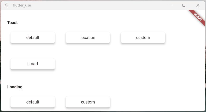
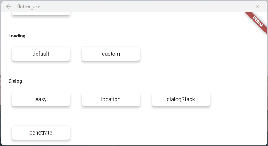
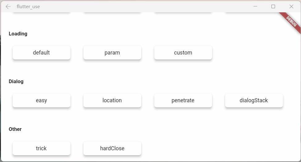
- 這邊舉倆個常見的例子,代碼有一點點多,就不貼了,感興趣的請查看:flutter_use
上面倆個業務場景非常常見,有時候,我們需要目標widget上面或下面或特定的區域,不被遮罩覆蓋
自己去做的話,可以做出來,但是會很麻煩;現在你可以使用showAttach中的highlightBuilder參數輕松實現這個需求
引導操作
引導操作在app上還是非常常見的,需要指定區域高亮,然后介紹其功能
- 使用
showAttach中的highlightBuilder參數,也可以輕松實現這個需求,來看下效果- 代碼同樣有一點點多,感興趣的請查看:flutter_use
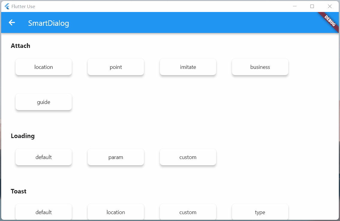
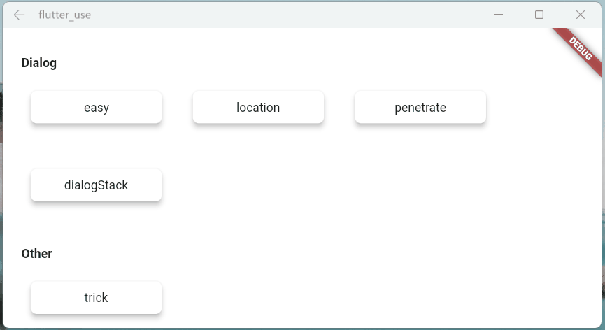
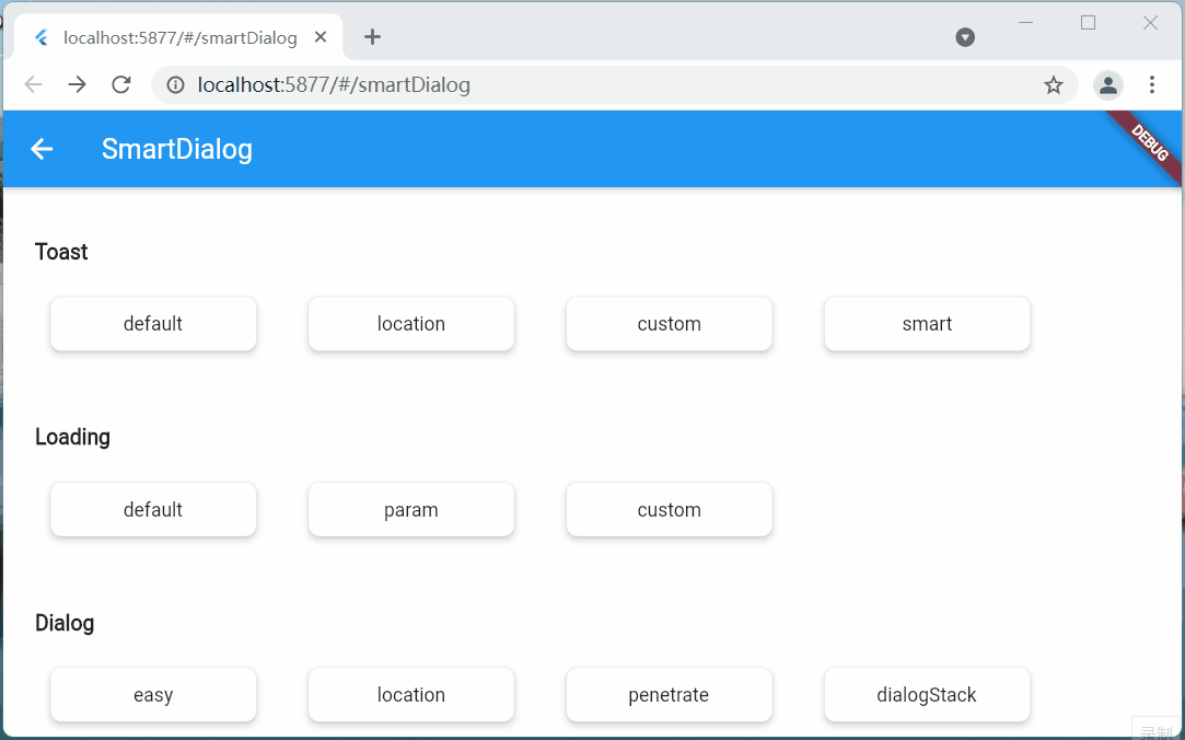
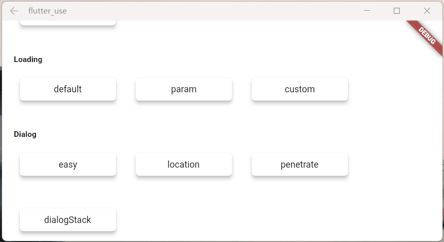
Dialog篇
花里胡哨
彈窗從不同位置彈出,動畫是有區別的
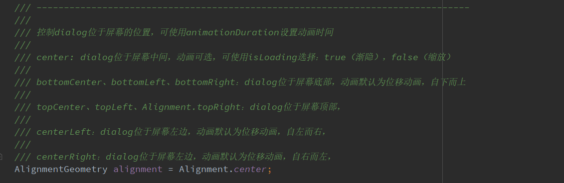
- alignment:該參數設置不同,動畫效果會有所區別
void _dialogLocation() async {
  locationDialog({
    required AlignmentGeometry alignment,
    double width = double.infinity,
    double height = double.infinity,
  }) async {
    SmartDialog.show(
      alignment: alignment,
      builder: (_) => Container(width: width, height: height, color: randomColor()),
    );
    await Future.delayed(Duration(milliseconds: 500));
  }

  //left
  await locationDialog(width: 70, alignment: Alignment.centerLeft);
  //top
  await locationDialog(height: 70, alignment: Alignment.topCenter);
  //right
  await locationDialog(width: 70, alignment: Alignment.centerRight);
  //bottom
  await locationDialog(height: 70, alignment: Alignment.bottomCenter);
  //center
  await locationDialog(height: 100, width: 100, alignment: Alignment.center);
}
- usePenetrate:交互事件穿透遮罩
SmartDialog.show(
  alignment: Alignment.centerRight,
  usePenetrate: true,
  clickMaskDismiss: false,
  builder: (_) {
    return Container(
      width: 80,
      height: double.infinity,
      color: randomColor(),
    );
  },
);

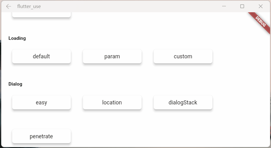
dialog棧
- 這是一個強大且實用的功能:可以很輕松的定點關閉某個彈窗
void _dialogStack() async {
  stackDialog({
    required AlignmentGeometry alignment,
    required String tag,
    double width = double.infinity,
    double height = double.infinity,
  }) async {
    SmartDialog.show(
      tag: tag,
      alignment: alignment,
      builder: (_) {
        return Container(
          width: width,
          height: height,
          color: randomColor(),
          alignment: Alignment.center,
          child: Text('dialog $tag', style: TextStyle(color: Colors.white)),
        );
      },
    );
    await Future.delayed(Duration(milliseconds: 500));
  }

  //left
  await stackDialog(tag: 'A', width: 70, alignment: Alignment.centerLeft);
  //top
  await stackDialog(tag: 'B', height: 70, alignment: Alignment.topCenter);
  //right
  await stackDialog(tag: 'C', width: 70, alignment: Alignment.centerRight);
  //bottom
  await stackDialog(tag: 'D', height: 70, alignment: Alignment.bottomCenter);

  //center:the stack handler
  SmartDialog.show(
    alignment: Alignment.center,
    builder: (_) {
      return Container(
        decoration: BoxDecoration(
          color: Colors.white,
          borderRadius: BorderRadius.circular(15),
        ),
        padding: EdgeInsets.symmetric(horizontal: 30, vertical: 20),
        child: Wrap(spacing: 20, children: [
          ElevatedButton(
            child: Text('close dialog A'),
            onPressed: () => SmartDialog.dismiss(tag: 'A'),
          ),
          ElevatedButton(
            child: Text('close dialog B'),
            onPressed: () => SmartDialog.dismiss(tag: 'B'),
          ),
          ElevatedButton(
            child: Text('close dialog C'),
            onPressed: () => SmartDialog.dismiss(tag: 'C'),
          ),
          ElevatedButton(
            child: Text('close dialog D'),
            onPressed: () => SmartDialog.dismiss(tag: 'D'),
          ),
        ]),
      );
    },
  );
}
Loading篇
避坑指南
- 開啟loading后,可以使用以下方式關閉
- SmartDialog.dismiss():可以關閉loading和dialog
- status設置為SmartStatus.loading:僅僅關閉loading
// easy close
SmartDialog.dismiss();
// exact close
SmartDialog.dismiss(status: SmartStatus.loading);
- 一般來說,loading彈窗是封裝在網絡庫里面的,隨着請求狀態的自動開啟和關閉
- 基於這種場景,我建議:使用dismiss時,加上status參數,將其設置為:SmartStatus.loading
- 坑比場景
- 網絡請求加載的時候,loading也隨之打開,這時很容易誤觸返回按鈕,關閉loading
- 當網絡請求結束時,會自動調用dismiss方法
- 因為loading已被關閉,假設此時頁面又有SmartDialog的彈窗,未設置status的dismiss就會關閉SmartDialog的彈窗
- 當然,這種情況很容易解決,封裝進網絡庫的loading,使用:
SmartDialog.dismiss(status: SmartStatus.loading);關閉就行了
status參數,是為了精確關閉對應類型彈窗而設計的參數,在一些特殊場景能起到巨大的作用- 如果大家理解這個參數的含義,那對於何時添加
status參數,必能胸有成竹
- 如果大家理解這個參數的含義,那對於何時添加
參數說明
參數在注釋里面寫的十分詳細,就不贅述了,來看看效果
- maskWidget:強大的遮罩自定義功能😆,發揮你的腦洞吧。。。
var maskWidget = Container(
  width: double.infinity,
  height: double.infinity,
  child: Opacity(
    opacity: 0.6,
    child: Image.network(
      'https://cdn.jsdelivr.net/gh/xdd666t/MyData@master/pic/flutter/blog/20211101103911.jpeg',
      fit: BoxFit.fill,
    ),
  ),
);
SmartDialog.showLoading(maskWidget: maskWidget);
- maskColor:支持快捷自定義遮罩顏色
SmartDialog.showLoading(maskColor: randomColor().withOpacity(0.3));

/// random color
Color randomColor() => Color.fromRGBO(Random().nextInt(256), Random().nextInt(256), Random().nextInt(256), 1);

- animationType:動畫效果切換
SmartDialog.showLoading(animationType: SmartAnimationType.scale);
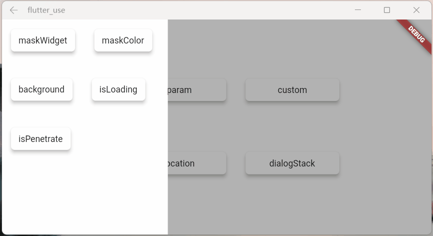
- usePenetrate:交互事件可以穿透遮罩,這是個十分有用的功能,對於一些特殊的需求場景十分關鍵
SmartDialog.showLoading(usePenetrate: true);

自定義Loading
使用showLoading可以輕松的自定義出強大的loading彈窗;鄙人腦洞有限,就簡單演示下
自定義一個loading布局
class CustomLoading extends StatefulWidget {
const CustomLoading({Key? key, this.type = 0}) : super(key: key);
final int type;
@override
_CustomLoadingState createState() => _CustomLoadingState();
}
class _CustomLoadingState extends State<CustomLoading>
with TickerProviderStateMixin {
late AnimationController _controller;
@override
void initState() {
_controller = AnimationController(
duration: const Duration(milliseconds: 800),
vsync: this,
);
_controller.forward();
_controller.addStatusListener((status) {
if (status == AnimationStatus.completed) {
_controller.reset();
_controller.forward();
}
});
super.initState();
}
@override
Widget build(BuildContext context) {
return Stack(children: [
// smile
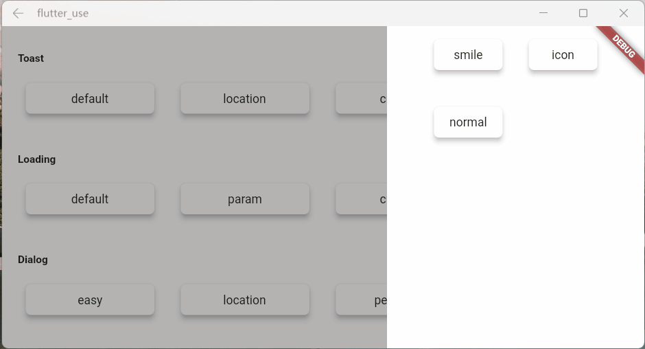
Visibility(visible: widget.type == 0, child: _buildLoadingOne()),
// icon
Visibility(visible: widget.type == 1, child: _buildLoadingTwo()),
// normal
Visibility(visible: widget.type == 2, child: _buildLoadingThree()),
]);
}
Widget _buildLoadingOne() {
return Stack(alignment: Alignment.center, children: [
RotationTransition(
alignment: Alignment.center,
turns: _controller,
child: Image.network(
'https://cdn.jsdelivr.net/gh/xdd666t/MyData@master/pic/flutter/blog/20211101174606.png',
height: 110,
width: 110,
),
),
Image.network(
'https://cdn.jsdelivr.net/gh/xdd666t/MyData@master/pic/flutter/blog/20211101181404.png',
height: 60,
width: 60,
),
]);
}
Widget _buildLoadingTwo() {
return Stack(alignment: Alignment.center, children: [
Image.network(
'https://cdn.jsdelivr.net/gh/xdd666t/MyData@master/pic/flutter/blog/20211101162946.png',
height: 50,
width: 50,
),
RotationTransition(
alignment: Alignment.center,
turns: _controller,
child: Image.network(
'https://cdn.jsdelivr.net/gh/xdd666t/MyData@master/pic/flutter/blog/20211101173708.png',
height: 80,
width: 80,
),
),
]);
}
Widget _buildLoadingThree() {
return Center(
child: Container(
height: 120,
width: 180,
decoration: BoxDecoration(
color: Colors.white,
borderRadius: BorderRadius.circular(15),
),
alignment: Alignment.center,
child: Column(mainAxisSize: MainAxisSize.min, children: [
RotationTransition(
alignment: Alignment.center,
turns: _controller,
child: Image.network(
'https://cdn.jsdelivr.net/gh/xdd666t/MyData@master/pic/flutter/blog/20211101163010.png',
height: 50,
width: 50,
),
),
Container(
margin: EdgeInsets.only(top: 20),
child: Text('loading...'),
),
]),
),
);
}
@override
void dispose() {
_controller.dispose();
super.dispose();
}
}
來看看效果
- 效果一
SmartDialog.showLoading(
  animationType: SmartAnimationType.scale,
  builder: (_) => CustomLoading(),
);
await Future.delayed(Duration(seconds: 2));
SmartDialog.dismiss();
- 效果二
SmartDialog.showLoading(
  animationType: SmartAnimationType.scale,
  builder: (_) => CustomLoading(type: 1),
);
await Future.delayed(Duration(seconds: 2));
SmartDialog.dismiss();
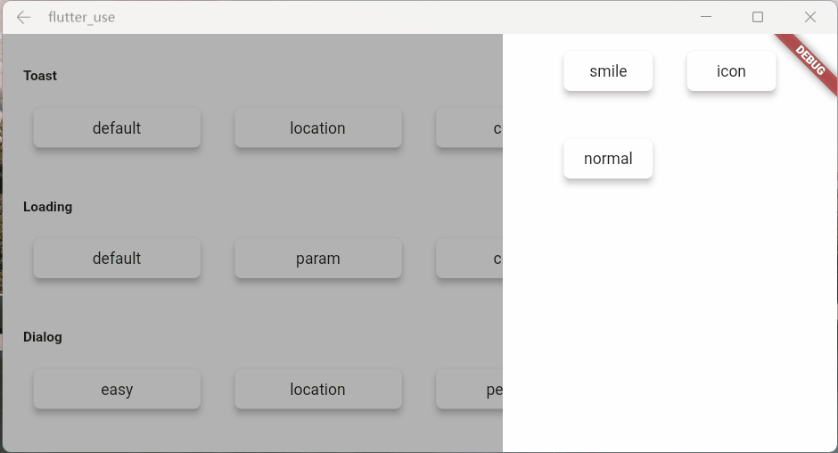
- 效果三
SmartDialog.showLoading(builder: (_) => CustomLoading(type: 2));
await Future.delayed(Duration(seconds: 2));
SmartDialog.dismiss();
Toast篇
toast的特殊性
嚴格來說,toast是一個非常特殊的彈窗,我覺得理應具備下述的特征
toast消息理應一個個展示,后續消息不應該頂掉前面的toast
- 這是一個坑點,如果框架內部不做處理,很容易出現后面toast會直接頂掉前面toast的情況
- 當然,內部提供了type參數,你可以選擇你想要的顯示邏輯

展示在頁面最上層,不應該被一些彈窗之類遮擋
- 可以發現loading和dialog的遮罩等布局,均未遮擋toast信息

對鍵盤遮擋情況做處理
- 鍵盤這玩意有點坑,會直接遮擋所有布局,只能曲線救國
- 在這里做了一個特殊處理,當喚起鍵盤的時候,toast自己會動態的調整自己和屏幕底部的距離
- 這樣就能起到一個,鍵盤不會遮擋toast的效果
自定義Toast
參數說明
toast的一些參數並未向外暴露,僅僅暴露了msg
- 例如:toast字體大小,字體顏色,toast的背景色等等之類,都沒提供參數
- 一是覺得提供了這些參數,會讓整體參數輸入變的非常多,亂花漸入迷人眼
- 二是覺得就算我提供了很多參數,也不一定會滿足那些奇奇怪怪的審美和需求
- 基於上述的考慮,我直接提供了大量的底層參數
- 你可以隨心所欲的定制toast
- 注意喔,不僅僅可以定制toast,例如:成功提示,失敗提示,警告提示等等
- Toast做了很多的優化,
displayType參數,讓你能擁有多種顯示邏輯,發揮你的想象力吧
- 注意:使用了
builder參數,msg參數會失效
- 你可以隨心所欲的定制toast
更強大的自定義toast
- 首先,整一個自定義toast
class CustomToast extends StatelessWidget {
  const CustomToast(this.msg, {Key? key}) : super(key: key);

  final String msg;

  @override
  Widget build(BuildContext context) {
    return Align(
      alignment: Alignment.bottomCenter,
      child: Container(
        margin: EdgeInsets.only(bottom: 30),
        padding: EdgeInsets.symmetric(horizontal: 20, vertical: 7),
        decoration: BoxDecoration(
          color: _randomColor(),
          borderRadius: BorderRadius.circular(100),
        ),
        child: Row(mainAxisSize: MainAxisSize.min, children: [
          //icon
          Container(
            margin: EdgeInsets.only(right: 15),
            child: Icon(Icons.add_moderator, color: _randomColor()),
          ),

          //msg
          Text('$msg', style: TextStyle(color: Colors.white)),
        ]),
      ),
    );
  }

  Color _randomColor() {
    return Color.fromRGBO(
      Random().nextInt(256),
      Random().nextInt(256),
      Random().nextInt(256),
      1,
    );
  }
}
- 使用
SmartDialog.showToast('', builder: (_) => CustomToast('custom toast'));
- 效果
騷氣的小技巧
有一種場景比較蛋筒
- 我們使用StatefulWidget封裝了一個小組件
- 在某個特殊的情況,我們需要在這個組件外部,去觸發這個組件內部的一個方法
- 對於這種場景,有不少實現方法,但是弄起來可能有點麻煩
這里提供一個簡單的小思路,可以非常輕松的觸發,組件內部的某個方法
- 建立一個小組件
class OtherTrick extends StatefulWidget {
  const OtherTrick({Key? key, this.onUpdate}) : super(key: key);

  final Function(VoidCallback onInvoke)? onUpdate;

  @override
  _OtherTrickState createState() => _OtherTrickState();
}

class _OtherTrickState extends State<OtherTrick> {
  int _count = 0;

  @override
  void initState() {
    // here
    widget.onUpdate?.call(() {
      _count++;
      setState(() {});
    });

    super.initState();
  }

  @override
  Widget build(BuildContext context) {
    return Center(
      child: Container(
        padding: EdgeInsets.symmetric(horizontal: 50, vertical: 20),
        decoration: BoxDecoration(
          color: Colors.white,
          borderRadius: BorderRadius.circular(10),
        ),
        child: Text('Counter: $_count ', style: TextStyle(fontSize: 30.0)),
      ),
    );
  }
}
- 展示這個組件,然后外部觸發它
void _otherTrick() async {
  VoidCallback? callback;

  // display
  SmartDialog.show(
    alignment: Alignment.center,
    builder: (_) =>
    OtherTrick(onUpdate: (VoidCallback onInvoke) => callback = onInvoke),
  );

  await Future.delayed(const Duration(milliseconds: 500));

  // handler
  SmartDialog.show(
    alignment: Alignment.centerRight,
    maskColor: Colors.transparent,
    builder: (_) {
      return Container(
        height: double.infinity,
        width: 150,
        color: Colors.white,
        alignment: Alignment.center,
        child: ElevatedButton(
          child: const Text('add'),
          onPressed: () => callback?.call(),
        ),
      );
    },
  );
}
- 來看下效果
最后
相關地址
- github:flutter_smart_dialog
- 文中demo地址:flutter_use
- demo演示效果:在線體驗
哎,人總是在不斷的迷茫中前行。。。