from matplotlib import pyplot as plt
plt.rcParams['font.family'] = 'Noto Sans CJK JP'
plt.rcParams['axes.unicode_minus'] = False
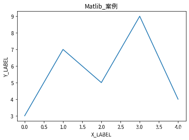
plt.figure()
plt.subplot(1,1,1)
x=[0,1,2,3,4]
y=[3,7,5,9,4]
plt.ylabel('Y_LABEL')
plt.xlabel('X_LABEL')
plt.title('Matlib_案例')
plt.plot(x,y)
plt.show()
[/code]
```code
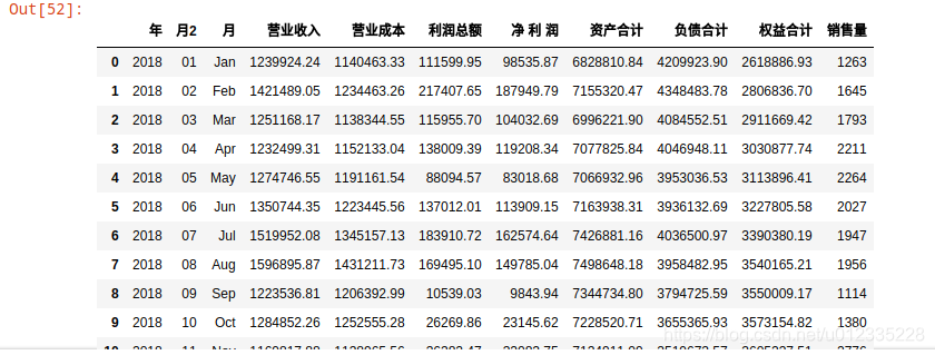
import pandas as pd
df1 = pd.read_excel(r'./fin_databak.xlsx',sheet_name=0,converters={'年':str,'公司':str})
monthdict={'Jan':'01','Feb':'02','Mar':'03','Apr':'04','May':'05','Jun':'06','Jul':'07','Aug':'08','Sep':'09','Oct':'10','Nov':'11','Dec':'12'}
df1 = df1.drop('月2',axis=1,errors='ignore')
df1.insert(2,'月2',value=df1['月'].map(lambda x:monthdict[x]))
df2 = df1.sort_values(by=['公司','年','月2'],ascending=True).reset_index(drop=True)
df3 = pd.read_excel(r'./fin_databak.xlsx',sheet_name=1,converters={'年':str,'公司':str})
df4 = pd.merge(df2,df3,how='left')
df6 = df4.groupby(['年','月2','月'],as_index=False).sum()
df6.head(12)
[/code]
```code
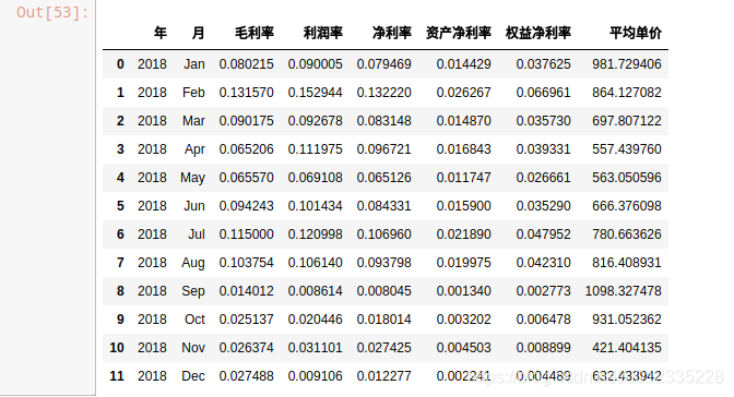
df6['毛利率'] = (df6['營業收入']-df6['營業成本'])/df6['營業收入']
df6['利潤率'] = df6['利潤總額']/df6['營業收入']
df6['凈利率'] = df6['凈 利 潤']/df6['營業收入']
df6['資產凈利率'] = df6['凈 利 潤']/df6['資產合計']
df6['權益凈利率'] = df6['凈 利 潤']/df6['權益合計']
df6['資產負載率'] = df6['負債合計']/df6['資產合計']
df6['平均單價'] = df6['營業收入']/df6['銷售量']
df7 = df6.loc[(df6['年']=='2018'),['年','月','毛利率','利潤率','凈利率','資產凈利率','權益凈利率','平均單價']]
df7
[/code]
```code
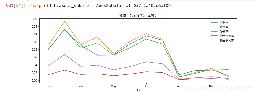
df7.plot(x='月',y=['毛利率','利潤率','凈利率','資產凈利率','權益凈利率'],title='2018年公司個指利率統計',figsize=(12,4))
[/code]
```code
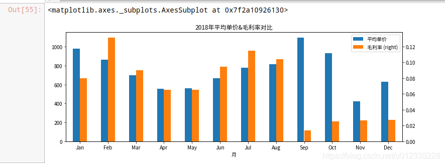
df7.plot('月',['平均單價','毛利率'],secondary_y=['毛利率'],kind='bar',title='2018年平均單價&毛利率對比',figsize=(12,4),rot=0)
[/code]
```code
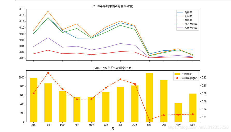
figure,axes = plt.subplots(2,1,figsize=(12,8),sharex=True)
ax0 = df7.plot('月',['毛利率','利潤率','凈利率','資產凈利率','權益凈利率'],title='2018年平均單價&毛利率對比',ax=axes[0])
ax1 = df7.plot('月','平均單價',kind='bar',title='2018平均單價&毛利率比對',color='gold',ax=axes[1])
ax2 = df7.plot('月','毛利率',secondary_y=True,color='orangered',ax=axes[1],style='--',marker='o',linewidth=2)
[/code]
```code
from pyecharts.charts import Bar
from pyecharts import options as opts
[/code]
```code
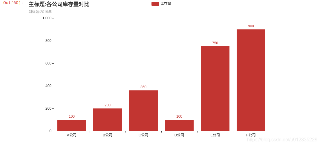
bar = (
Bar()
.add_xaxis(['A公司','B公司','C公司','D公司','E公司','F公司'])
.add_yaxis('庫存量',[100,200,360,100,750,900])
)
bar.render_notebook
[/code]
```code
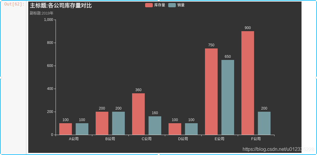
from pyecharts.globals import ThemeType
bar = (
Bar(init_opts=opts.InitOpts(theme=ThemeType.DARK))
.add_xaxis(['A公司','B公司','C公司','D公司','E公司','F公司'])
.add_yaxis('庫存量',[100,200,360,100,750,900])
.add_yaxis('銷量',[100,200,160,100,650,200])
.set_global_opts(title_opts=opts.TitleOpts(title='主標題:各公司庫存量對比',subtitle='副標題:2019年'))
)
bar.render_notebook()
[/code]
```code
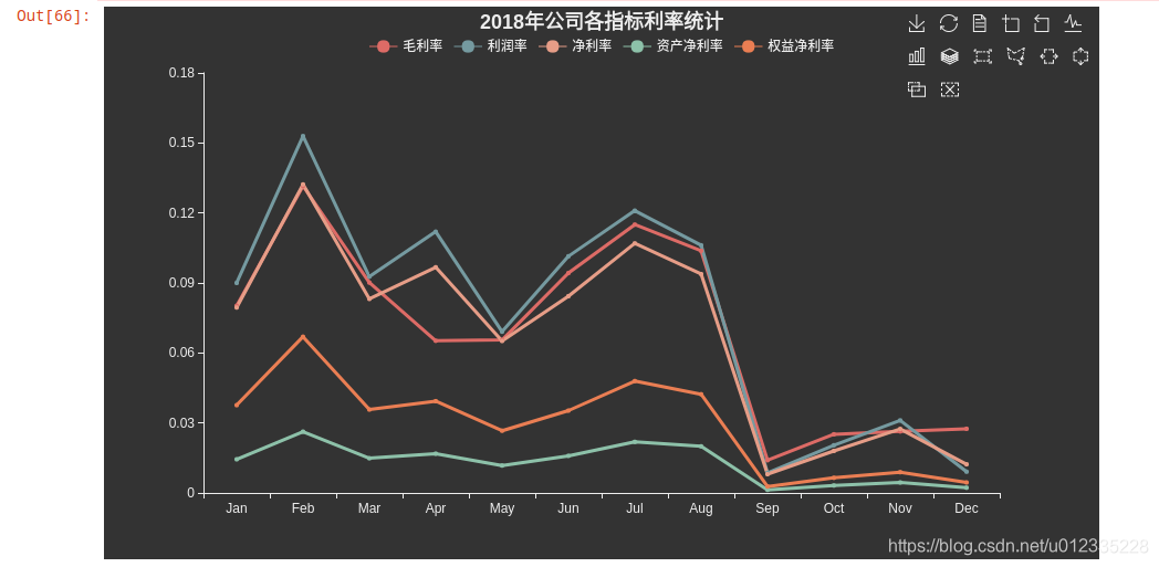
from pyecharts.charts import Line
y1 = df7['毛利率'].tolist()
y2 = df7['利潤率'].tolist()
y3 = df7['凈利率'].tolist()
y4 = df7['資產凈利率'].tolist()
y5 = df7['權益凈利率'].tolist()
x = df7['月'].tolist()
line = (
Line(init_opts=opts.InitOpts(theme=ThemeType.DARK))
.add_xaxis(x)
.add_yaxis('毛利率',y1,linestyle_opts=opts.LineStyleOpts(width=3))
.add_yaxis('利潤率',y2,linestyle_opts=opts.LineStyleOpts(width=3))
.add_yaxis('凈利率',y3,linestyle_opts=opts.LineStyleOpts(width=3))
.add_yaxis('資產凈利率',y4,linestyle_opts=opts.LineStyleOpts(width=3))
.add_yaxis('權益凈利率',y5,linestyle_opts=opts.LineStyleOpts(width=3))
.set_global_opts(title_opts=opts.TitleOpts(title='2018年公司各指標利率統計',
pos_left='center'),legend_opts=opts.LegendOpts(pos_top='5%'),
toolbox_opts=opts.ToolboxOpts(pos_top='%5'))
.set_series_opts(label_opts=opts.LabelOpts(is_show=False))
)
line.render_notebook()
[/code]