假設高度已知,請寫出三欄布局,其中左欄、右欄寬度各為 300 px,中間自適應。
中間自適應就是說中間的盒子可以隨着瀏覽器窗口的大小或子元素的大小自動調整大小,中間盒子不能是定寬的,它的大小是由子元素撐開的。
接下來用五種方法來實現題目中的要求。
1. float 布局
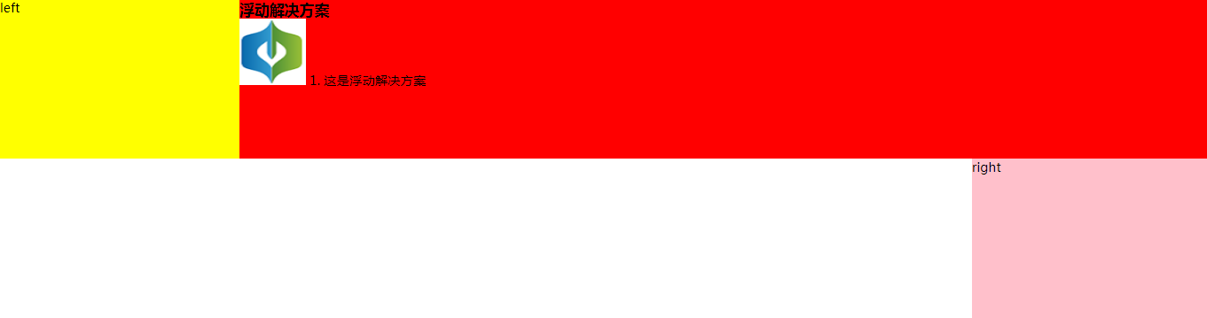
    <!-- float 布局 -->
    <section class="layout float">
      <style media="screen">
        /* 清除浮動 */
        .left-right-center::after {
          content: '';
          clear: both; /* 使兩邊沒有浮動元素 */
          display: block;
          height: 0;
          visibility: hidden;
        }

        /* float布局 */
        .float .left {
          float: left;
          width: 300px;
          background-color: yellow;
        }
        .float .right {
          float: right;
          width: 300px;
          background-color: pink;
        }
        .float .center {
          background-color: red;
        }
      </style>
      <h1>float布局</h1>
      <!-- article作為容器將左中右三塊包裹起來 -->
      <article class="left-right-center">
        <!-- 划分左中右三個模塊 -->
        <div class="left">left</div>
        <div class="right">right</div>
        <!-- 中間寫一些內容撐開盒子 -->
        <div class="center">
          <h1>浮動解決方案</h1>
          <img src="./慧思圖標.png" alt="">
          1. 這是浮動解決方案
        </div>
      </article>
    </section
這里要強調的一點 .left 和 .right 的元素的順序不能顛倒,如果顛倒了會出現下面的結果。

這是因為向右浮動的元素會盡量靠右和靠上,但是現在由於 center 元素將上面的整行都占據了,所以它沒法靠上去了,所以盡量靠上只能靠到 center 元素的下面,然后再盡量靠右,因此顯示在了圖中所示的位置。
如果將 right 元素放在 center 元素的上面,這時候沒有 center 元素盡量靠上靠右就會就會顯示在最上面然后靠右的位置。當有了 center 元素之后,由於 float 元素是脫離文檔流的,所以 center 可以靠在最上面占據一整行。又因為 float 元素不脫離文本流,所以 center 元素的子元素不能出現在 left 元素的下面,而是出現在了 left 元素的左邊。(注意並不只是文字,就算是 center 元素中加載了一張圖片也不會出現在 left 元素的下面,總之所有的子元素都不會出現在 left 元素的下面)
2. 絕對定位
    <!-- absolute 布局 -->
    <section class="layout absolute">
      <style media="screen">
        .absolute .left-right-center {
          position: relative;
        }
        .absolute .left {
          position: absolute;
          width: 300px;
          left: 0;
          background-color: rgb(105, 170, 67);
        }
        .absolute .right {
          position: absolute;
          width: 300px;
          right: 0;
          background-color: bisque;
        }
        .absolute .center {
          position: absolute;
          left: 300px;
          right: 300px;
          background-color:rgb(106, 19, 219);
        }
      </style>
      <h1>absolute布局</h1>
      <!-- article作為容器將左中右三塊包裹起來 -->
      <article class="left-right-center">
        <!-- 划分左中右三個模塊 -->
        <div class="left">left</div>
        <!-- 中間寫一些內容撐開盒子 -->
        <div class="center">
          <h1>絕對定位</h1>
          <img src="./慧思圖標.png" alt="">
          1. 這是絕對定位方案
        </div>
        <div class="right">right</div>
      </article>
    </section>
由於兩邊的元素寬度是固定的,因此中間元素不定位而是設置 margin: 0 300px; 會出現下面的情況,不清楚是為什么,如果有知道的麻煩講解一下,謝謝。

3. flex-box 布局
    <!-- flexbox 布局 -->
    <section class="layout flex-box">
      <style>
        .flex-box .left-right-center {
          display: flex;
        }
        .flex-box .left {
          flex: none;
          width: 300px;
          background-color: rgb(228, 116, 116);
        }
        .flex-box .right {
          flex: none;
          width: 300px;
          background-color: rgb(212, 131, 32);
        }
        .flex-box .center {
          flex: 1;
          background-color:rgb(26, 128, 119);
        }
      </style>
      <h1>flex-box布局</h1>
      <!-- article作為容器將左中右三塊包裹起來 -->
      <article class="left-right-center">
        <!-- 划分左中右三個模塊 -->
        <div class="left">left</div>
        <!-- 中間寫一些內容撐開盒子 -->
        <div class="center">
          <h1>flex-box布局</h1>
          <img src="./慧思圖標.png" alt="">
          1. 這是flex-box布局方案
        </div>
        <div class="right">right</div>
      </article>
    </section>
兩邊固定寬度,中間元素自適應。
4. table 布局
    <!-- table 布局 -->
    <section class="layout table">
      <style>
        .table .left-right-center {
          width: 100%;
          display: table;
        }
        .table .left-right-center>div {
          display: table-cell;
        }
        .table .left {
          width: 300px;
          background-color: rgb(218, 42, 42);
        }
        .table .right {
          width: 300px;
          background-color: rgb(82, 35, 49);
        }
        .table .center {
          background-color:rgb(44, 62, 167);
        }
      </style>
      <h1>table布局</h1>
      <!-- article作為容器將左中右三塊包裹起來 -->
      <article class="left-right-center">
        <!-- 划分左中右三個模塊 -->
        <div class="left">left</div>
        <!-- 中間寫一些內容撐開盒子 -->
        <div class="center">
          <h1>table布局</h1>
          <img src="./慧思圖標.png" alt="">
          1. 這是table布局方案
        </div>
        <div class="right">right</div>
      </article>
    </section>
將 article 元素設置為表格,並且寬度與頁面寬度相等,通過設置 display: table-cell 設置左中右元素為單元格,其中 left 元素寬度 300 px,right 元素寬度為 300 px,center 元素寬度不設置寬度,寬度自適應。
5. 網格布局
    <!-- 網格布局 -->
    <section class="layout grid">
      <style>
        .grid .left-right-center {
          display: grid;
          /* 網格每行的寬度與頁面寬度相等 */
          width: 100%;
          /* 網格每行的高度 */
          grid-template-rows: 120px;
          /* 左側寬度300px,中間自適應,右側寬度300px */
          grid-template-columns: 300px auto 300px;
        }
        .grid .left {
          background-color: rgb(16, 138, 53);
        }
        .grid .right {
          background-color: rgb(238, 13, 118);
        }
        .grid .center {
          background-color:rgb(196, 184, 26);
        }
      </style>
      <h1>網格布局</h1>
      <!-- article作為容器將左中右三塊包裹起來 -->
      <article class="left-right-center">
        <!-- 划分左中右三個模塊 -->
        <div class="left">left</div>
        <!-- 中間寫一些內容撐開盒子 -->
        <div class="center">
          <h1>網格布局</h1>
          <img src="./慧思圖標.png" alt="">
          1. 這是網格布局方案
        </div>
        <div class="right">right</div>
      </article>
    </section>
通過 display: grid 將 article 元素設置為網格顯示,通過 grid-template-columns: 300px auto 300px; 設置一行中有三個網格,左邊的網格寬度為 300 px,中間自適應,右邊網格的寬度為 300px。
6. inline-block 布局
inline-block 也可以作為一種布局方式,但是不適合這種中間需要自適應的情況,適合定寬條件下的布局。
完整代碼:實現三欄布局的五種方法源代碼
執行結果:

完,如有不恰當之處,歡迎指正。