一、TabView
TabView 可以實現類似 Windows 任務管理器的界面,有人叫 TabView 為標簽控件,有人又稱之為選項卡控件,我們知道它就是這么個東西就行了。現在來介紹 TabView 的屬性和方法。
-
count 屬性是只讀的,返回 TabView 內的標簽頁的個數。
-
currentlndex 屬性代表當前標簽頁的索引,從 0 開始,可以讀取也可以設置它來切換標簽。
-
frameVisible 指示標簽頁對應的內容周圍的邊框是否可見。tabVisible 設置標簽欄是否可見。
-
tabPosition 保存標簽欄的位置,默認是 Qt.TopEdge,在界面頂部;置 tabPosition 為 Qt.BottomEdge,標簽欄就會跑到界面底部。
-
addTab (title, component) 方法用於增加一個標簽,第一個參數是標簽的標題,第二個參數是一個組件,代表標簽對應的可視控件。
insertTab (index, title, component)在指定索引位置插入一個標簽。 -
removeTab (index) 刪除指定位置的標簽。moveTab(from, to) 將一個標簽從索引 from 移動到索引。getTab (index) 返回指定位置的標簽對象(類型為Tab),Tab 對象只有一個 title 屬性,是 Loader 的派生類。
7.1 標簽控件簡單示例
tabview_simple.qml 的內容如下:
import QtQuick 2.2
import QtQuick.Controls 1.2

Rectangle {
    width: 360;
    height: 240;
    color: "lightgray";

    Component {
        id: tabContent;
        Rectangle {
            implicitWidth: 100;
            implicitHeight: 100;
            anchors.fill: parent;
            color: Qt.rgba(Math.random(), Math.random(), Math.random());
        }
    }

    Button {
        id: addTab;
        x: 8;
        y: 8;
        width: 60;
        height: 25;
        text: "AddTab";
        onClicked: {
            tabView.addTab("tab-" + tabView.count, tabContent);
        }
    }

    TabView {
        id: tabView;
        anchors.top: addTab.bottom;
        anchors.margins: 8;
        anchors.left: parent.left;
        anchors.right: parent.right;
        anchors.bottom: parent.bottom;
    }
}
執行后,點擊四次 "AddTab" 按鈕后,再選擇 "tab-1" 后的效果圖如下所示。
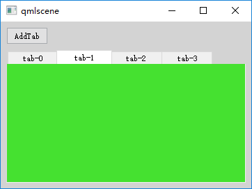
太丑了點兒,對吧。沒關系,咱們可以用 TabViewStyle 來定制。
7.2 使用 TabViewStyle
TabView 有 style 這個屬性,可以為其指定一個 TabViewStyle 對象來定制 TabView。tabBar 繪制標簽欄的背景。tab 繪制一個個的標簽。frame 繪制 TabView 的邊框。一般我們設置這三個屬性即可打造一個美麗動人的 TabView。
下面看一個示例:
import QtQuick 2.2
import QtQuick.Controls 1.2
import QtQuick.Controls.Styles 1.2
import QtQuick.Layouts 1.1

Rectangle {
    width: 360;
    height: 240;
    color: "lightgray";
    id: root;
    property var icons: ["call1.png", "call2.png", "call3.png"];
    Component.onCompleted: {
        tabView.addTab("ABC", tabContent);
        tabView.addTab("ZXY", tabContent);
        tabView.addTab("MQF", tabContent);
        tabView.addTab("WKJ", tabContent);
    }

    Component {
        id: tabContent;
        Rectangle {
            implicitWidth: 100;
            implicitHeight: 100;
            anchors.fill: parent;
            color: Qt.rgba(Math.random(), Math.random(), Math.random());
        }
    }

    TabView {
        id: tabView;
        anchors.fill: parent;

        style: TabViewStyle {
            tab: Item{
                implicitWidth: Math.max(text.width + 8, 80);
                implicitHeight: 48;
                Rectangle {
                    width: (styleData.index < control.count - 1) ? (parent.width - 2) : parent.width;
                    height: parent.height - 4;
                    anchors.top: parent.top;
                    anchors.left: parent.left;
                    anchors.leftMargin: 1;
                    visible: styleData.selected;
                    gradient: Gradient {
                        GradientStop{position: 0.0; color: "#606060";}
                        GradientStop{position: 0.5; color: "#c0c0c0";}
                        GradientStop{position: 1.0; color: "#a0a0a0";}
                    }
                }
                Rectangle {
                    width: 2;
                    height: parent.height - 4;
                    anchors.top: parent.top;
                    anchors.right: parent.right;
                    visible: styleData.index < control.count - 1;
                    gradient: Gradient {
                        GradientStop{position: 0.0; color: "#404040";}
                        GradientStop{position: 0.5; color: "#707070";}
                        GradientStop{position: 1.0; color: "#404040";}
                    }
                }
                RowLayout {
                    implicitWidth: Math.max(text.width, 72);
                    height: 48;
                    anchors.centerIn: parent;
                    z: 1;
                    Image{
                        width: 48;
                        height: 48;
                        source: root.icons[styleData.index%3];
                    }
                    Text {
                        id: text;
                        text: styleData.title;
                        color: styleData.selected ? "blue" : (styleData.hovered ? "green" : "white");
                    }
                }
            }
            tabBar: Rectangle {
                height: 56;
                gradient: Gradient {
                    GradientStop{position: 0.0; color: "#484848";}
                    GradientStop{position: 0.3; color: "#787878";}
                    GradientStop{position: 1.0; color: "#a0a0a0";}
                }
                Rectangle {
                    width: parent.width;
                    height: 4;
                    anchors.bottom: parent.bottom;
                    border.width: 2;
                    border.color: "#c7c7c7";
                }
            }
        }
    }
}
執行后的效果圖如下所示:
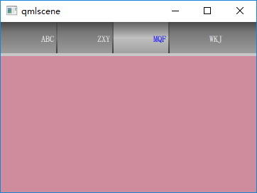
TabViewStyle 對象的 tab 組件相對復雜一些,我設計為 “圖標+文本” 的樣式,圖標在左, 文本在右。當選中標簽時,使用 Rectangle 高亮背景。選中標簽(styleData.selected為true)的文本,顏色為藍色;未選中標簽的文本,鼠標懸停(styleData.hovered為true)時為綠色,否則為白色。
二、Slider
Slider 類代表一個水平或垂直的滑塊控件,通常用於讓用戶在某個取值范圍內選擇一個值。先來看一個示意圖,見下圖。
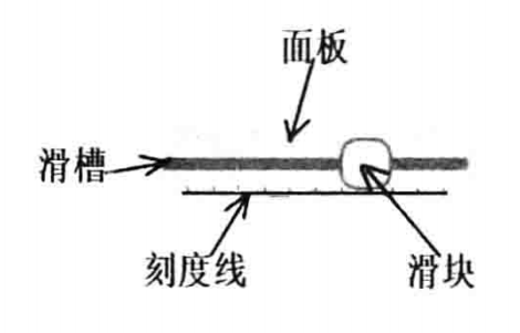
滑塊組件分為面板(panel)、滑槽(groove)、刻度線(tickmarks)和滑塊(handle)四部分。而 Slider 對應的用來定制滑塊控件外觀的 SliderStyle 類,恰恰就有 groove、handle、 panel、tickmarks 四個組件。也就是說,滑塊控件的每個組成部分,都可以定制。不過,我們一般只定制 handle 和 groove,其他兩個定制起來稍微麻煩一些。
-
maximumValue 用來設置最大值,默認值為 1.0。minimumValue 用來設置最小值,默認值為0。value 代表滑塊控件的當前值,默認值為 0,使用 onValueChanged 信號處理器可以跟蹤滑塊當前值的變化。
-
stepSize 用來設置滑塊變化的步長,當你使用方向鍵調整滑塊時,按一次它就增加或減少 stepSize 設定的值。
-
orientation 屬性用來設置控件的方向,可以是水平的(Qt.Horizontal)或垂直的 (Qt. Vertical)。
-
updateValueWhileDragging 屬性用來設置拖動滑塊時控件的當前值是否變化,默認為 true。
-
tickmarksEnabled 屬性指示是否顯示刻度線,默認為 false。
-
hovered 屬性指示鼠標是否懸停在控件上方,pressed 指示鼠標或手指是否按下。這兩個屬性都是只讀的。
-
activeFocusOnPress 屬性指示當用戶按下鼠標或手指時,控件是否獲得鍵盤焦點,默認為 false。
現在隆重地介紹我們的重量級嘉賓:style。使用 style 屬性,你就可以隨心所欲地妝扮你的滑塊控件了。一般,style 屬性指向一個 SliderStyle 對象。
2.1 SliderStyle
SliderStyle 用來定制一個 Slider 的外觀,你可以定制面板、滑槽、滑塊、刻度線四部分。
- control 屬性指向應用此風格對象的滑塊控件實例。
- groove 屬性指向滑槽組件,handle 指向滑塊組件,tickmarks 指向刻度線組件,panel 指向面板組件,它們的類型都是 Component。
需要說明的是,一般我們只需要定制 groove 和 handle 就能夠得到不錯的效果。
2.2 滑塊簡單示例
好啦,現在我們提供一個滑塊的示例,看看 Slider 的各個屬性的用法。slider_demo.qml 代碼如下:
import QtQuick 2.2
import QtQuick.Controls 1.2
import QtQuick.Controls.Styles 1.2

Rectangle {
    width: 320;
    height: 240;
    color: "lightgray";
    Row {
        anchors.fill: parent;
        spacing: 20;
        Column{
            width: 200;
            spacing: 16;
            Text {
                id: sliderStat;
                color: "blue";
                text: "current - 0.1";
            }
            Slider {
                width: 200;
                height: 30;
                stepSize: 0.01;
                value: 0.1;
                onValueChanged: {
                    sliderStat.text = "current - " + value;
                }
                Component.onCompleted: console.log(activeFocusOnPress);
            }

            Slider {
                width: 200;
                height: 30;
                minimumValue: 0;
                maximumValue: 100;
                stepSize: 1;
                value: 50;
                tickmarksEnabled: true;
            }
            Slider {
                id: customGrooveAndHandle;
                width: 200;
                height: 30;
                stepSize: 0.1;
                value: 0;
                tickmarksEnabled: true;
                style: SliderStyle {
                    groove: Rectangle {
                        implicitWidth: 200;
                        implicitHeight: 8;
                        color: "gray";
                        radius: 8;
                    }
                    handle: Rectangle {
                        anchors.centerIn: parent;
                        color: control.pressed ? "white" : "lightgray";
                        border.color: "gray";
                        border.width: 2;
                        width: 34;
                        height: 34;
                        radius: 12;
                    }
                }
            }
            Slider {
                id: customPanel;
                width: 200;
                height: 36;
                stepSize: 0.1;
                value: 0;
                tickmarksEnabled: true;
                style: SliderStyle {
                    groove: Rectangle {
                        implicitWidth: 200;
                        implicitHeight: 8;
                        color: "gray";
                        radius: 8;
                    }
                    handle: Rectangle {
                        anchors.centerIn: parent;
                        color: control.pressed ? "white" : "lightgray";
                        border.color: "gray";
                        border.width: 2;
                        width: 34;
                        height: 34;
                        radius: 12;
                        Text {
                            anchors.centerIn: parent;
                            text: control.value;
                            color: "red";
                        }
                    }
                    panel: Rectangle {
                        anchors.fill: parent;
                        radius: 4;
                        color: "lightsteelblue";
                        Loader {
                            id: grooveLoader;
                            anchors.centerIn: parent;
                            sourceComponent: groove;
                        }
                        Loader {
                            id: handleLoader;
                            anchors.verticalCenter: grooveLoader.verticalCenter;
                            x: Math.min(grooveLoader.x + (control.value * grooveLoader.width) / (control.maximumValue - control.minimumValue), grooveLoader.width - item.width);
                            sourceComponent: handle;
                        }
                    }
                }
            }
        }
        Slider {
            width: 30;
            height: 200;
            orientation: Qt.Vertical;
            stepSize: 0.1;
            value: 0.2;
            tickmarksEnabled: true;
        }
    }
}
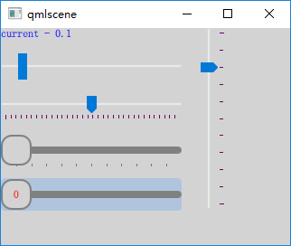
使用 qmlscene 加載 slider_demo.qml,效果如下圖所示。
參考:
《Qt Quick核心編程》第9章