一、ComboBox
ComboBox,即下拉列表框,由一個列表框和一個標簽控件(或編輯控件)組成。ComboBox 的下拉列表是使用 Menu 實現的,列表內的每個條目對應一個 Menultem。
-
彈出下拉列表框后,用戶選擇列表中的一個條目,此時 currentlndex、currentText 屬性就會變化,同時 activated 信號也會發射。
-
ComboBox 的 find() 方法用於查找列表中是否存在指定的字符串,對於可編輯的 ComboBox,向列表中添加條目時可以使用此方法來濾重;textAt() 返回指定索引位置的字符串;selectAll() 可以選中可編輯 ComboBox 的編輯框內的所有文本。
-
count 屬性返回ComboBox下拉列表內的條目個數。
-
下拉列表的數據從 model 屬性來。model 可以是一個簡單的字符串列表,如 ["TV”,"CD Player”,"Set Top Box" , ’’Router"];也可以是 ListModel,當使用 ListModel 時,可以通過 textRole 屬性指定列表條目對應的 model 內的 role,如果不設定, 則默認使用第一個 role。比如下面的 ComboBox 示例使用的 ListModel,內部數據有 text 和 color 兩個角色,如果不設定 ComboBox 的 textRole,則會默認使用 model 的 text;如果設定 textRole: "color",則使用 model 的 color 角色。
ComboBox { editable: true; model: ListModel { ListElement { text: "Banana"; color: "Yellow" } } textRole: "color"; } -
你可以給 style 屬性指定一個 ComboBoxStyle 對象來定制 ComboBox。其實在 ComboBox.qml 中,為 style 指定了 一個動態創建的 ComboBoxStyle 對象,看源碼:
style: Qt.createComponent(Settings.style + "/ComboBoxStyle.qml", comboBox)
如果你想了解怎樣實現一個功能完備的 ComboBoxStyle,可以循着這個線索找到可參考的源碼。為了展示 Qt Quick “一切風格皆可定制” 的特色,我們還是來看看 ComboBoxStyle 到底能干什么。
1.1 ComboBoxStyle
先說一 下ComboBox 頂部顯示當前條目的那個控件。當 ComboBox 不可編輯時,它是一個 Button,顯示 currentText,響應點擊彈出下拉列表框。如果你還記得 ButtonStyle 這個對象,應該能夠想到這個 Button 的 background 和 label 可以定制。沒錯,ComboBoxStyle 恰恰有 background 和 label 兩個類型為 Component 的屬性,就是用來定制背景和文本的。
當 ComboBox 可編輯時,一個 Textlnput 對象疊加到 Button 上面,Textlnput 左邊與 Button 左邊對齊,右邊留一些位置給那個代表 “下拉” 含義的小圖標—這個小圖標的寬度由 ComboBoxStyle 的 dropDownButtonWidth 屬性來決定。
好啦,現在說到了 ComboBoxStyle 的 background、label、dropDownButtonWidth 三個屬性。control 指向 ComboBox 實例,而 renderType —般不用設置。
1.2 ComboBox 綜合演示
combobox demo.qml 的內容如下:
import QtQuick 2.2
import QtQuick.Controls 1.2
import QtQuick.Controls.Styles 1.2

Rectangle {
    width: 480;
    height: 360;
    color: "#a0b0a0";

    Grid {
        anchors.fill: parent;
        rows: 2;
        columns: 2;
        rowSpacing: 4;
        columnSpacing: 4;
        GroupBox {
            width: 200;
            height: 120;
            title: "只讀電器";
            ComboBox {
                anchors.top: parent.top;
                anchors.topMargin: 8;
                width: parent.width;
                model: ["TV" , "CD Player" , "Set Top Box" , "Router"];
            }
        }

        GroupBox {
            width: 200;
            height: 120;
            title: "可編輯水果";
            ComboBox {
                anchors.top: parent.top;
                anchors.topMargin: 8;
                width: parent.width;
                editable: true;
                model: ListModel {
                    ListElement { text: "Banana"; color: "Yellow" }
                }
                //textRole: "color";
                onAccepted: {
                    if(count < 4 && find(currentText) === -1){
                        model.append({text: editText});
                        currentIndex = find(currentText);
                        if(count === 4){
                            editable = false;
                        }
                    }
                }
            }
        }

        GroupBox {
            width: 200;
            height: 120;
            title: "定制風格";
            ComboBox {
                anchors.top: parent.top;
                anchors.topMargin: 8;
                width: parent.width;
                //editable: true;
                model: ["Google" , "IBM" , "Digia"];
                style: ComboBoxStyle {
                    dropDownButtonWidth: 20;
                    background: Rectangle {
                        implicitHeight: 24;
                        border.width: control.editable ? 0 : 1;
                        border.color: (control.hovered || control.pressed)? "blue" : "gray";
                        color: (control.hovered || control.pressed)? "#e0e0e0" : "#c0c0c0";
                        Canvas {
                            width: 16;
                            height: 18;
                            anchors.right: parent.right;
                            anchors.rightMargin: 2;
                            anchors.top: parent.top;
                            anchors.topMargin: 1;
                            onPaint: {
                                var ctx = getContext("2d");
                                ctx.save();
                                ctx.strokeStyle = "black";
                                ctx.lineWidth = 2;
                                ctx.beginPath();
                                ctx.moveTo(1, 8);
                                ctx.lineTo(8, 16);
                                ctx.lineTo(15, 8);
                                ctx.stroke();
                                ctx.restore();
                            }
                        }
                    }
                    label: Text {
                        anchors.left: parent.left;
                        anchors.leftMargin: 2;
                        width: parent.width - 22;
                        height: parent.height;
                        verticalAlignment: Text.AlignVCenter;
                        horizontalAlignment: Text.AlignHCenter;
                        text: control.currentText;
                        color: (control.hovered || control.pressed) ? "blue" : "black";
                    }
                }
            }
        }

        GroupBox {
            width: 200;
            height: 236;
            title: "月份輸入";
            ComboBox {
                anchors.top: parent.top;
                anchors.topMargin: 8;
                width: parent.width;
                editable: true;
                model: ListModel {
                }
                validator: IntValidator{ top: 12; bottom: 1; }
                onAccepted: {
                    if(count < 12 && find(currentText) === -1){
                        model.append({text: editText});
                        currentIndex = find(currentText);
                        if(count === 12){
                            editable = false;
                        }
                    }
                }
            }
        }
    }
}
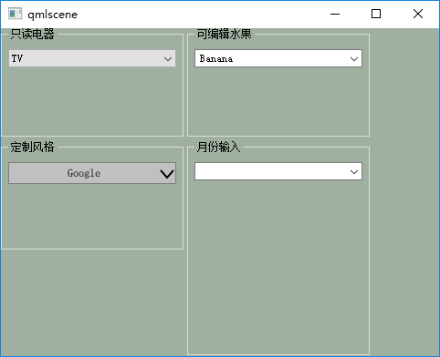
下圖是使用 qmlscene 記載 combobox_demo.qml 后的效果圖。
下圖是做了一些操作后的效果圖。
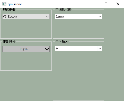
我設計了 4 個 ComboBox 對象,把它們分別放在 4 個 GroupBox 里,這樣可以利用 GroupBox 的標題和邊框,分界清晰。Grid 定位器管理 4 個 GroupBox。
-
名為 “只讀電器” 的 ComboBox,使用一個字符串列表作為 model,最為簡單。
-
“可編輯水果” 下拉列表框,使用 ListModel,允許編輯,在 onAccepted 信號處理器內插入用戶輸入的文本,帶濾重功能。當下拉列表內的條目數量達到 4 時禁止編輯。
-
名為 “月份輸入” 的 ComboBox,使用了 IntValidator,只允許輸入 1 至 12 這幾個月份。其他的與 “可編輯水果” 類似。
二、ProgressBar
ProgressBar 進度條,用途大家都了解,這里就不贅述了。
- minimumValue 表示最小值;maximumValue 表示最大值;value 是當前值,更新它進度條就會變化。
- orientation 代表方向,默認取值 Qt.Horizontal,水平方向;要想進度條變垂直,設置其為 Qt. Vertical。
- style,又見 style,無處不在的 style,它指向一個 ProgressBarStyle 來定制進度條的外觀。 indeterminate 屬性比較有意思,當你不知道實際進度時,設置它為 true,ProgressBar 就會變身為Busylndicator 了,請稍等,就不告訴你等多久……它的默認值為 false。
2.1 ProgressBarStyle
ProgressBarStyle 的 control 屬性指向 ProgressBar 對象。currentProgress 是一個 0〜1 的值,表示當前進度。background 用來繪制進度條的背景,progress 用來繪制進度。
2.2 進度條綜合演示
import QtQuick 2.2
import QtQuick.Controls 1.2
import QtQuick.Controls.Styles 1.2

Rectangle {
    width: 480;
    height: 240;
    color: "#a0b0a0";

    Row {
        anchors.fill: parent;
        anchors.margins: 10;
        spacing: 8;

        ProgressBar {
            minimumValue: 0;
            maximumValue: 100;
            value: 40;
            width: 150;
            height: 20;
            Timer {
                interval: 1000;
                repeat: true;
                running: true;
                onTriggered: {
                    if(parent.value < 99.1){
                        parent.value += 1;
                    }else{
                        stop();
                    }
                }
            }
        }

        ProgressBar {
            orientation: Qt.Vertical;
            minimumValue: 0;
            maximumValue: 1;
            value: 0.2;
            width: 20;
            height: 200;
            Timer {
                interval: 1000;
                repeat: true;
                running: true;
                onTriggered: {
                    parent.value = Math.random();
                }
            }
        }

        ProgressBar {
            minimumValue: 0;
            maximumValue: 1;
            value: 0.2;
            width: 80;
            height: 16;
            indeterminate: true;
        }

        Item {
            width: 180;
            height: parent.height;

            ProgressBar {
                id: customProgress;
                anchors.centerIn: parent;
                minimumValue: 0;
                maximumValue: 1;
                value: 0.2;
                width: 160;
                height: 20;
                style: ProgressBarStyle {
                    background: Rectangle {
                        implicitWidth: 200;
                        implicitHeight: 20;
                        border.width: 1;
                        border.color: control.hovered ? "green" : "gray";
                        color: "lightgray";
                    }
                    progress: Rectangle {
                        color: "#208020";
                    }
                }
            }

            ProgressBar {
                id: percentProgress;
                anchors.top: customProgress.bottom;
                anchors.topMargin: 4;
                anchors.horizontalCenter: parent.horizontalCenter;
                minimumValue: 0;
                maximumValue: 1;
                value: 0.33;
                width: 160;
                height: 20;
                style: ProgressBarStyle {
                    id: progressStyle;
                    background: Rectangle {
                        border.width: 1;
                        border.color: control.hovered ? "green" : "gray";
                        color: "lightgray";
                    }
                    progress: Rectangle {
                        color: "#208020";
                    }
                    panel: Item {
                        implicitWidth: 200;
                        implicitHeight: 20;

                        Loader {
                            anchors.fill: parent;
                            sourceComponent: background;
                        }
                        Loader {
                            id: progressLoader;
                            anchors.top: parent.top;
                            anchors.left: parent.left;
                            anchors.bottom: parent.bottom;
                            anchors.margins: 3;
                            z: 1;
                            width: currentProgress * (parent.width - 6);
                            sourceComponent: progressStyle.progress;
                        }
                        Text {
                            color: "blue";
                            text: currentProgress * 100 + "%";
                            z: 2;
                            anchors.centerIn: parent;
                        }
                    }
                }
            }
        }
    }
}
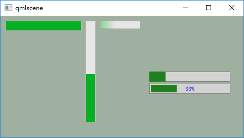
設計了 5 個進度條,水平、垂直、忙等待這三個 ProgressBar 對象都很簡單。id 為 customProgress 的 ProgressBar 對象只定制了 progress 和 label, 不必說了。
id 為 percentProgress 的 ProgressBar,進度條的填充部分與背景之間留了 3 個像素的空隙, 這是通過設置 progressLoader 的 anchors.margins 實現的。在定制 panel 時,我添加了一個 Text 對象,讓它居中顯示進度百分比。
下圖是執行 “qmlscene progressbar_demo.qml” 命令的效果圖。
參考:
《Qt Quick核心編程》第9章