先介紹一下 ExclusiveGroup。
ExclusiveGroup (互斥分組)本身是不可見元素,用於將若干個可選擇元素組合在一起, 供用戶選擇其中的一個選項。你可以在 ExclusiveGroup 對象中定義 RadioButton、CheckBox、Action 等元素,此時不需要設置它們的 exclusiveGroup 屬性;也可以定義一個只設置了 id 屬性的 ExclusiveGroup 對象,在別處定義 RadioButton、CheckBox、Action 等元素時通過 id 初始化這些元素的 exclusiveGroup 屬性。current 屬性指向互斥分組中第一個選中的元素。
一、RadioButton
RadioButton用於多選一的場景,使用時需要通過 exclusiveGroup 屬性為其指定一個分組。 它也可以和GroupBox結合使用。要使用RadioButton,需要導入Controls模塊,這樣: import QtQuick.Controls 1.2。
-
text 屬性存儲單選按鈕的文本。
-
單選按鈕還有一個指示選中與否的小圖標,一般顯示在文本前面。給 style 屬性設置自定義的 RadioButtonStyle 對象,可以定制 RadioButton 的外觀。 checked 屬性指示 RadioButton 是否被選中,也可以設置它來選中或取消選中。
-
hovered 是只讀屬性,指示鼠標是否懸停在 RadioButton 上。
-
pressed 屬性在按鈕被按下時為 true;當單選按鈕被按下時,activeFocusOnPress 屬性為 true,按鈕獲得焦點。
-
如果你點擊了一個單選按鈕,則會觸發clicked()信號。
1.1 RadioButtonStyle
RadioButtonStyle 用來定制一個 RadioButton,要使用它需要引入 QtQuick.Controls.Styles 1.x 模塊。
-
background 屬性定制背景,indicator 定制選中指示圖標,label 定制單選按鈕的文本,它們的類型都是 Component。
-
spacing 指定圖標和文本之間的間隔。
-
control 指向使用 style 的 RadioButton 對象,組件內的對象可以通過 control 訪問 RadioButton 的各種屬性,如 focus、activeFocus、hovered 等。
下面的實例中我們會使用 RadioButtonStyle 來定制 RadioButton。
1.2 實例:選擇你喜歡的手機操作系統
提供一個簡單的實例,preferred_mobile_os.qml,內容如下:
import QtQuick 2.2
import QtQuick.Controls 1.2
import QtQuick.Controls.Styles 1.2

Rectangle {
    width: 320;
    height: 300;
    color: "#d0d0d0";

    Rectangle {
        id: resultHolder;
        color: "#a0a0a0";
        width: 200;
        height: 60;
        anchors.centerIn: parent;
        visible: false;
        z: 2;
        opacity: 0.8;
        border.width: 2;
        border.color: "#808080";
        Text {
            id: result;
            anchors.centerIn: parent;
            font.pointSize: 20;
            color: "blue";
            font.bold: true;
        }
    }

    ExclusiveGroup {
        id: mos;
    }

    Component {
        id: radioStyle;
        RadioButtonStyle {
            indicator: Rectangle {
                implicitWidth: 16;
                implicitHeight: 12;
                radius: 6;
                border.color: control.hovered ? "darkblue" : "gray";
                border.width: 1;
                Rectangle {
                    anchors.fill: parent;
                    visible: control.checked;
                    color: "#0000A0";
                    radius: 5;
                    anchors.margins: 3;
                }
            }
            label: Text {
                color: control.activeFocus ? "blue" : "black";
                text: control.text;
            }
        }
    }

    Text {
        id: notation;
        text: "Please select the best mobile os:"
        anchors.top: parent.top;
        anchors.topMargin: 16;
        anchors.left: parent.left;
        anchors.leftMargin: 8;
    }

    RadioButton {
        id: android;
        text: "Android";
        exclusiveGroup: mos;
        anchors.top: notation.bottom;
        anchors.topMargin: 4;
        anchors.left: notation.left;
        anchors.leftMargin: 20;
        checked: true;
        focus: true;
        activeFocusOnPress: true;
        style: radioStyle;
        onClicked: resultHolder.visible = false;
    }
    RadioButton {
        id: ios;
        text: "iOS";
        exclusiveGroup: mos;
        anchors.top: android.bottom;
        anchors.topMargin: 4;
        anchors.left: android.left;
        activeFocusOnPress: true;
        style: radioStyle;
        onClicked: resultHolder.visible = false;
    }
    RadioButton {
        id: wp;
        text: "Windows Phone";
        exclusiveGroup: mos;
        anchors.top: ios.bottom;
        anchors.topMargin: 4;
        anchors.left: android.left;
        activeFocusOnPress: true;
        style: radioStyle;
        onClicked: resultHolder.visible = false;
    }
    RadioButton {
        id: firefox;
        text: "Firefox OS";
        exclusiveGroup: mos;
        anchors.top: wp.bottom;
        anchors.topMargin: 4;
        anchors.left: android.left;
        activeFocusOnPress: true;
        style: radioStyle;
        onClicked: resultHolder.visible = false;
    }
    RadioButton {
        id: sailfish;
        text: "Sailfish OS";
        exclusiveGroup: mos;
        anchors.top: firefox.bottom;
        anchors.topMargin: 4;
        anchors.left: android.left;
        activeFocusOnPress: true;
        style: radioStyle;
        onClicked: resultHolder.visible = false;
    }

    Button {
        id: confirm;
        text: "Confirm";
        anchors.top: sailfish.bottom;
        anchors.topMargin: 8;
        anchors.left: notation.left;
        onClicked: {
            result.text = mos.current.text;
            resultHolder.visible = true;
        }
    }
}
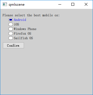
實例定義了 5 個 RadioButton,分別代表 5 個移動操作系統,這些單選按鈕同屬於 mos 這個 ExclusiveGroup。我使用錨布局來安排界面元素的位置。
用於顯示結果的 Text 對象處於界面中央,一開始是隱藏的,當點擊 “Confirm” 按鈕時顯示用戶的選擇結果。當用戶點擊某個 RadioButton 時觸發 clicked 信號,我在 onClicked 信號處理器內隱藏顯示結果的 Text 對象。
QML 文件內嵌入了一個 RadioButtonStyle 組件,將選中圖標變成了橢圓形,將選中時的文字變成了藍色。RadioButton 通過 radioStyle 這個id來引用組件。
執行 “qmlscene preferred_mobile_os.qml” 命令,效果如下圖所示。
二、CheckBox
CheckBox,復選框,顧名思義,你可以在一組選項中選擇一個或多個選項,這些選項之間互不影響。像 RadioButton —樣,CheckBox 可以顯示一個提示選中與否的小圖標,以及一行簡單的文本。
相比 RadioButton,CheckBox 多了兩個屬性:partiallyCheckedEnabled 屬性指示是否允許部分選中狀態,默認為 false;checkedState 記錄選中狀態,它的值可能是 Qt.UnChecked、 Qt.Checked 或 Qt.PartiallyChecked。
2.1 CheckBoxStyle
與 RadioButtonStyle 類似,CheckBoxStyle 用來定制 CheckBox。需要注意的是,如果你指定了 exdusiveGroup 屬性,那么同屬於一個互斥組的復選框, 也可以達到多選一的效果。CheckBoxStyle 的屬性與 RadioButtonStyle 幾乎完全一樣,唯一不同的是 control 屬性的類型是 CheckBox。
2.2 實例:那些你喜歡的愛情電影
一個簡單的實例,preferred_movies.qml,內容如下:
import QtQuick 2.2
import QtQuick.Controls 1.2
import QtQuick.Controls.Styles 1.2

Rectangle {
    width: 320;
    height: 300;
    color: "#d0d0d0";

    Rectangle {
        id: resultHolder;
        color: "#a0a0a0";
        width: 220;
        height: 80;
        anchors.centerIn: parent;
        visible: false;
        z: 2;
        opacity: 0.8;
        border.width: 2;
        border.color: "#808080";
        radius: 8;
        Text {
            id: result;
            anchors.fill: parent;
            anchors.margins: 5;
            font.pointSize: 16;
            color: "blue";
            font.bold: true;
            wrapMode: Text.Wrap;
        }
    }

    Component {
        id: checkStyle;
        CheckBoxStyle {
            indicator: Rectangle {
                implicitWidth: 14;
                implicitHeight: 14;
                border.color: control.hovered ? "darkblue" : "gray";
                border.width: 1;
                Canvas {
                    anchors.fill: parent;
                    anchors.margins: 3;
                    visible: control.checked;
                    onPaint: {
                        var ctx = getContext("2d");
                        ctx.save();
                        ctx.strokeStyle = "#C00020";
                        ctx.lineWidth = 2;
                        ctx.beginPath();
                        ctx.moveTo(0, 0);
                        ctx.lineTo(width, height);
                        ctx.moveTo(0, height);
                        ctx.lineTo(width, 0);
                        ctx.stroke();
                        ctx.restore();
                    }
                }
            }
            label: Text {
                color: control.checked ? "blue" : "black";
                text: control.text;
            }
        }
    }

    Text {
        id: notation;
        text: "Please select the best love movies:"
        anchors.top: parent.top;
        anchors.topMargin: 16;
        anchors.left: parent.left;
        anchors.leftMargin: 8;
    }

    Column {
        id: movies;
        anchors.top: notation.bottom;
        anchors.topMargin: 8;
        anchors.left: notation.left;
        anchors.leftMargin: 20;
        spacing: 8;
        CheckBox {
            text: "廊橋遺夢";
            style: checkStyle;
            onClicked: resultHolder.visible = false;
        }
        CheckBox {
            text: "人鬼情未了";
            style: checkStyle;
            onClicked: resultHolder.visible = false;
        }
        CheckBox {
            text: "觸不到的戀人";
            style: checkStyle;
            onClicked: resultHolder.visible = false;
        }
        CheckBox {
            text: "西雅圖夜未眠";
            style: checkStyle;
            onClicked: resultHolder.visible = false;
        }
    }

    Button {
        id: confirm;
        text: "Confirm";
        anchors.top: movies.bottom;
        anchors.topMargin: 8;
        anchors.left: notation.left;
        onClicked: {
            var str = new Array();
            var index = 0;
            var count = movies.children.length;
            for(var i = 0; i < count; i++){
                if(movies.children[i].checked){
                    str[index] = movies.children[i].text;
                    index++;
                }
            }
            if(index > 0){
                result.text = str.join();
                resultHolder.visible = true;
            }
        }
    }
}
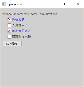
我選擇 4 部經典愛情片供用戶選擇,使用 Row 管理對應的 CheckBox。定義了一個 CheckBoxStyle 組件,將選中圖標的選中狀態變為方框內嵌紅叉,將選中時的文字變成了藍色。CheckBox 通過 checkStyle 這個 id 來引用組件。
執行 “qmlscene preferred_movies.qml” 命令,效果如下圖所示。
三、GroupBox
GmupBox (分組框),用於將其他的窗口部件組合在一起顯示,最常用的是將單選按鈕或復選框放在分組框中顯示,不過也可以將任何控件放在分組框內。使用分組框需要導入 QtQuick.Controls 1.x 模塊。
-
分組框一般在頂部有一個標題(title 屬性),說明其用途。默認帶有邊框,不過可以設置 flat 屬性為 true 來去掉左、右、底三條邊的邊框。
-
GroupBox 本身也支持選中,可以通過 checkable 屬性來設置。當你設置 checkable 為 true 時,它的標題欄會出現一個復選框,如果你勾選了它,那么它的子控件就是可選中的,否則它的子控件就不可操作。當分組框可選時,checked 屬性保存其選中狀態。
-
分組框的尺寸根據它的孩子們的尺寸計算而來。如果你想使用錨布局來管理分組框的孩子們,則需要顯式指定分組框本身的尺寸。
-
contentltem 指向一個 Item 對象,代表分組框的內容區,在分組框內聲明的孩子們,它們的父會被自動設置為 contentltem。而如果你動態創建分組框的孩子們,則需要顯式地將 contentltem 指定為它們的父。
我們修改 4.2 節的實例,使用分組框將表示電影的 CheckBox 組合在一塊。新的 QML 文檔是preferred_movies_groupbox.qml,內容如下(注意,我略掉了與 4.2 節相同的部分):
Rectangle {
	...

    GroupBox {
        id: groupbox;
        title: "請選擇你最喜歡的愛情電影:";
        anchors.top: parent.top;
        anchors.topMargin: 8;
        anchors.left: parent.left;
        anchors.leftMargin: 20;
        width: 280;
        height: 160;
        Column {
            id: movies;
            anchors.top: parent.top;
            anchors.topMargin: 8;
            spacing: 8;
            CheckBox {
                text: "廊橋遺夢";
                style: checkStyle;
                onClicked: resultHolder.visible = false;
            }
            CheckBox {
                text: "人鬼情未了";
                style: checkStyle;
                onClicked: resultHolder.visible = false;
            }
            CheckBox {
                text: "觸不到的戀人";
                style: checkStyle;
                onClicked: resultHolder.visible = false;
            }
            CheckBox {
                text: "西雅圖夜未眠";
                style: checkStyle;
                onClicked: resultHolder.visible = false;
            }
        }
    }

    Button {
        id: confirm;
        text: "確認";
        anchors.top: groupbox.bottom;
        anchors.topMargin: 8;
        anchors.left: parent.left;
        anchors.leftMargin: 20;
        onClicked: {
            var str = new Array();
            var index = 0;
            var count = movies.children.length;
            for(var i = 0; i < count; i++){
                if(movies.children[i].checked){
                    str[index] = movies.children[i].text;
                    index++;
                }
            }
            if(index > 0){
                result.text = str.join();
                resultHolder.visible = true;
            }
        }
    }
}
使用 qmlscene 加載 preferred_movies_groupbox.qml,效果如下圖所示。
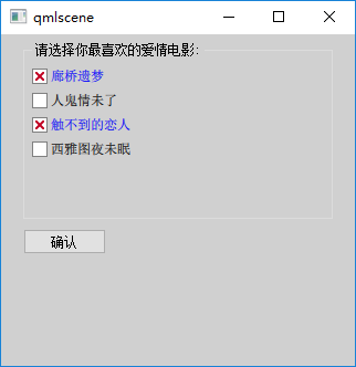
請對照下圖和 4.2 節的圖,看看使用分組框的效果與不使用分組框時的效果有何不同。
參考:
《Qt Quick核心編程》第9章