一直以來,使用純 CSS 實現波浪效果都是十分困難的。
因為實現波浪的曲線需要借助貝塞爾曲線。
而使用純 CSS 的方式,實現貝塞爾曲線,額,暫時是沒有很好的方法。

當然,借助其他力量(SVG、CANVAS),是可以很輕松的完成所謂的波浪效果的,先看看,非 CSS 方式實現的波浪效果。
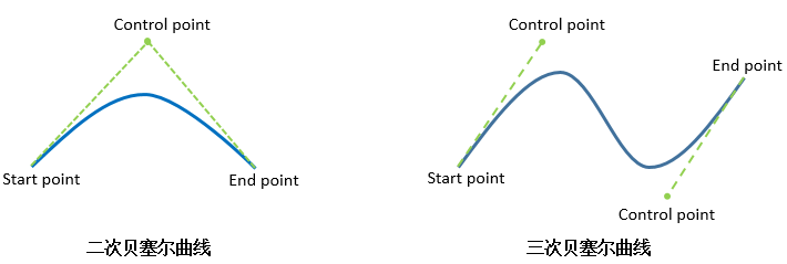
使用 SVG 實現波浪效果
借助 SVG ,是很容易畫出三次貝塞爾曲線的。
看看效果:
代碼如下:
<svg width="200px" height="200px" version="1.1" xmlns="http://www.w3.org/2000/svg">
    <text class="liquidFillGaugeText" text-anchor="middle" font-size="42px" transform="translate(100,120)" style="fill: #000">50.0%</text>
    <!-- Wave -->
    <g id="wave">
        <path id="wave-2" fill="rgba(154, 205, 50, .8)" d="M 0 100 C 133.633 85.12 51.54 116.327 200 100 A 95 95 0 0 1 0 100 Z">
        <animate dur="5s" repeatCount="indefinite" attributeName="d" attributeType="XML" values="M0 100 C90 28, 92 179, 200 100 A95 95 0 0 1 0 100 Z;
                                    M0 100 C145 100, 41 100, 200 100 A95 95 0 0 1 0 100 Z;
                                    M0 100 C90 28, 92 179, 200 100 A95 95 0 0 1 0 100 Z"></animate>
        </path>
    </g>
    <circle cx="100" cy="100" r="80" stroke-width="10" stroke="white" fill="transparent"></circle>
    <circle cx="100" cy="100" r="90" stroke-width="20" stroke="yellowgreen" fill="none" class="percentage-pie-svg"></circle>
</svg>
畫出三次貝塞爾曲線的核心在於 <path id="wave-2" fill="rgba(154, 205, 50, .8)" d="M 0 100 C 133.633 85.12 51.54 116.327 200 100 A 95 95 0 0 1 0 100 Z"> 這一段。感興趣的可以自行去研究研究。
使用 canvas 實現波浪效果
使用 canvas 實現波浪效果的原理與 SVG 一樣,都是利用路徑繪制出三次貝塞爾曲線並賦予動畫效果。
使用 canvas 的話,代碼如下:
$(function() {
    let canvas = $("canvas");
    let ctx = canvas[0].getContext('2d');
    let radians = (Math.PI / 180) * 180;
    let startTime = Date.now();
    let time = 2000;
    let clockwise = 1;
    let cp1x, cp1y, cp2x, cp2y;

    // 初始狀態
    // ctx.bezierCurveTo(90, 28, 92, 179, 200, 100);
    // 末尾狀態
    // ctx.bezierCurveTo(145, 100, 41, 100, 200, 100);

    requestAnimationFrame(function waveDraw() {
        let t = Math.min(1.0, (Date.now() - startTime) / time);

        if(clockwise) {
            cp1x = 90 + (55 * t);
            cp1y = 28 + (72 * t);
            cp2x = 92 - (51 * t);
            cp2y = 179 - (79 * t);
        } else {
            cp1x = 145 - (55 * t);
            cp1y = 100 - (72 * t);
            cp2x = 41 + (51 * t);
            cp2y = 100 + (79 * t);
        }

        ctx.clearRect(0, 0, 200, 200);
        ctx.beginPath();
        ctx.moveTo(0, 100);
        // 繪制三次貝塞爾曲線
        ctx.bezierCurveTo(cp1x, cp1y, cp2x, cp2y, 200, 100);
        // 繪制圓弧
        ctx.arc(100, 100, 100, 0, radians, 0);
        ctx.fillStyle = "rgba(154, 205, 50, .8)";
        ctx.fill();
        ctx.save();

        if( t == 1 ) {
            startTime = Date.now();
            clockwise = !clockwise;
        }

        requestAnimationFrame(waveDraw);
    });
})
主要是利用了動態繪制 ctx.bezierCurveTo() 三次貝塞爾曲線實現波浪的運動效果,感興趣的可以自行研究。
純 CSS 實現波浪效果
好,接下來才是本文的重點!使用純 CSS 的方式,實現波浪的效果。
你 TM 在逗我?剛剛不是還說使用 CSS 無能為力嗎?
是,我們沒有辦法直接繪制出三次貝塞爾曲線,但是我們可以利用一些討巧的方法,模擬達到波浪運動時的效果,姑且把下面這種方法看作一種奇技淫巧。
原理
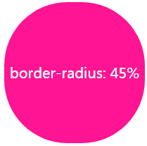
原理十分簡單,我們都知道,一個正方形,給它添加 border-radius: 50%,將會得到一個圓形。
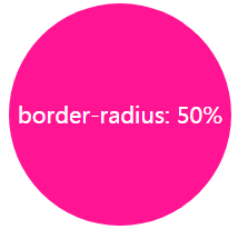
border-radius:用來設置邊框圓角,當使用一個半徑時確定一個圓形。
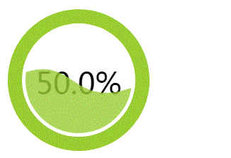
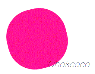
好的,如果 border-radius 沒到 50%,但是接近 50% ,我們會得到一個這樣的圖形:
注意邊角,整個圖形給人的感覺是有點圓,卻不是很圓。額,這不是廢話嗎 
好的,那整這么個圖形又有什么用?還能變出波浪來不成?
沒錯!就是這么神奇。:) 我們讓上面這個圖形滾動起來(rotate) ,看看效果:
可能很多人看到這里還沒懂旋轉起來的意圖,仔細盯着一邊看,是會有類似波浪的起伏效果的。
而我們的目的,就是要借助這個動態變換的起伏動畫,模擬制造出類似波浪的效果。
實現
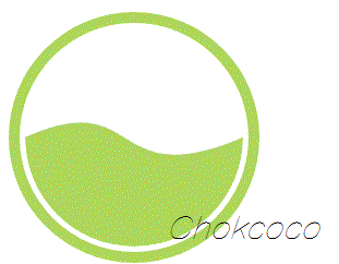
當然,這里看到是全景實現圖,所以感覺並不明顯,OK,讓我們用一個個例子看看具體實現起來能達到什么樣的效果。
我們利用上面原理可以做到的一種波浪運動背景效果圖:

后面漂浮的波浪效果,其實就是利用了上面的 border-radius: 45% 的橢圓形,只是放大了很多倍,視野之外的圖形都 overflow: hidden ,只留下了一條邊的視野,並且增加了一些相應的 transform 變換。
注意,這里背景是藍色靜止的,運動是白色的橢圓形。
代碼也很簡單,SCSS 代碼如下:
body {
    position: relative;
    align-items: center;
    min-height: 100vh;
    background-color: rgb(118, 218, 255);
    overflow: hidden;

    &:before, &:after {
        content: "";
        position: absolute;
        left: 50%;
        min-width: 300vw;
        min-height: 300vw;
        background-color: #fff;
        animation-name: rotate;
        animation-iteration-count: infinite;
        animation-timing-function: linear;
    }

    &:before {
        bottom: 15vh;
        border-radius: 45%;
        animation-duration: 10s;
    }

    &:after {
        bottom: 12vh;
        opacity: .5;
        border-radius: 47%;
        animation-duration: 10s;
    }
}

@keyframes rotate {
    0% {
        transform: translate(-50%, 0) rotateZ(0deg);
    }
    50% {
        transform: translate(-50%, -2%) rotateZ(180deg);
    }
    100% {
        transform: translate(-50%, 0%) rotateZ(360deg);
    }
}
為了方便寫 DEMO,用到的長度單位是 VW 與 VH,不太了解這兩個單位的可以戳這里:vh、vw、vmin、vmax 知多少
可能有部分同學,還存在疑問,OK,那我們把上面的效果縮小 10 倍,將視野之外的動畫也補齊,那么其實生成波浪的原理是這樣的:
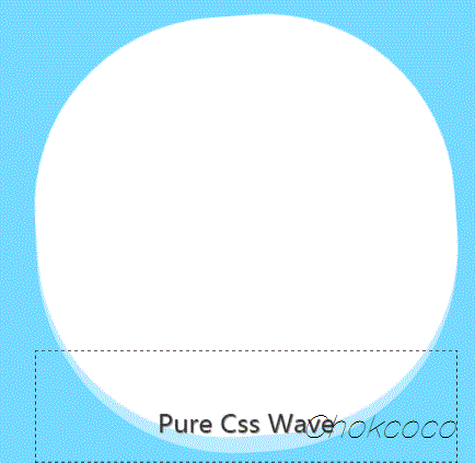
圖中的虛線框就是我們實際的視野范圍。

值得探討的點
值得注意的是,要看到,這里我們生成波浪,並不是利用旋轉的橢圓本身,而是利用它去切割背景,產生波浪的效果。那為什么不直接使用旋轉的橢圓本身模擬波浪效果呢?因為
- 中間高,兩邊低的效果不符合物理學原理,看上去十分別扭;
可以點進去看看下面這個例子:
使用純 CSS 實現波浪進度圖
好,既然掌握了這種方法,下面我們就使用純 CSS 實現上面最開始使用 SVG 或者 CANVAS 才能實現的波浪進度圖。
HTML 結構如下:
<div class="container">
    <div class="wave"></div>
</div>
CSS 代碼如下:
.wave {
    position: relative;
    width: 200px;
    height: 200px;
    background-color: rgb(118, 218, 255);
    border-radius: 50%;

    &::before,
    &::after{
        content: "";
        position: absolute;
        width: 400px;
        height: 400px;
        top: 0;
        left: 50%;
        background-color: rgba(255, 255, 255, .4);
        border-radius: 45%;
        transform: translate(-50%, -70%) rotate(0);
        animation: rotate 6s linear infinite;
        z-index: 10;
    }

    &::after {
        border-radius: 47%;
        background-color: rgba(255, 255, 255, .9);
        transform: translate(-50%, -70%) rotate(0);
        animation: rotate 10s linear -5s infinite;
        z-index: 20;
    }
}

@keyframes rotate {
    50% {
        transform: translate(-50%, -73%) rotate(180deg);
    } 100% {
        transform: translate(-50%, -70%) rotate(360deg);
    }
}
效果圖:
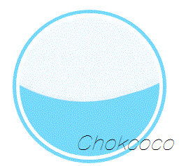
CodePen Demo -- Pure Css Wave Loading
雖然效果差了一點點,但是相較於要使用學習成本更高的 SVG 或者 CANVAS,這種純 CSS 方法無疑可使用的場景更多,學習成本更低!
一些小技巧
單純的讓一個 border-radius 接近 50 的橢圓形旋轉,動畫效果可能不是那么好,我們可以適當的添加一些其他變換因素,讓動畫效果看上去更真實:
- 在動畫過程中,動態的改變
border-radius的值; - 在動畫過程中,利用 transform 對旋轉橢圓進行輕微的位移、變形;
- 上面也演示到了,多個橢圓同時轉動,賦予不同時長的動畫,並且添加輕微的透明度,讓整個效果更佳逼真。
最后
系列 CSS 文章匯總在我的 Github ,持續更新,歡迎點個 star 訂閱收藏。
好了,本文到此結束,希望對你有幫助 :)
如果還有什么疑問或者建議,可以多多交流,原創文章,文筆有限,才疏學淺,文中若有不正之處,萬望告知。